
Motion
Bringing our brand to life through movement
Motion graphics strengthen recognition, storytelling and engagement across the GE HealthCare brand. They bring our logo, graphic device, messaging and imagery to life while reinforcing visual consistency across design assets.
Our motion approach is guided by clear principles that define a concise and consistent motion language. Every movement should feel purposeful, approachable and aligned with our brand personality.
These guidelines establish the essence and cadence of how information is revealed on screen. They provide direction for animating and transitioning core assets, including intros and outros, typography, transitions and lower thirds. More complex video or animation applications are addressed separately.
Motion Principles
Our principles of motion graphics
Three foundational principles guide the creation of motion graphics that reflect our compassion and optimism while reinforcing clarity and precision.
Calm
Calm describes the smooth, gentle movement of assets. This motion principle reinforces a sense of compassion by creating fluid, natural transitions. Use calm motion to introduce or reveal elements such as messaging, allowing space for focus and pause within the composition.
Balanced
Balance refers to the smooth, even movement of elements that creates harmony and symmetry. Motion should feel coordinated, guiding the viewer naturally from one element to the next, such as transitioning from messaging to a product feature.
Concise
Concise movements are made with precision and confidence. It is deliberate and direct with no unnecessary motion, putting emphasis on being functional like UI elements (i.e., lower thirds). Elements move with the least amount of effort and time.
The spacing between each circle in the animation examples illustrates the nuance, pace, rhythm and style of motion for each principle.
Calm
Use calm motion to introduce or reveal elements such as messaging, allowing space for focus and pause within the composition.
Balanced
Motion should feel coordinated, guiding the viewer naturally from messaging to a product feature.
Concise
Movement should feel deliberate and direct, without unnecessary animation. Use concise motion for functional elements such as UI components and lower thirds.
Calm
Calm refers to the smooth, gentle movement of assets. This motion principle reinforces a sense of compassion by creating fluid, natural transitions.
Use calm motion for elements such as messaging where a moment of focus or pause is needed.
Balanced
Balance refers to the smooth and even movement of elements to create a sense of harmony and symmetry. There is a coordinated flow between elements, like transitioning between messaging to a product feature.
Concise
Concise movements are made with precision and confidence. It is deliberate and direct with no unnecessary motion, putting emphasis on being functional like UI elements (i.e., lower thirds). Elements move with the least amount of effort and time.
Technical motion reference for animators
Calm
- Smooth
- Soft
- Gentle
- Compassionate
Uses and applications
- Background and foundational elements
- Logo animation intro/outro
- Logo animation
- Typography in motion
| 2000 milliseconds 50 frames / 25 fps |
| Color-bezier (.6,0,.3,1) |
| Incoming velocity | 70% |
| Outgoing velocity | 40% |
Balanced
- Harmonious
- Symmetrical
- Coordinated
- Stability
Uses and applications
- Standard transitions
- Graphic device transitions
- Data graphics
| 1400 milliseconds 35 frames / 25 fps |
| Color-bezier (.6,0,.6,1) |
| Incoming velocity | 40% |
| Outgoing velocity | 40% |
Concise
- Precise
- Confident
- Deliberate
- Crisp
Uses and applications
- Lower thirds
- Subtitles
- Smaller type
- UI elements (i.e., graphic bar)
- Overlay stats (infographic) over moving footage
| 1000 milliseconds 25 frames / 25 fps |
| Color-bezier (.9,0,.9,1) |
| Incoming velocity | 10% |
| Outgoing velocity | 10% |
Openers and transitions
Logo animation intro and outro
Our universal logo animation may appear at the beginning or end of content to create a clear bookend. As a primary brand asset, it follows the calm motion principle.
Animate in (intro)
Animate out (outro)
Logo animation intro and outro—with content
The intro animation opens on a Compassion Purple background with a white logo and transitions seamlessly into video using the calm motion principle. As the first element viewers see, it establishes a tone of compassion and subtle movement.
The outro animation mirrors the intro, with motion reversed. It concludes on a Compassion Purple background with a white logo. As the closing element, the outro reinforces a tone of compassion and subtle movement.
Intro
Outro
Standard transitions
Transitions are a post-production technique used in video editing to connect one shot or visual element to another.
Standard transitions can be used in a variety of scenarios, from introducing a title board to transitioning between footage. They follow the balance motion principle and use Compassion Purple as the transition device.
Horizontal transition
Horizontal transition into products
Graphic device transitions
Graphic device transitions introduce a new block of information, such as moving from footage to text. Like standard transitions, they follow the balance motion principle.
Graphic device revealing video
Graphic device with animated text over video
Motion graphics transitions
A transition moves the viewer from one frame to the next. Our transitions should remain simple and clean so they never distract from the content.
Video editors should transition between shots using:
- Straight cuts
- Simple dissolves to indicate passage of time, a change of location, a connection between related shots or a smooth move to a new scene
- A wipe effect using Compassion Purple
- Graphic device transitions
1.
2.
3.
4.
Overlays and treatments
Typography in motion
When animating paragraph text, maintain a calm pace to support comfortable reading for global audiences. Keep text stationary and left-aligned. Animate opacity in and out as a single block from beginning to end.
If animation is paired with music, align the timing carefully so the rhythm reinforces key moments and supports the narrative.
When animating headline text over footage or static imagery, ensure the text remains the primary focus. Footage should support the message without distracting, creating a balanced and coordinated flow between elements.
Paragraph text
Headline text
Lower thirds
A lower third combines text and graphic elements placed in the lower portion of the screen to provide additional context or identify a speaker.
Lower thirds provide additional context within a video, such as identifying a speaker or indicating a location.
Use the version that includes the GE HealthCare logo for external content or when the speaker represents an external organization. In line with the concise motion principle, movement should remain deliberate and direct.
With logo
Without logo
Lower thirds and logo
Lower thirds are graphic text elements placed within the lower portion of the title-safe area to provide identification, labeling or additional information. They may appear with or without motion.
If the shot duration allows for animation, apply the concise motion principle with deliberate and direct movement. Introduce on-camera speakers with their name, title and organization on first appearance. Font size may vary based on length, but default to 32-point type for the name and 18-point type for the title and organization.
Select the lower third format based on the speaker’s relationship to GE HealthCare and whether subtitles are present:
- With GE HealthCare logo
- Without GE HealthCare logo
- With subtitles
1.
2.
3.
Subtitles
We are a global organization serving audiences who speak many languages. Use subtitles in all videos to ensure the message is clear and accessible.
Use subtitles:
- In the audience’s language when the audio is in English but the video is intended for non-English speakers
- In English when the audio is in another language or when sound may not be heard, such as in loud trade show environments or muted social media playback
Subtitles should fade in and out smoothly. Use font sizes between 28 and 32 points. Place white text over a black color block set at 55% opacity to maintain legibility.
Set subtitle text in our corporate typefaces, Source Sans Pro or Source Han Sans.

Subtitles should be centered at the bottom of the title-safe border.
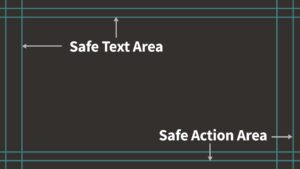
Every aspect ratio has safe areas that ensure content is not cropped during presentation.

If bottom-centered subtitles block important visuals or lower thirds, center them at the top of the title-safe border.
Infographic and graphic overlay elements
Video graphics offer an advantage over print graphics because motion can reinforce the message and add context to the story. Animate graphics with balance, clarity and purpose. For guidance on using the graphic device correctly, refer to the Principles section of the Brand Guidelines.
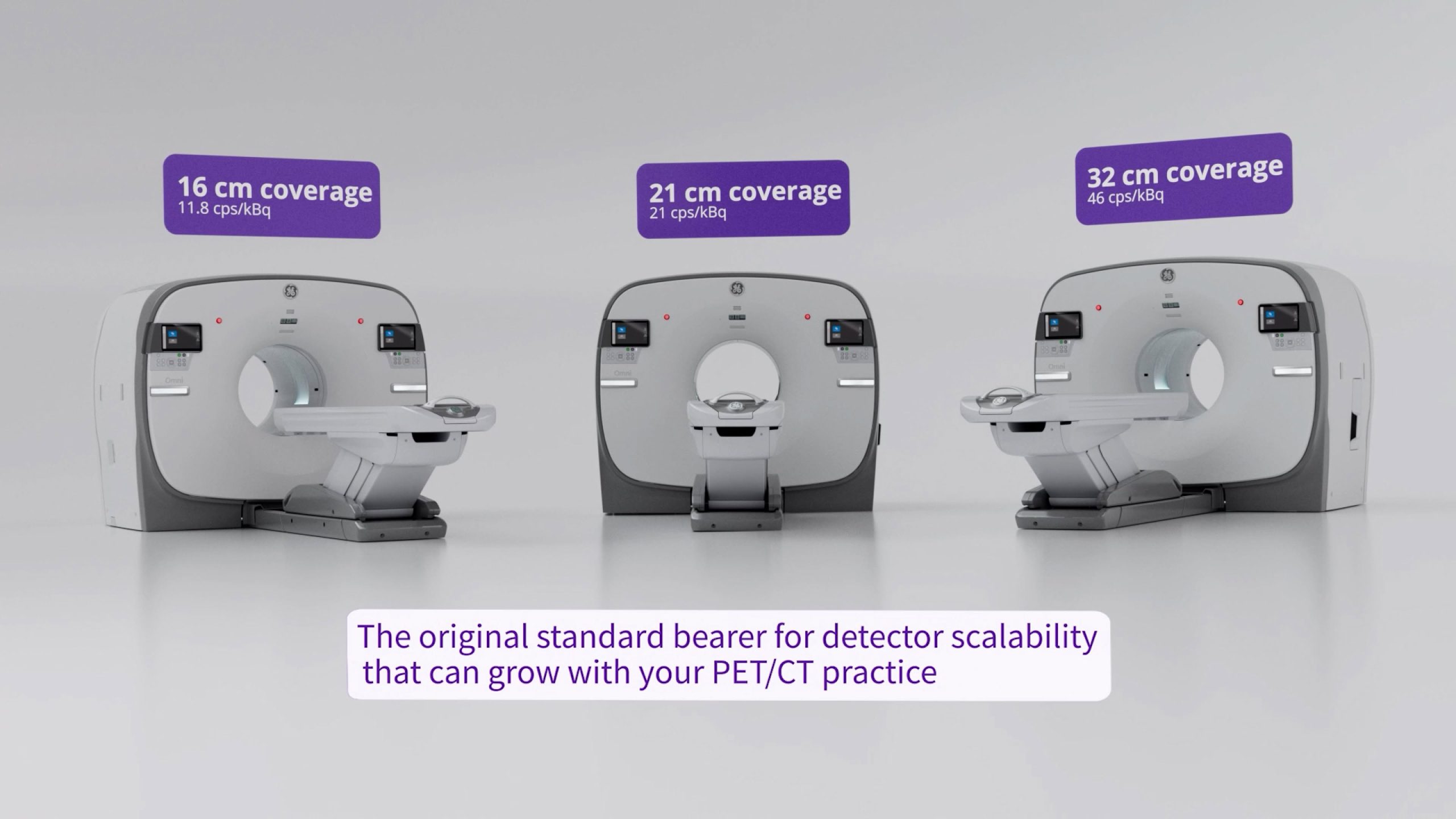
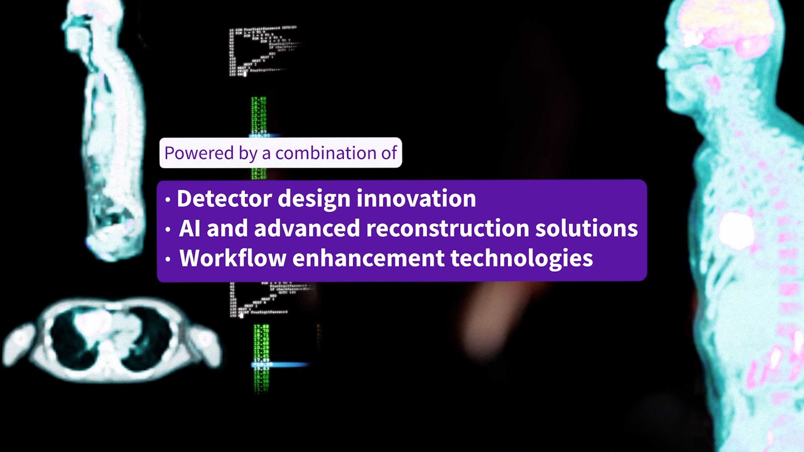
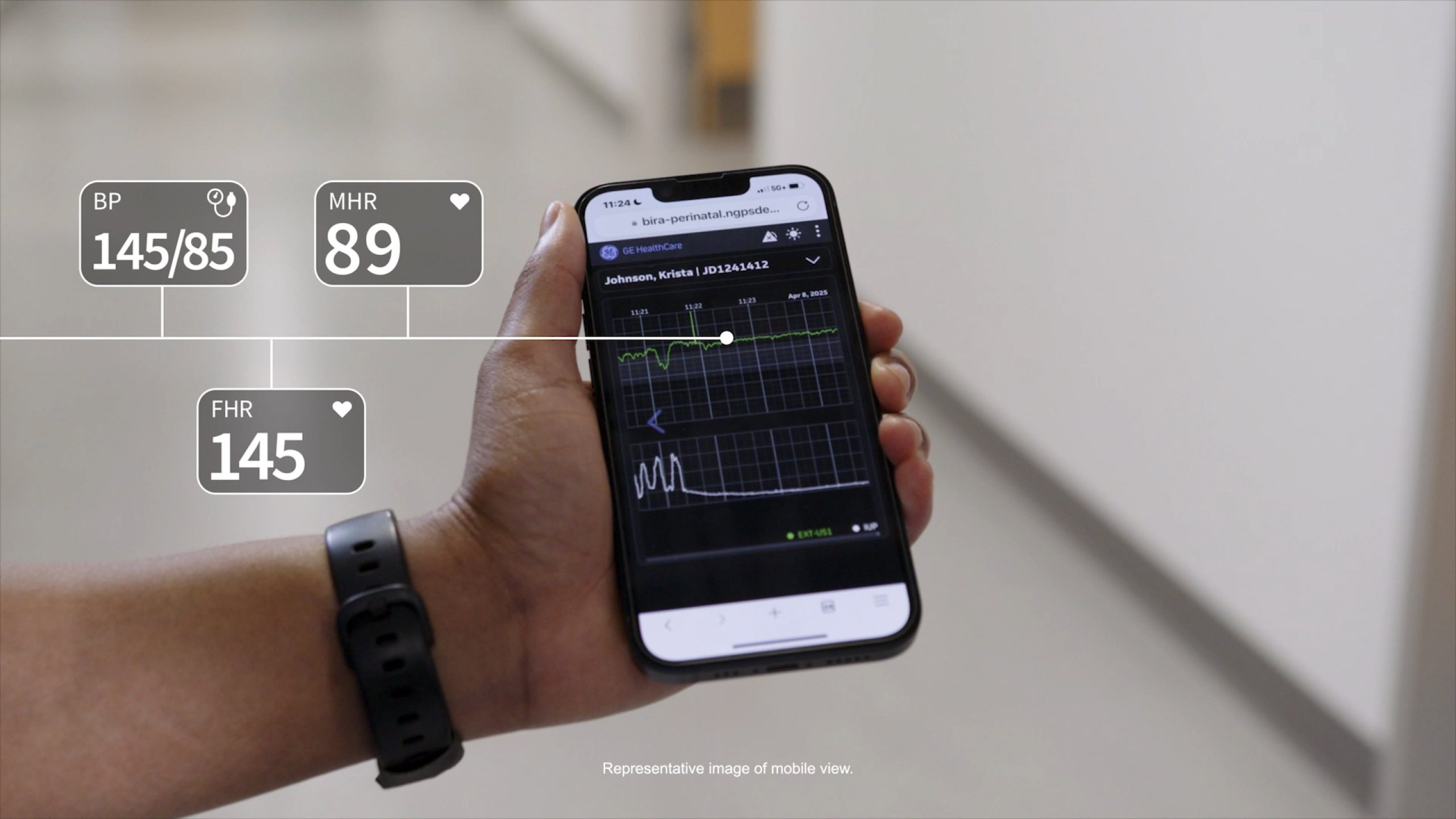
On-screen text (supers) and our graphic device
On-screen text can serve many purposes, from labeling key elements to reinforcing important points or replacing narration entirely. In environments such as trade shows or social media, audio may be muted, so on-screen text must clearly communicate the message.
Keep text concise and easy to read. Prioritize legibility while maintaining visual balance. Use a minimum font size of 28 points.
The GE HealthCare graphic device begins as a base square that can expand or contract vertically or horizontally as needed. Its rounded corners have a .125 in radius that scales proportionally. Use it to support legibility, draw attention and maintain brand consistency.
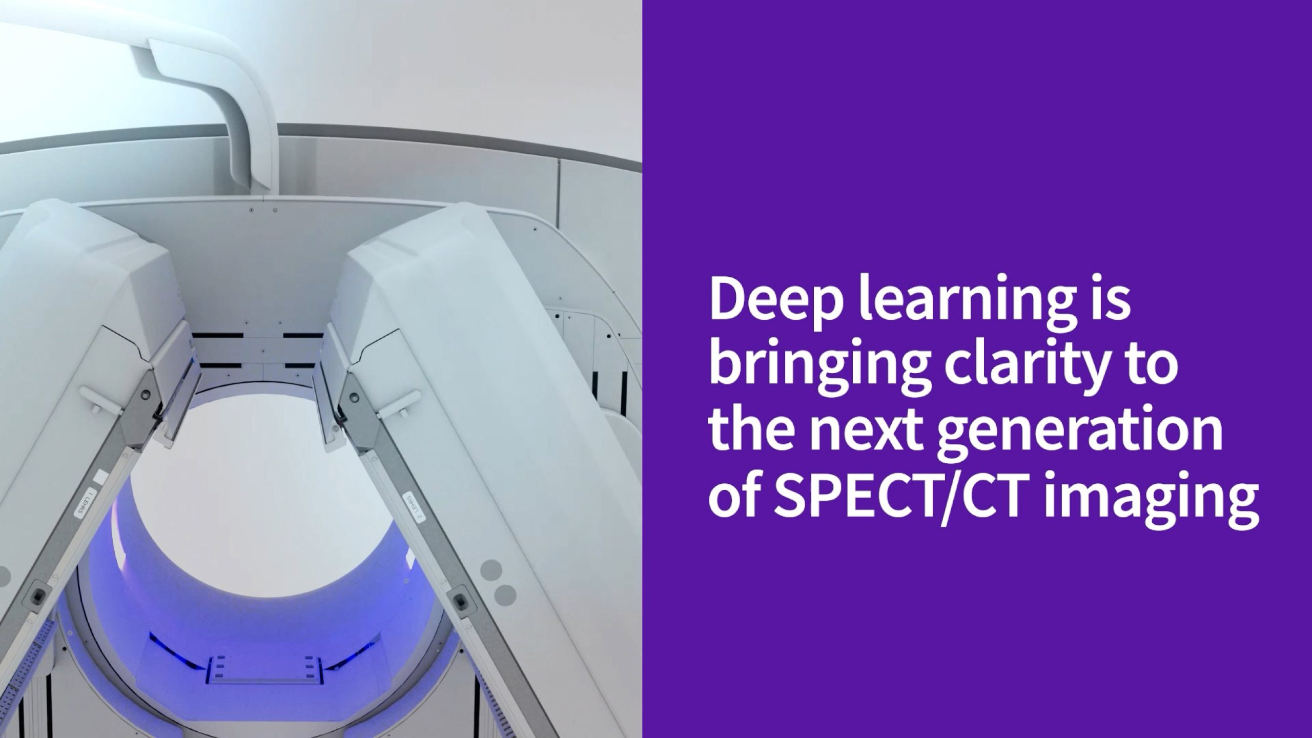
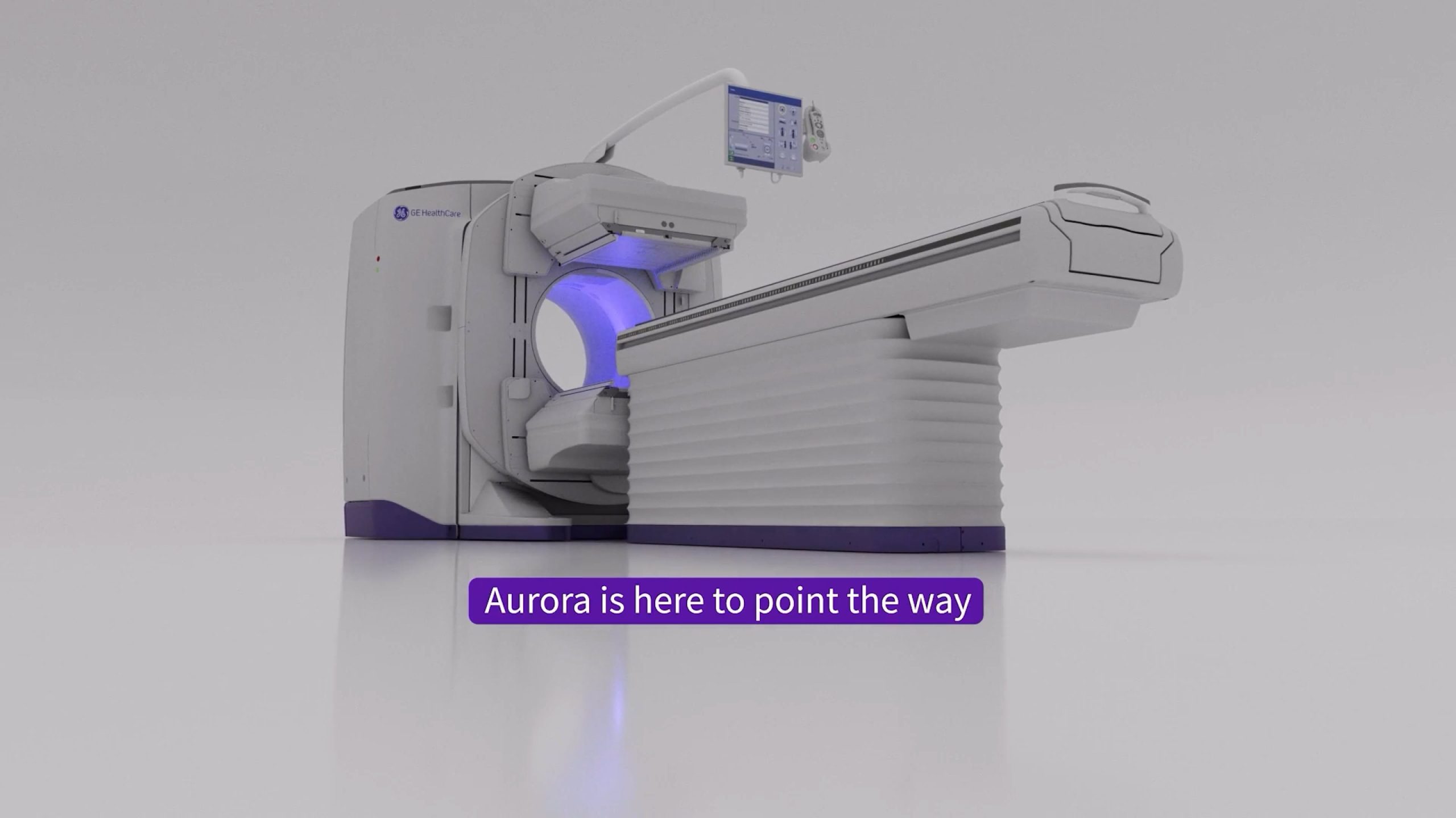
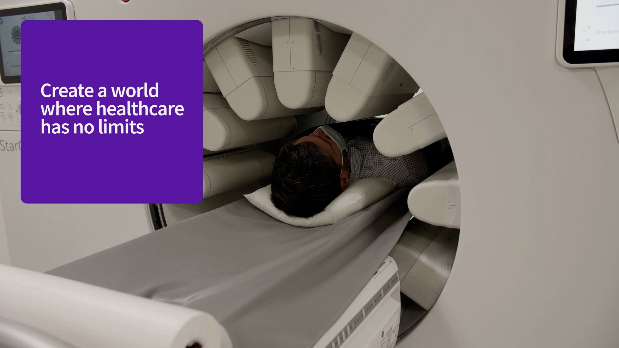
Best practice motion
Infographic overlay explainer videos
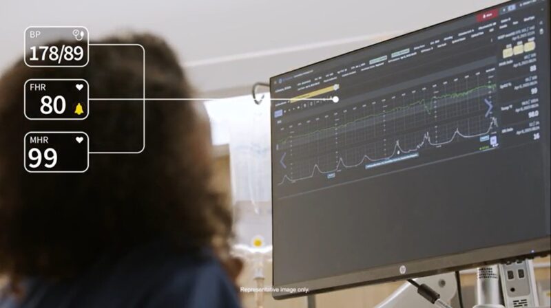
Our products, services, technologies and clinical applications are complex and often require explainer videos to help audiences understand them. Infographics and animation can simplify complex data and concepts and turn them into clear, coherent stories.
When creating infographic-based or animated explainer videos, tailor the content to the expertise of the intended audience. Keep messaging succinct and clear to make the information accessible.
Animated explainer videos
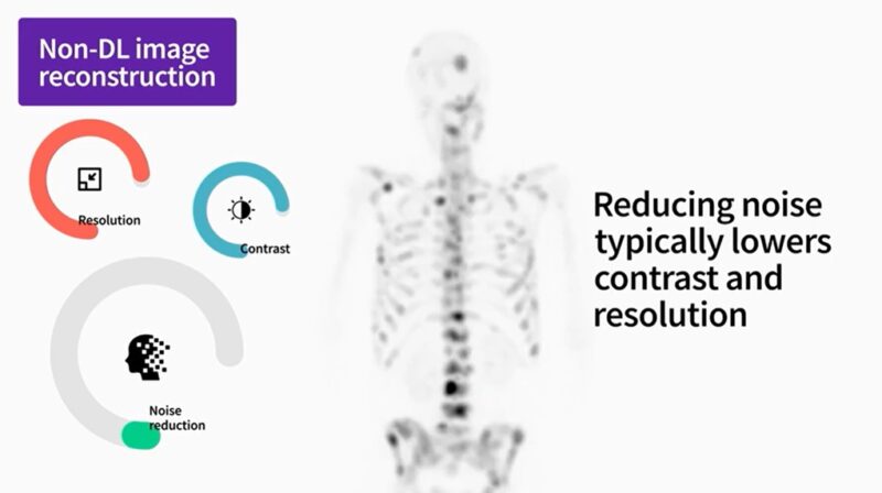
Our products, services, technologies and clinical applications are complex and often require explainer videos to help audiences understand them. Infographics and animation can transform complicated data and concepts into clear, coherent stories.
When creating infographic-based or animated explainer videos, match the level of detail to the audience’s expertise. Keep messaging succinct and clear so the information remains accessible.
Animated products
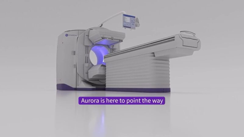
Because we prioritize realism and authenticity, design video concepts around real-life action whenever possible. Use animation only for product explainer or training videos.
Never upload technical drawings or product data to an AI generator, as this information is protected intellectual property.
CAD product files may be used for animated system renderings. Present these renderings on a neutral white background.
Do not place products in unrealistic or metaphorical environments.