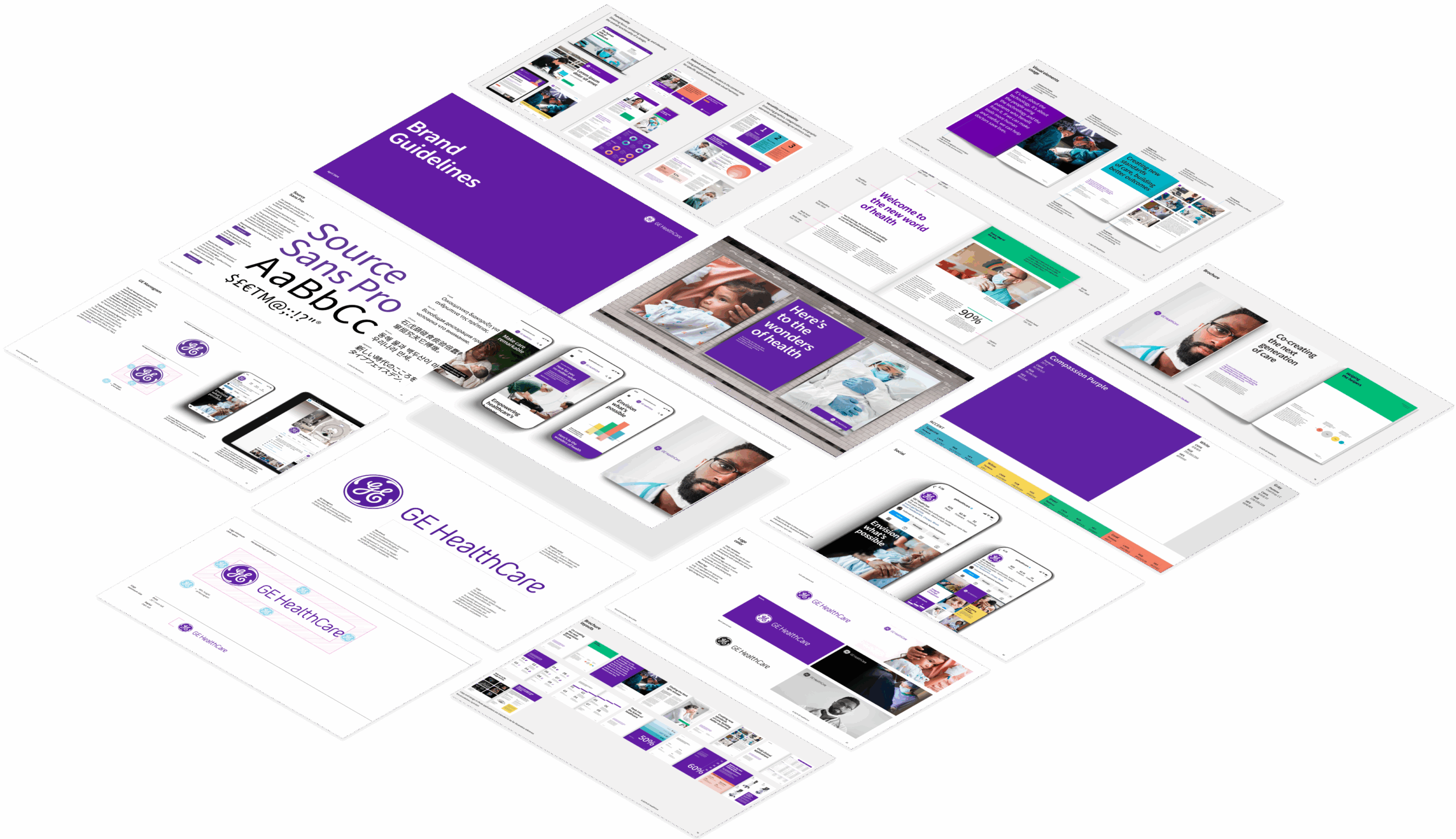





GE HealthCare Brand Hub

Designed with purpose, expressed with clarity

GE HealthCare brand resource

One system for every expression of our brand

Designed to support collaboration across internal teams and external partners, the Brand Hub helps ensure consistency, strengthen our brand presence and streamline the way we work.

Core brand elements

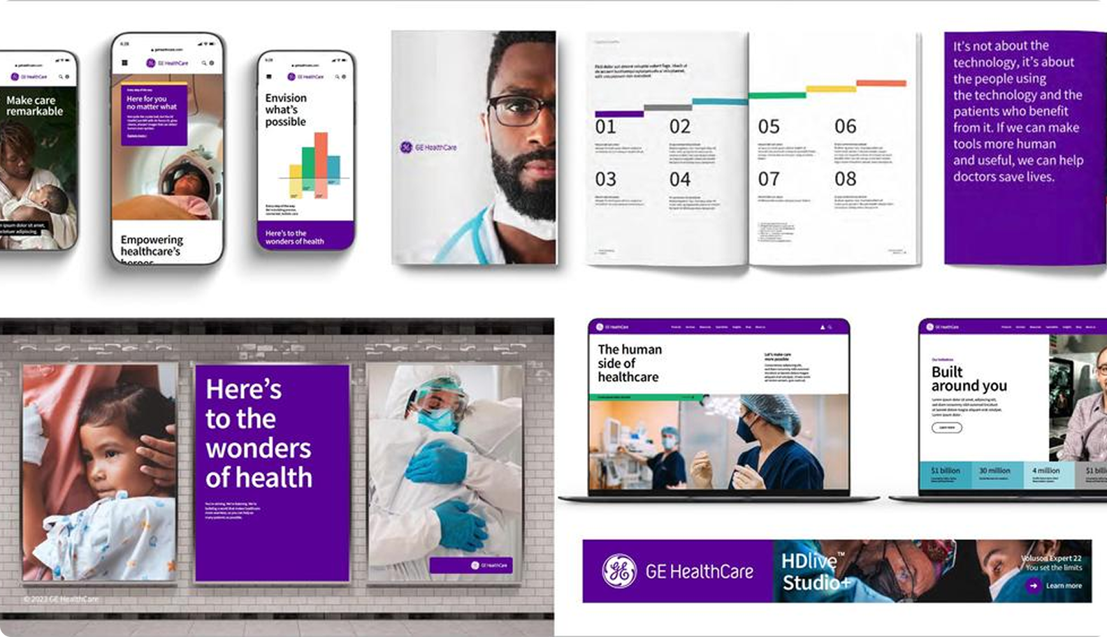
Bringing the GE HealthCare brand to life

Explore the tools and guidelines that help create clear, consistent and recognizable experiences.
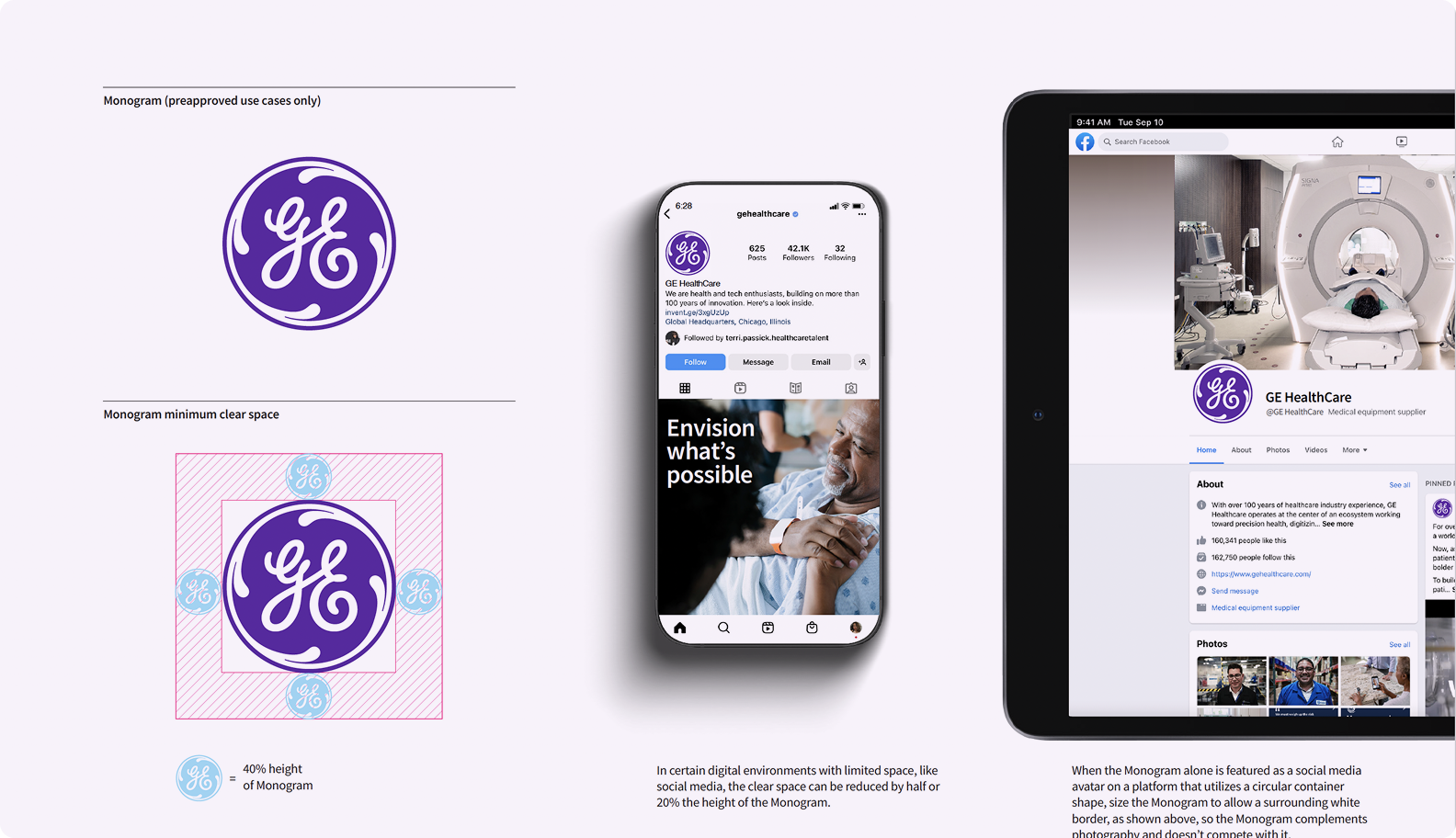
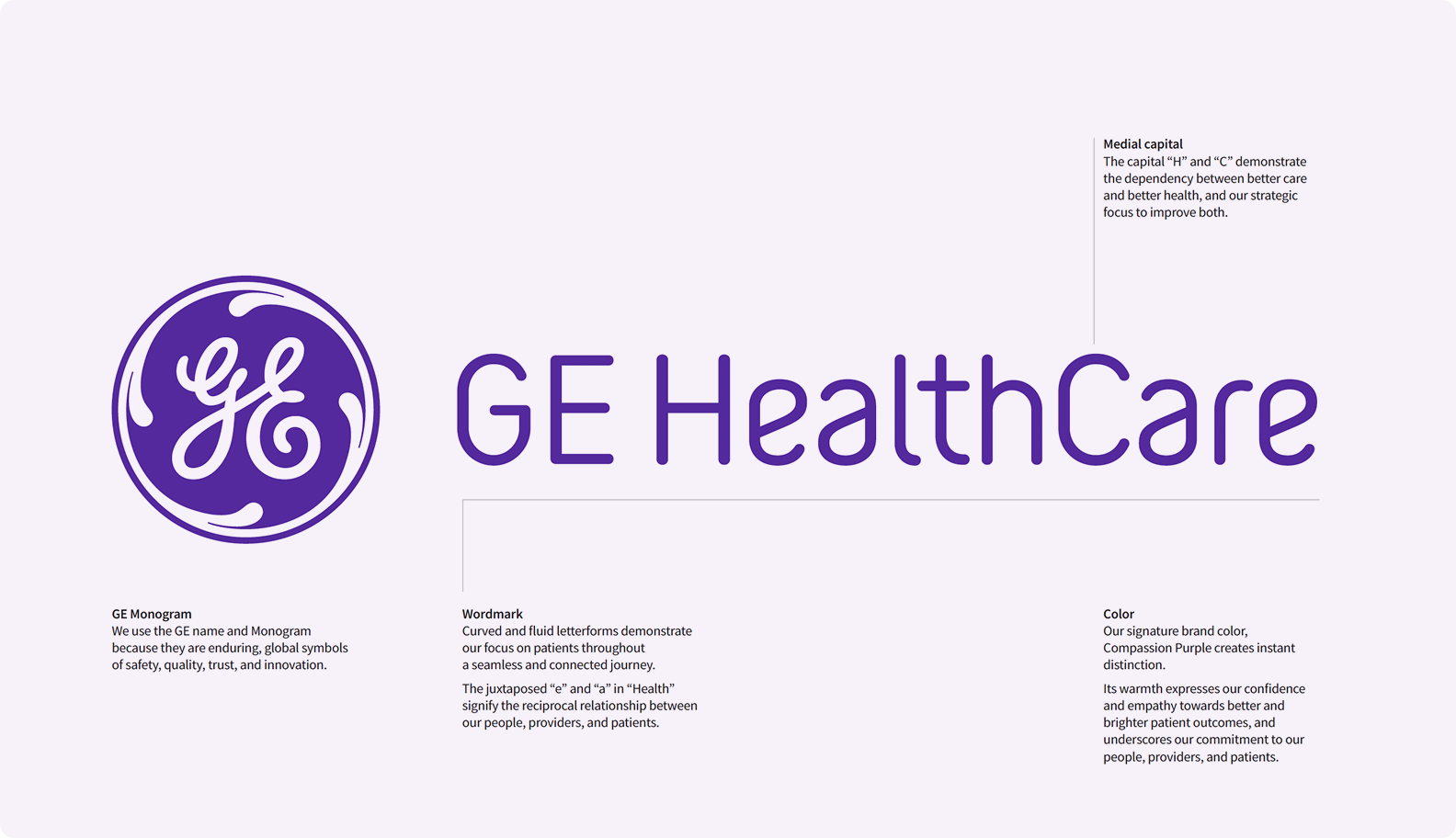
  • Logos

    Our logo narrative explains the role of the GE HealthCare logo and how it represents our brand.

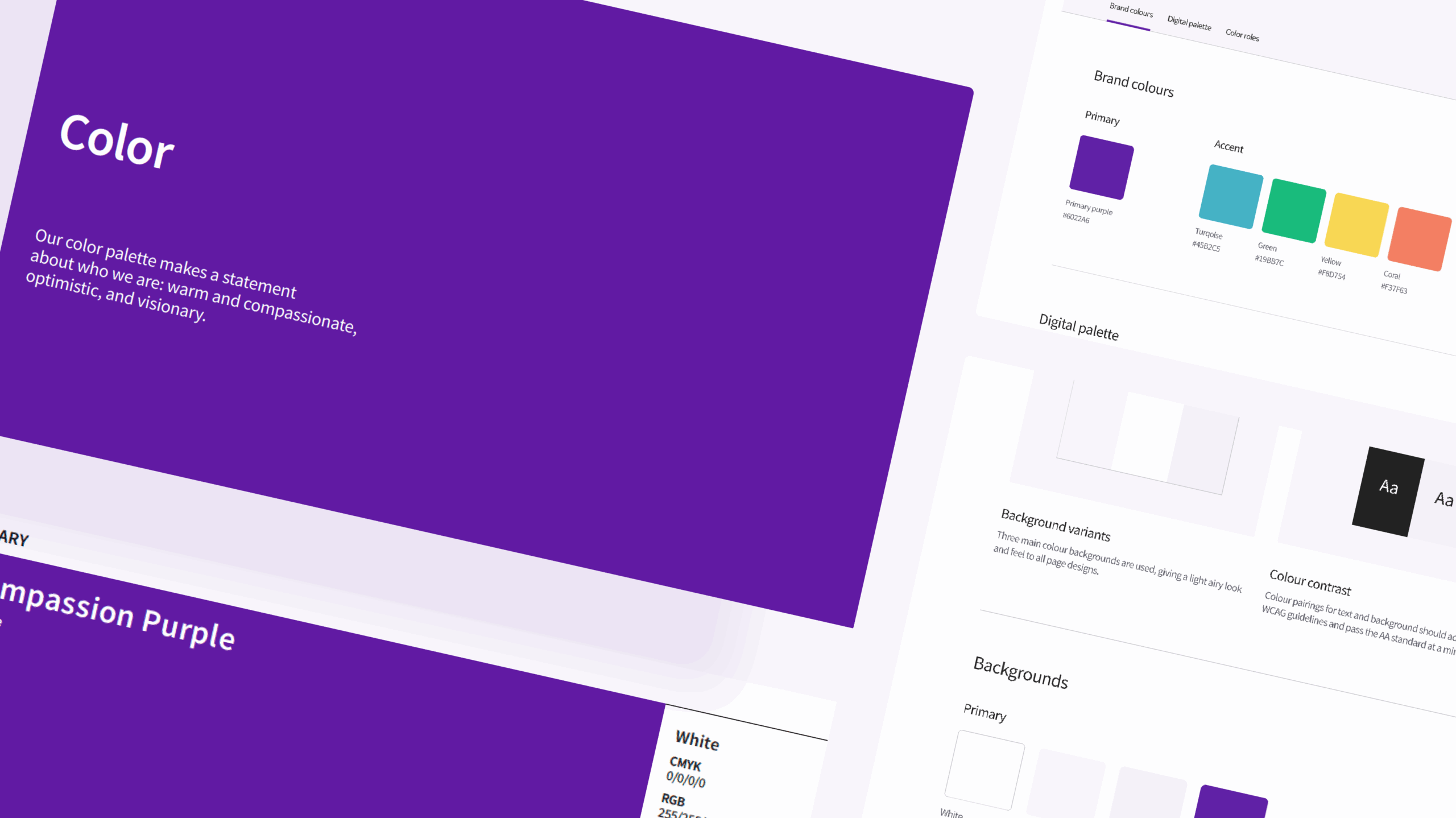
  • Color

    Color brings together the palette, accessibility guidance and usage principles that help create a consistent GE HealthCare brand experience.

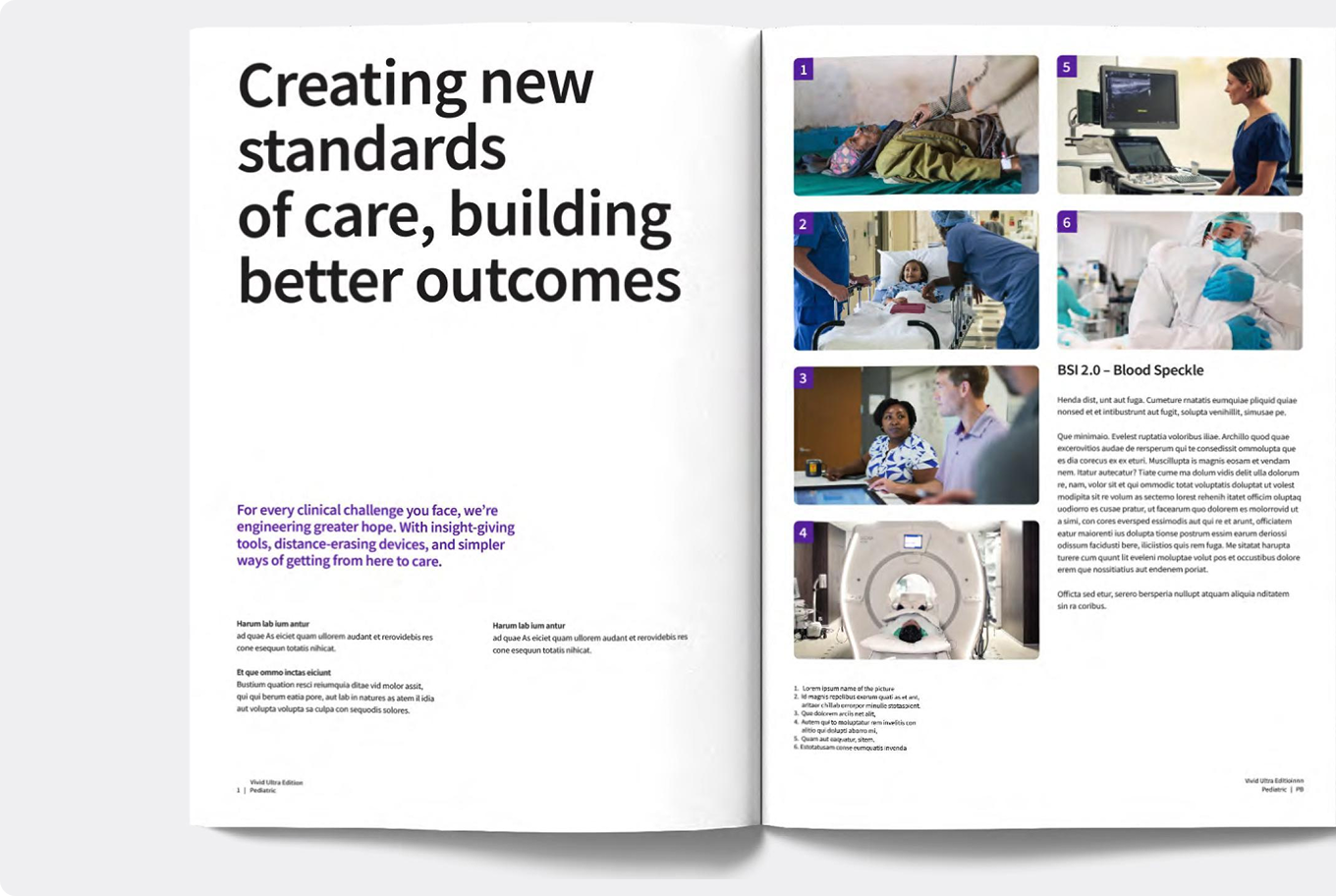
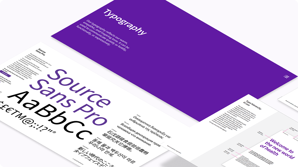
  • Typography

    Typography brings together the fonts, styles and hierarchy that help GE HealthCare communications feel clear, consistent and recognizable.

  • Iconography

    Iconography guidance outlines how icons support simple, intuitive communication across GE HealthCare's brand experiences.

  • Photography

    Photography brings together the style, principles and themes that shape how GE HealthCare uses imagery across brand experiences.

  • Video

    Video brings together direction, production guidance and best practices that shape how GE HealthCare’s brand moves, sounds and shows up on screen.

Brand training

New here? Start with the essentials.

Get up to speed with the fundamentals of the 
GE HealthCare brand. Our training resources are designed to help you understand the system, apply it confidently and create work that’s consistent from day one.

Not sure where to begin?

Explore our brand guidelines to find the tools, principles and direction you need. Whether you’re creating something new or refining existing work, everything starts here.