Design elements
Bringing every element together with purpose
GE HealthCare’s visual identity comes to life through the thoughtful application of our distinctive brand elements. Clear principles guide how these elements work together to express the brand and support the content in every application.
Layout system
Grid
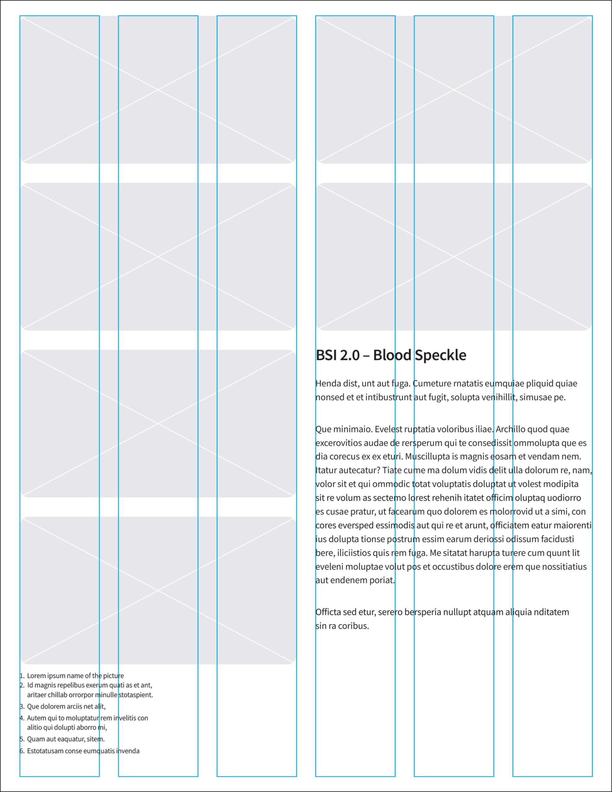
We use a grid system to structure and organize content across all branded communications.
Format
Start with a U.S. Letter format as the base. Apply similar guidance for A4.
Margins
Set margins at .5 in from the outer edge of the format to contain content within the live area. Adjust margins as needed based on the size and scale of the application.
Gutters
Set gutters at half the width of the margins. This ensures consistent spacing and helps organize and separate design elements across the layout.
Columns
Define columns by the gutters to organize content across one or multiple columns. Use either a 6-column or 12-column layout depending on the complexity of the communication.
6-column grid
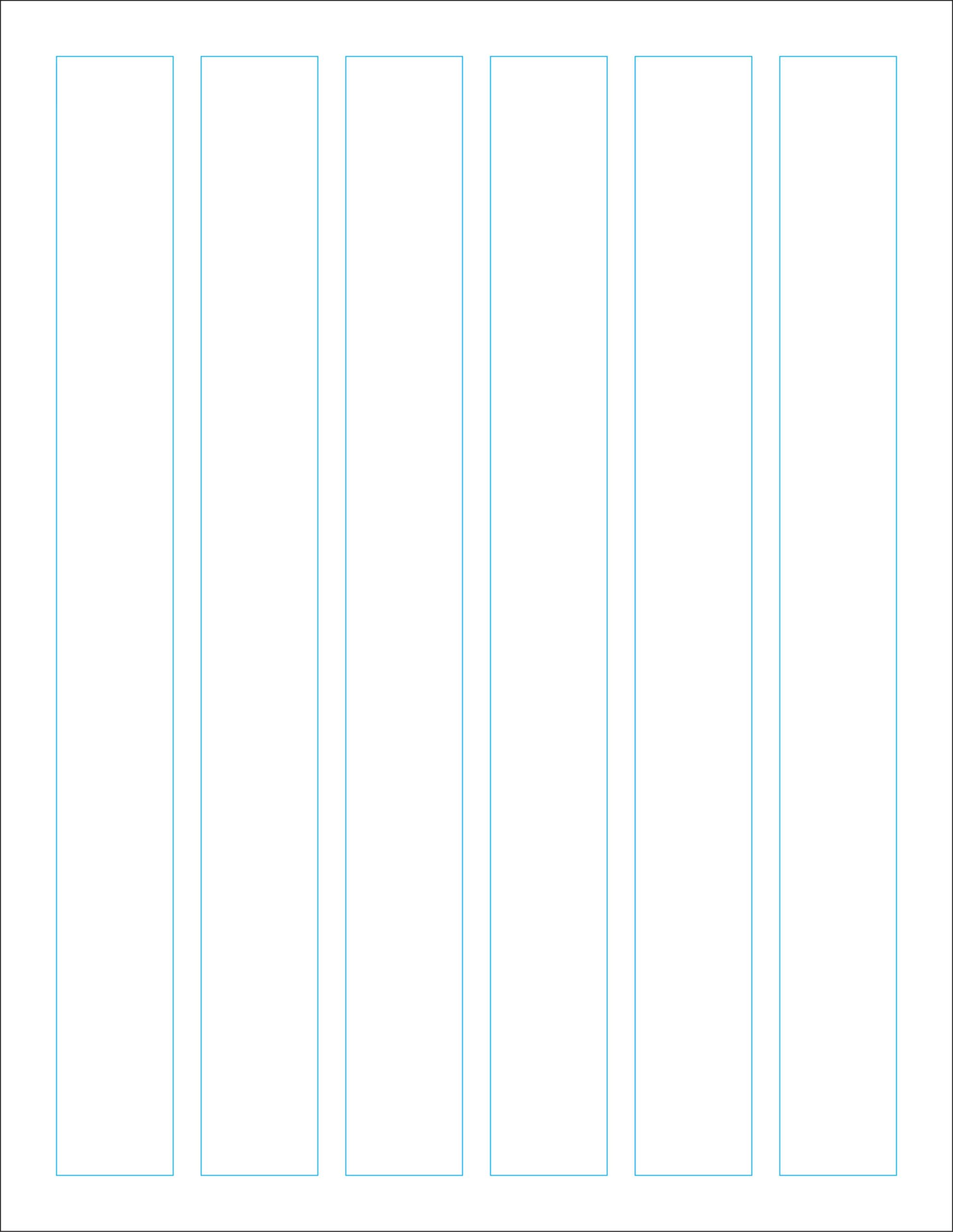
 Margins
 Gutters
 Columns
12-column grid
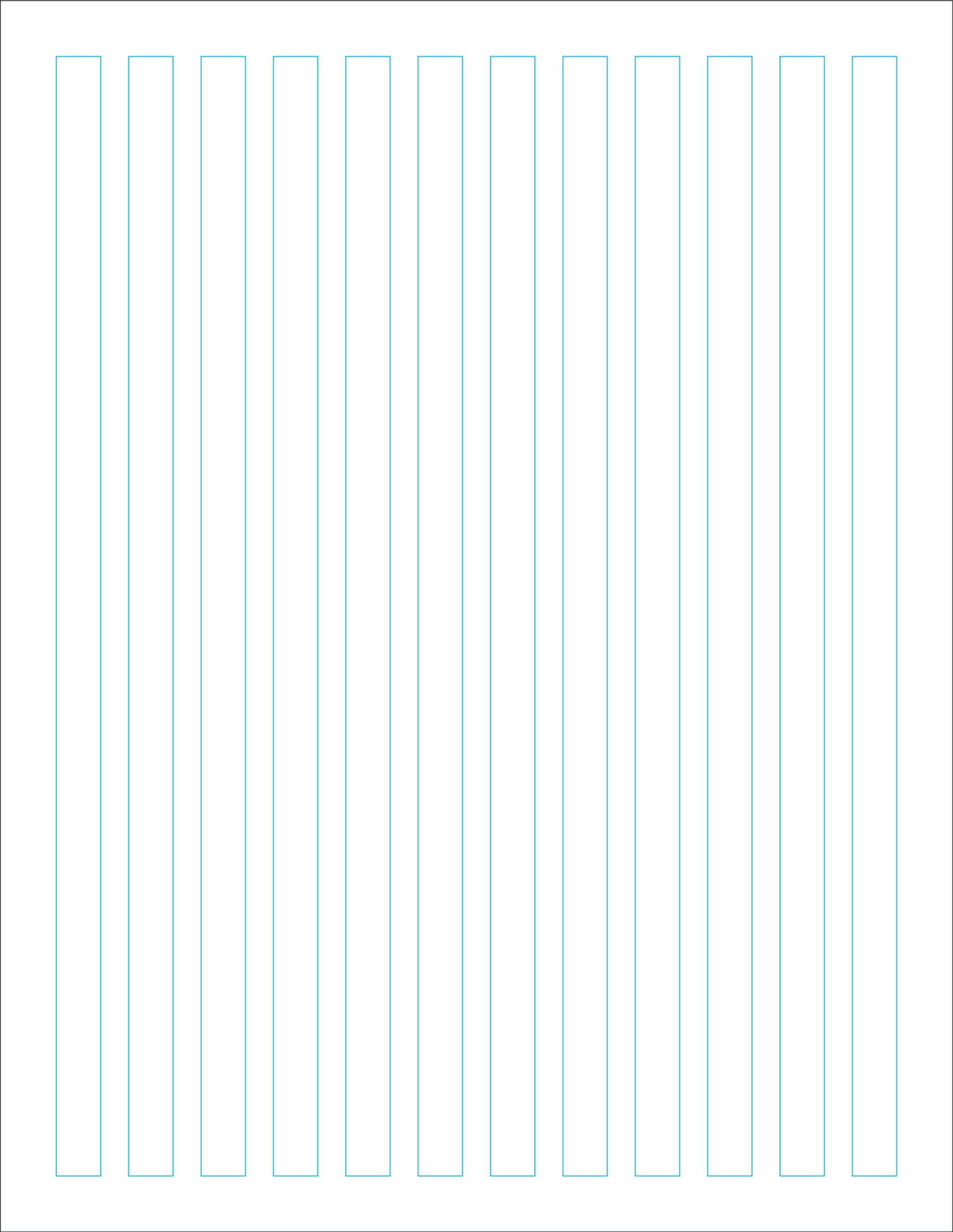
Content placement
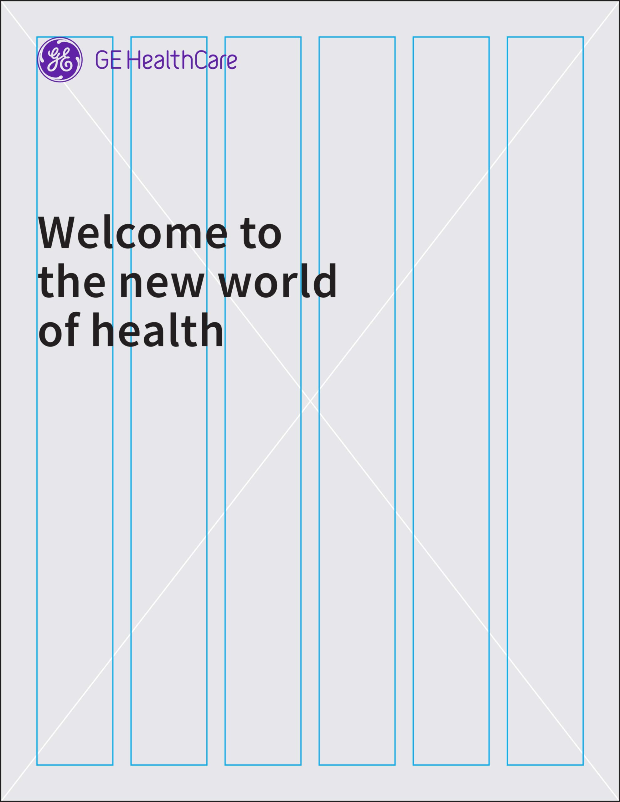
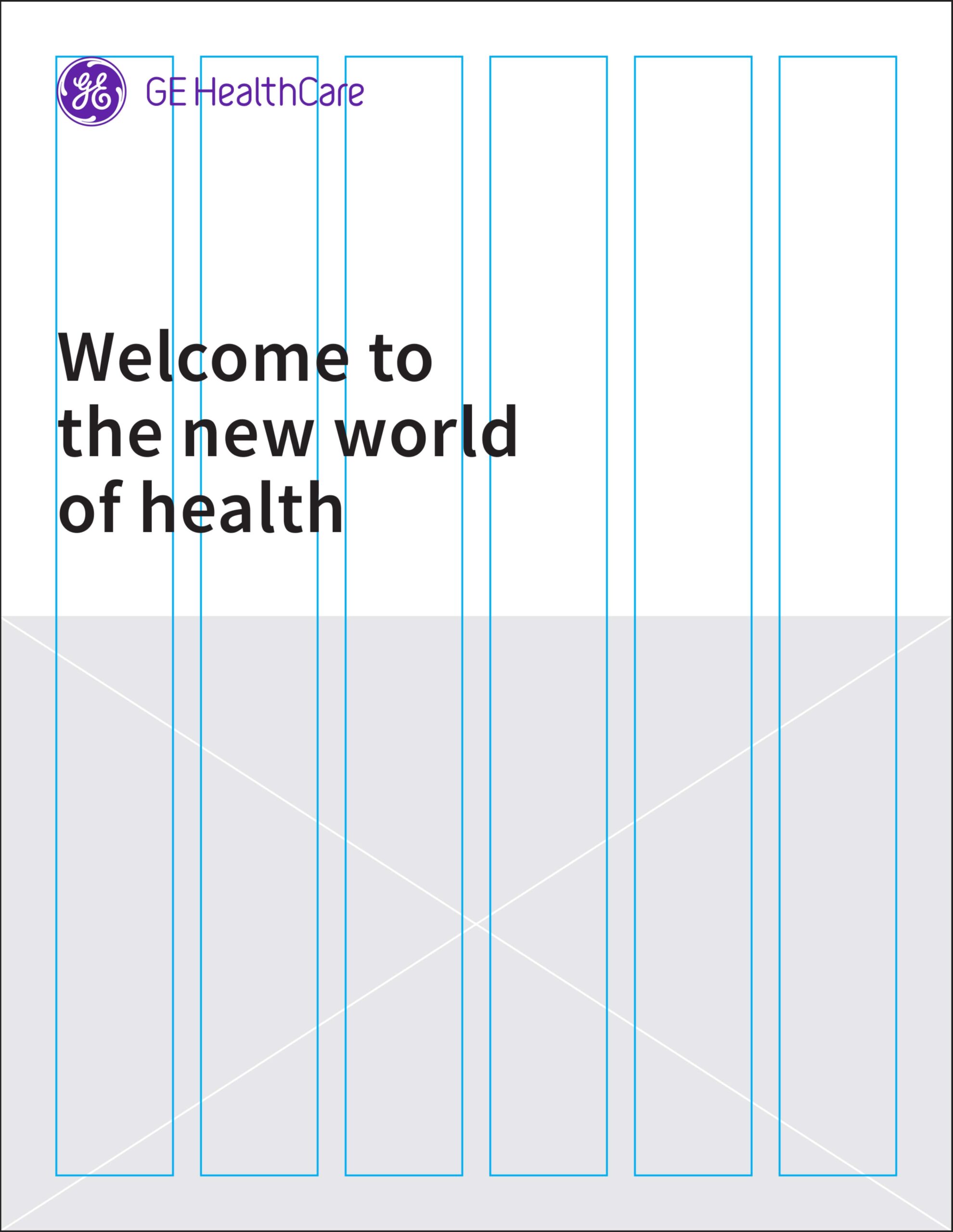
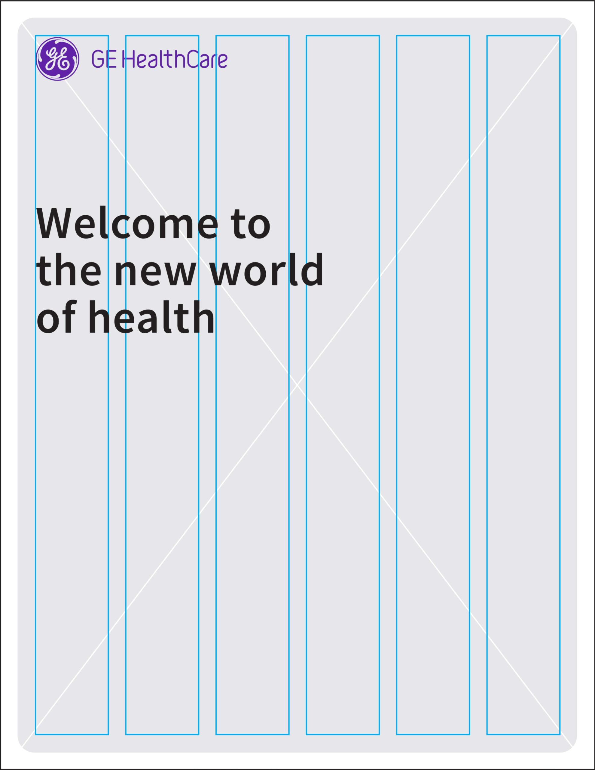
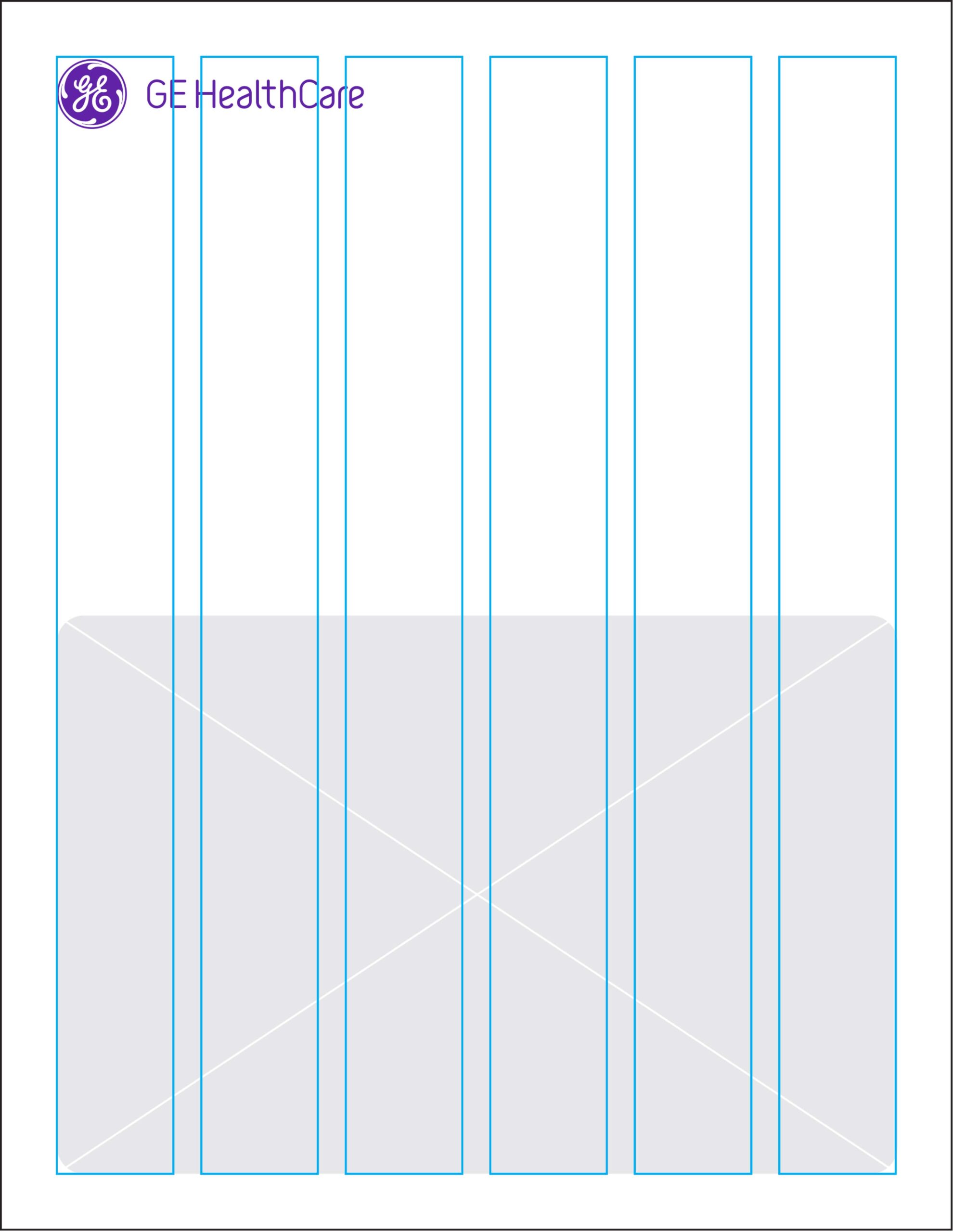
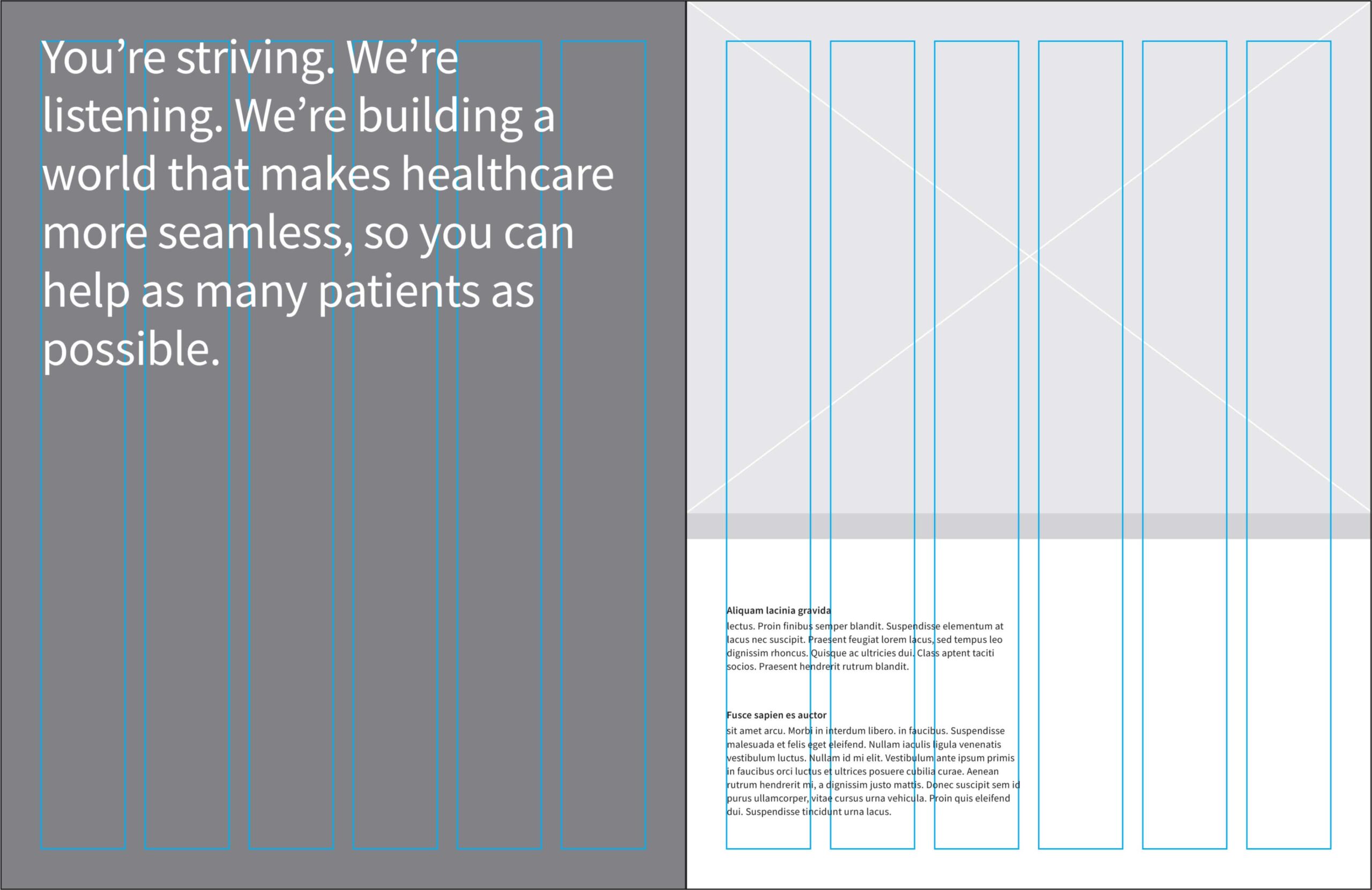
The sample layouts shown provide guidance for designs using type only or type paired with imagery. Choose a 6-column or 12-column grid based on content volume and communication complexity.
Use proportional scaling to set margins. Gutters should be half the width of the margins to maintain consistent spacing. In general, the height of the logo Monogram should equal 125% of the margin width. In extreme cases where margins are unusually small or large, adjust the logo visually to maintain balance.
Introduce contrast in graphic elements and typography to create energy and reinforce hierarchy within the layout.
Full image
Half image
Full image in graphic device. Graphic device is placed in an outer margin.
Half image in graphic device.
Multi-column text and image page adjacent to full-bleed image.
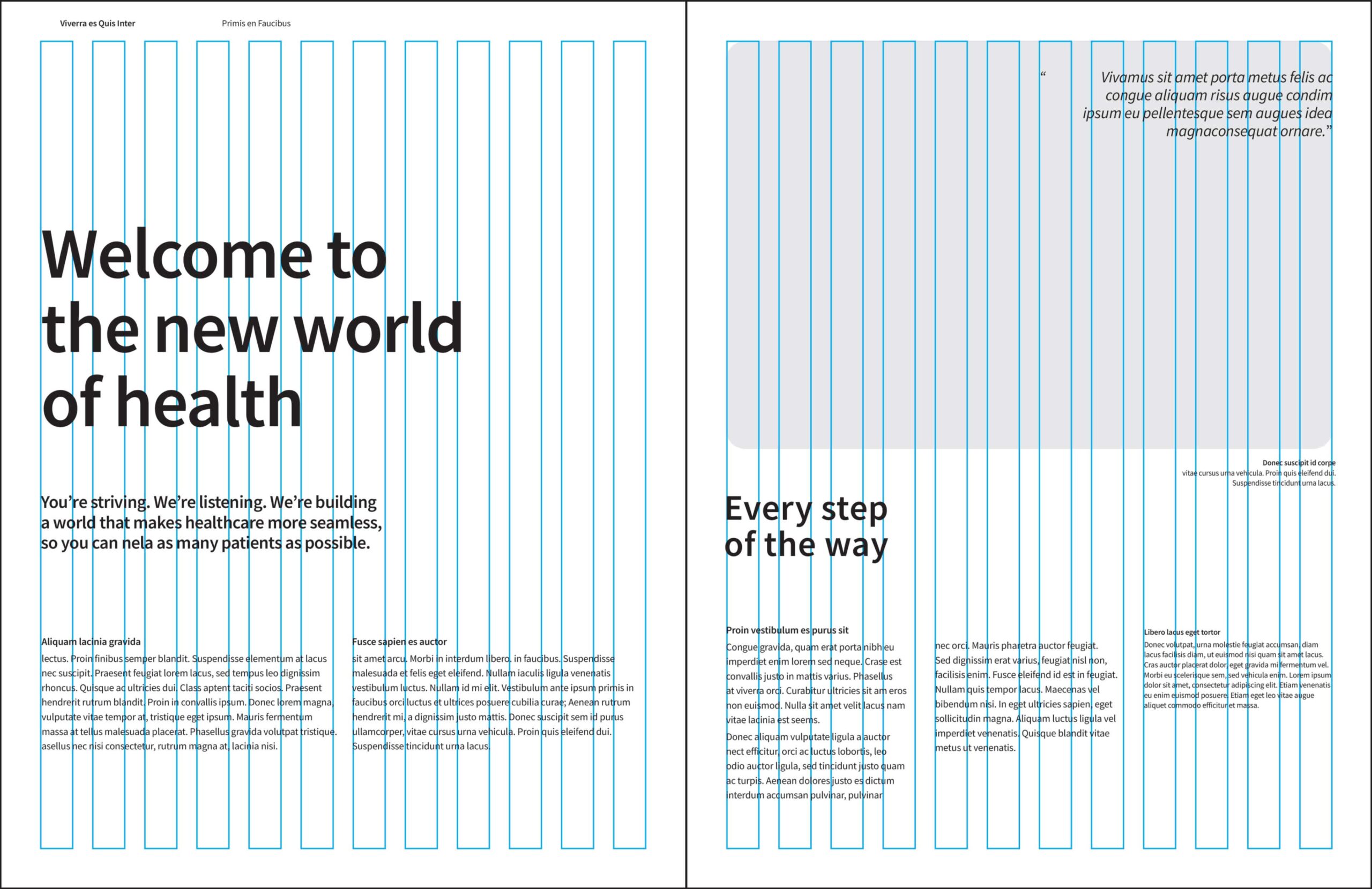
12-column layout needed for complexity of content/information.
Graphic device
Our graphic device is dynamic and can highlight content or frame imagery within a layout.
The rounded corners are proportionate to the base square. Use the example shown as the foundation for construction, then scale the graphic proportionally or adjust its width and height as needed to fit the form
Construction specifications:
Square: 4″ H x 4″ W
Corner radius: .125″
Rounded corner of unit

Constructing
The square graphic device is 4″ x 4″, with the radius set to .125″ in each of the four corners.
Graphic device usage
The examples shown provide guidance for using the graphic device.
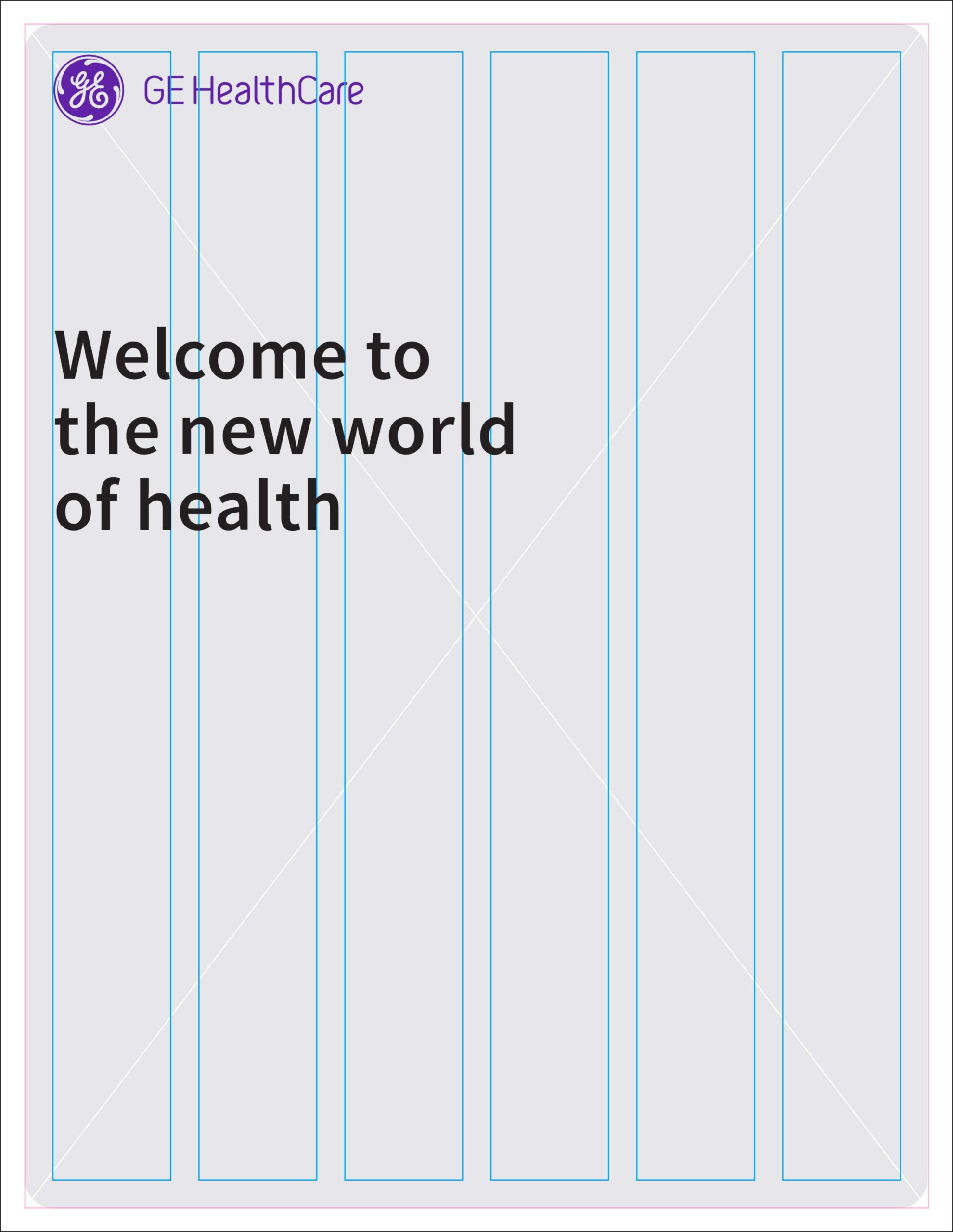
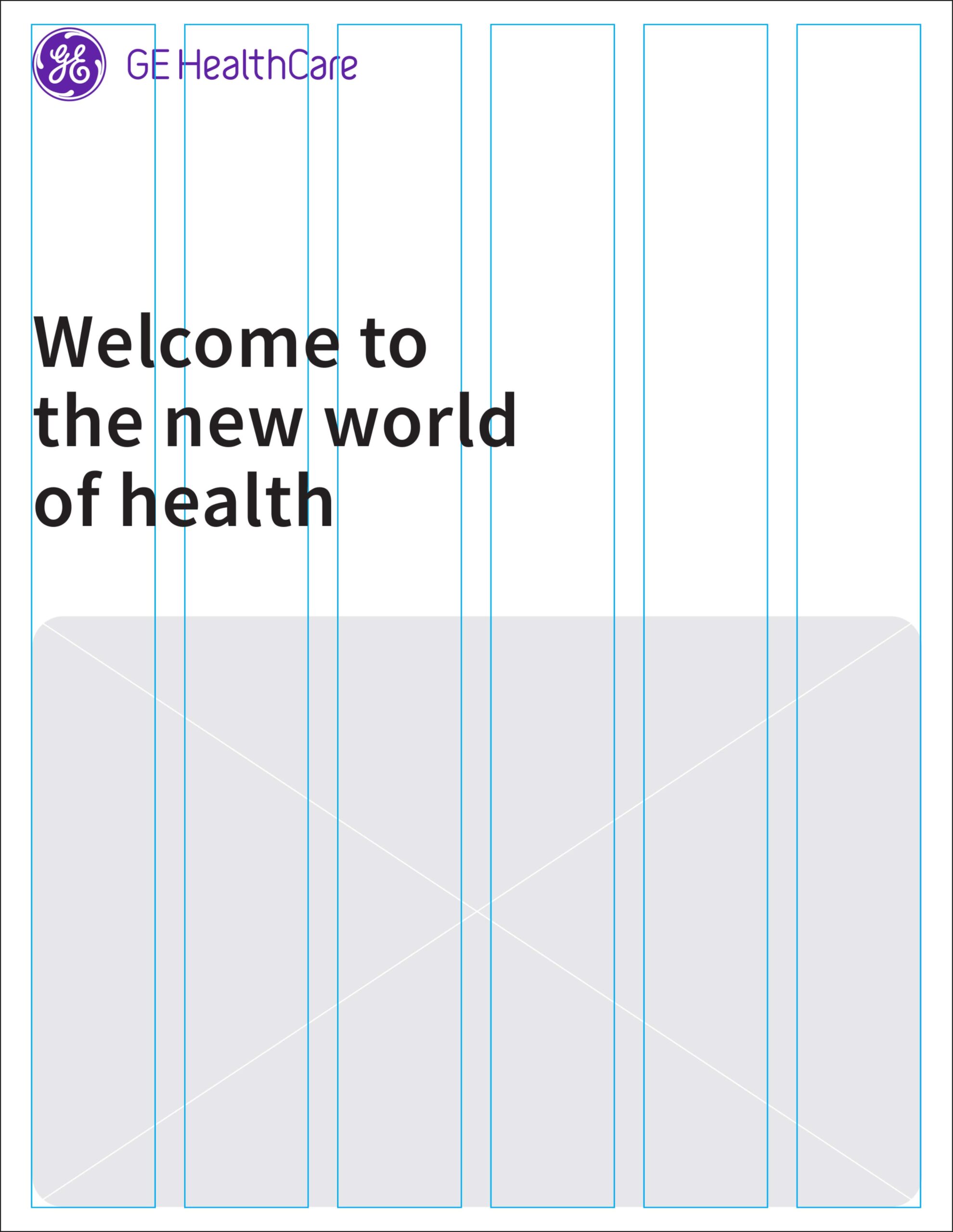
In most instances, align the device to the margins, columns and surrounding design elements. The only exception is when the device appears as a full-page, non-bleed graphic. In that case, align it to the outer margin to maintain proper spacing and alignment within the device.
Do not crop the graphic device at any edge of the format.
Align the graphic device with the outer margin only for full-page non-bleed graphic use.
Align the graphic device with the margin and other design elements.
Align multiple graphic devices with the margin, column and other design elements.
Graphic device don’ts
Using the graphic device correctly is essential for maintaining brand consistency. Avoid the use cases shown.
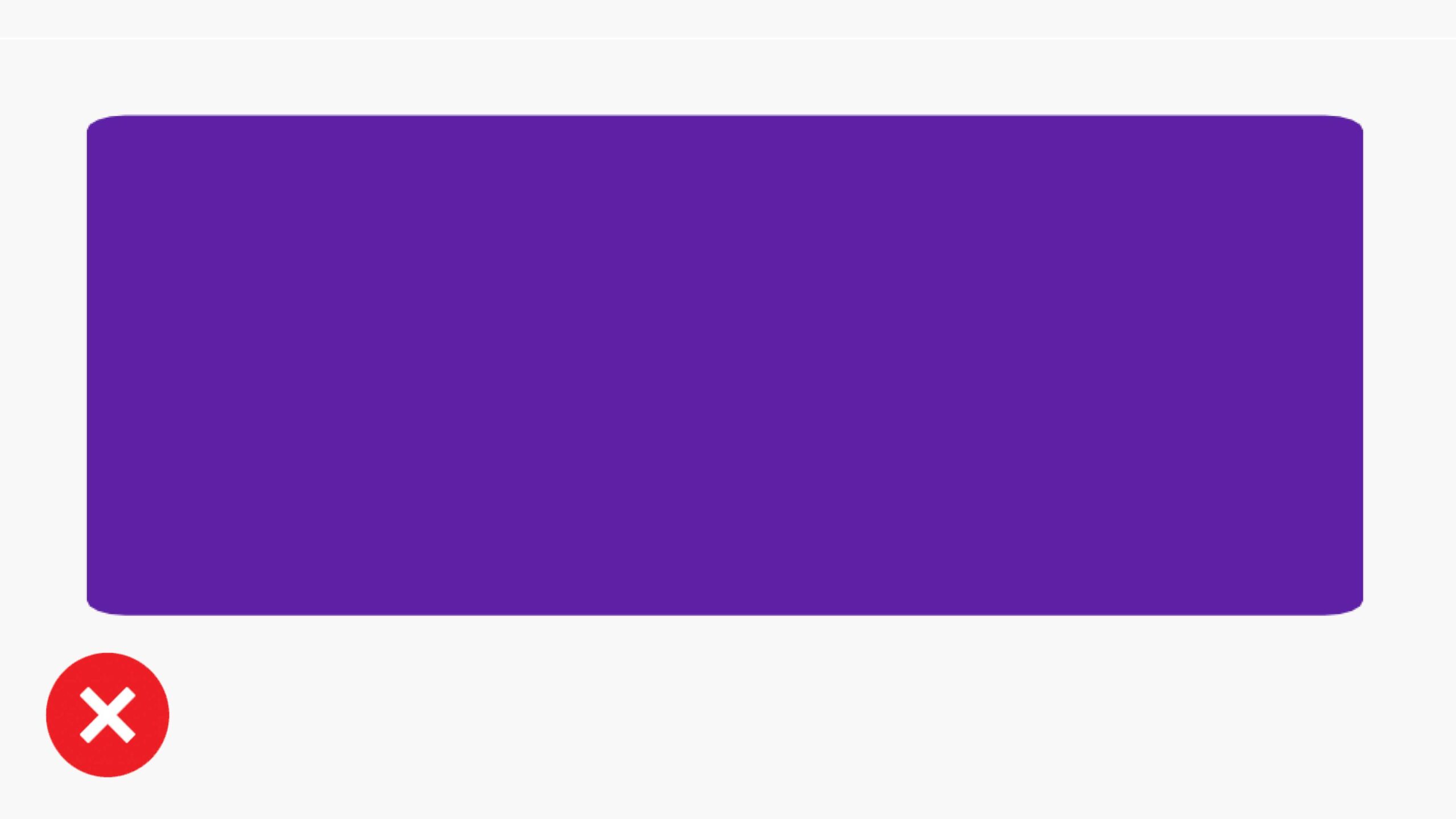
Don’t disproportionately stretch the graphic device or distort the corner radius.

Don’t crop the graphic device off any edges of the format.

Don’t skew the graphic device.
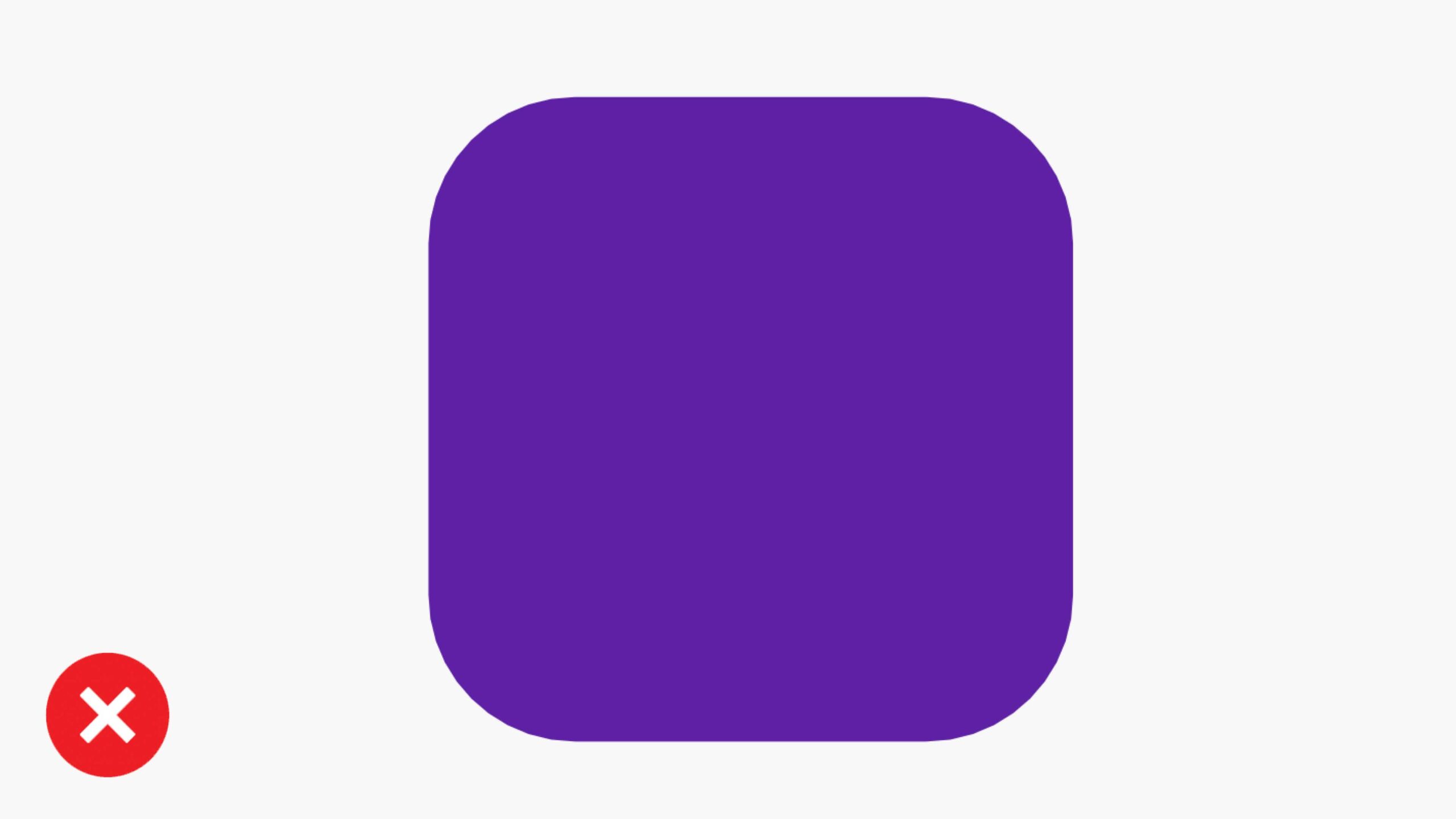
Don’t use an exaggerated round or sharp radius that is not in proportion to the base graphic device.
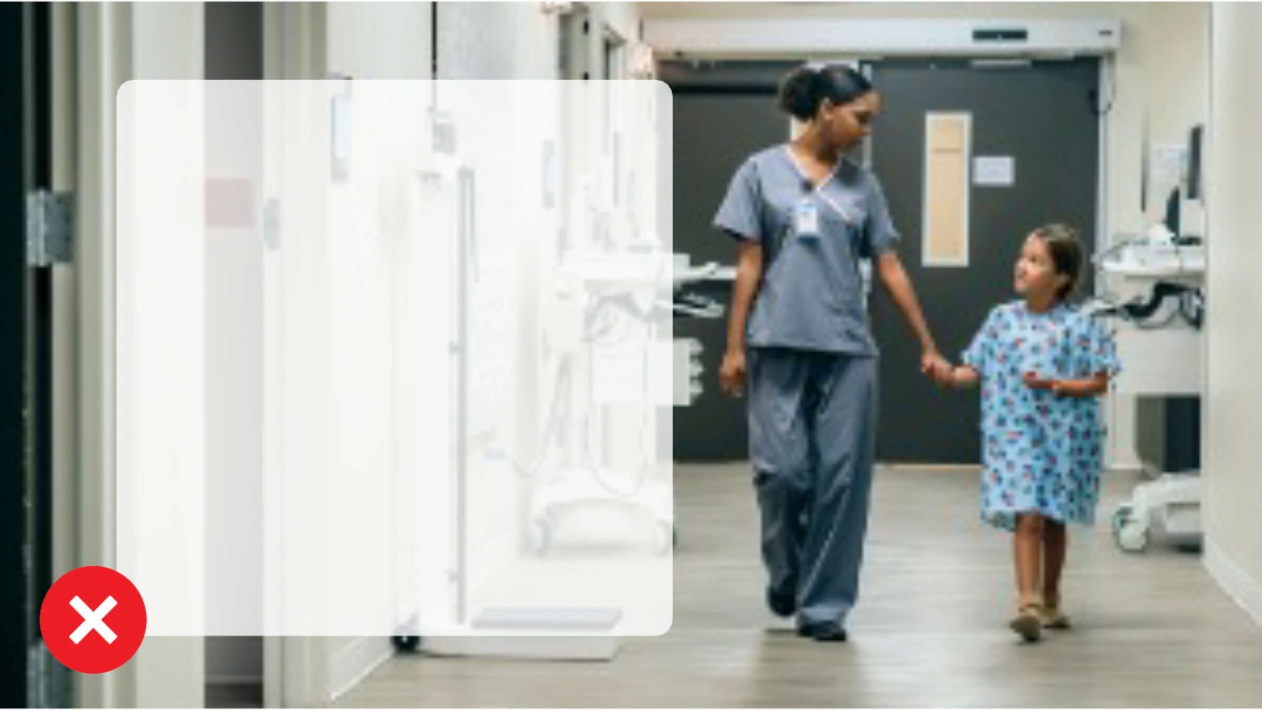
Don’t apply opacity to the graphic device.
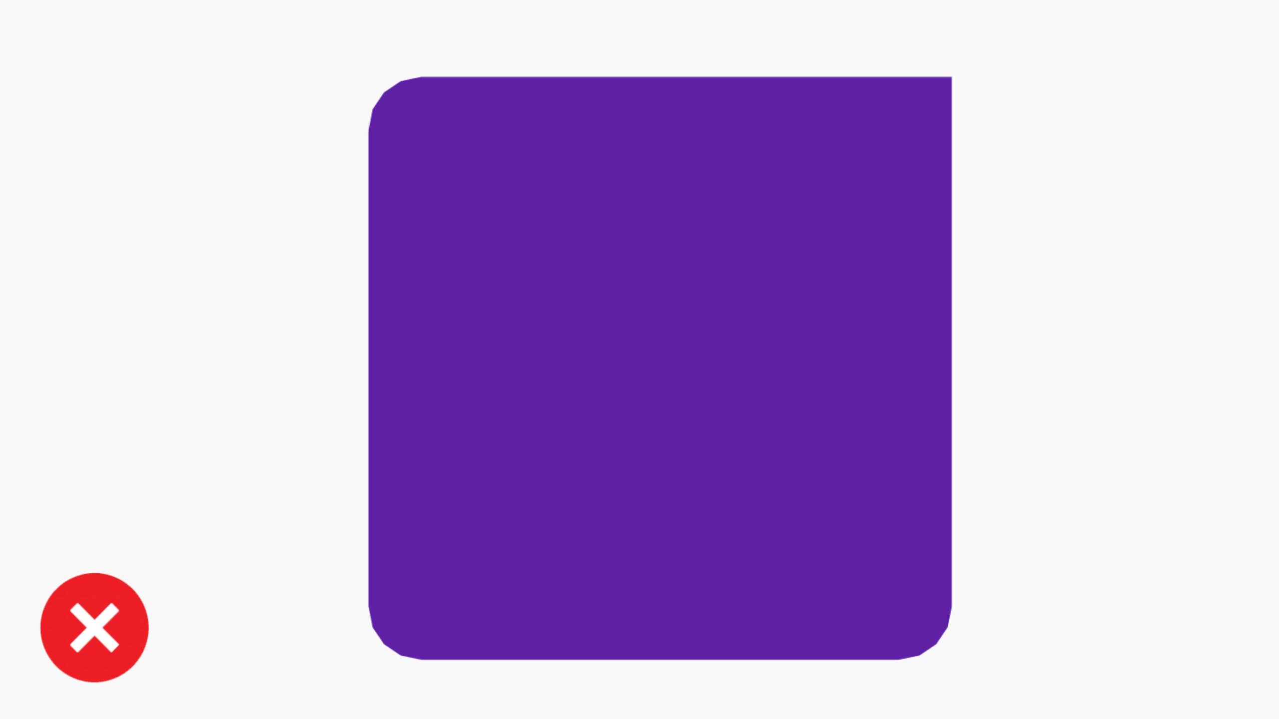
Don’t mix sharp and round radii in the graphic device.
Iconography
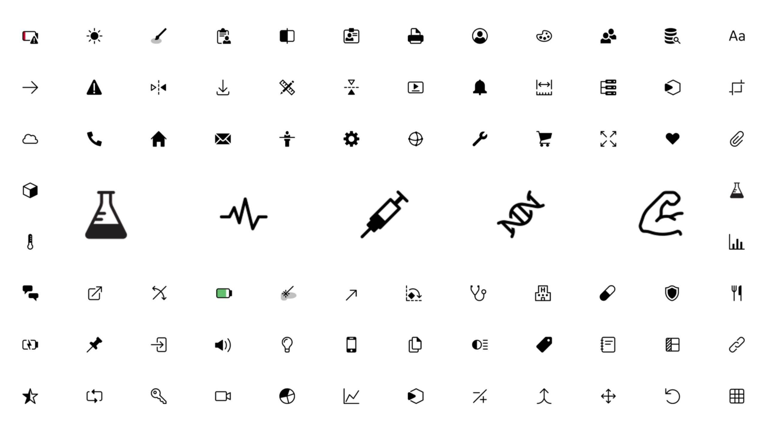
As part of our Ethos Design System, a full suite of icons is available for digital use in software interfaces and may also be used in marketing communications.
Explore full icon library (Ethos design system)
For further information on icons, please reach out to the Global Design team. Request an icon here.
Usage and applications
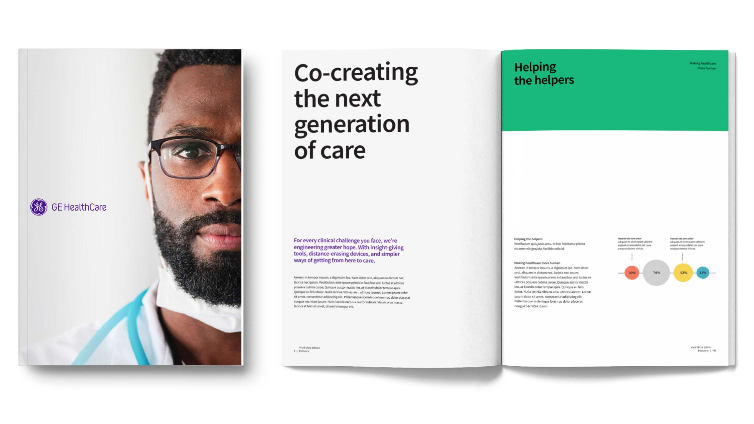
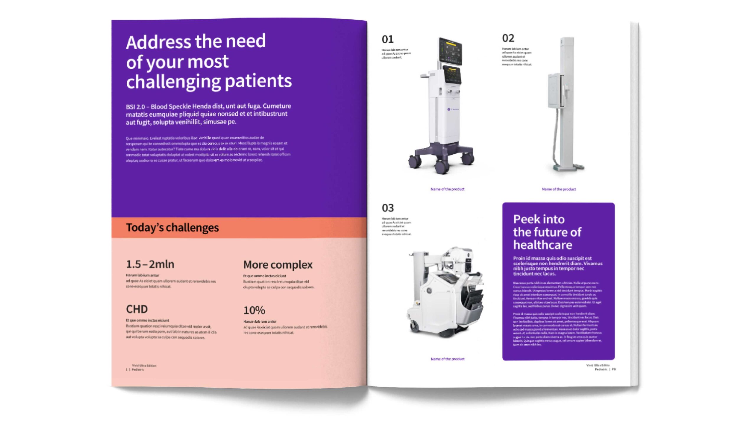
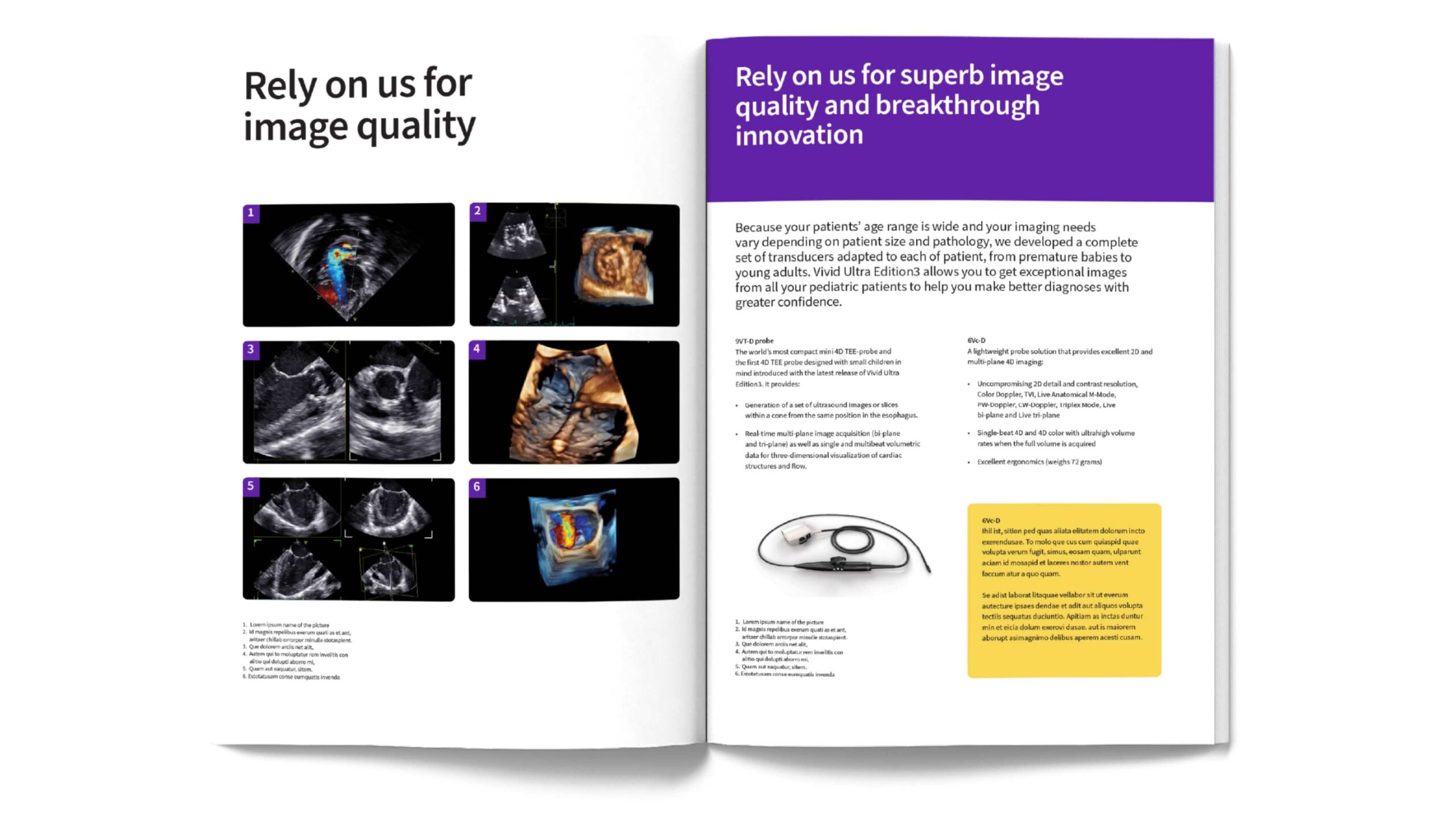
Brochure
Copy and design in these applications are intended to be for illustrative reference.
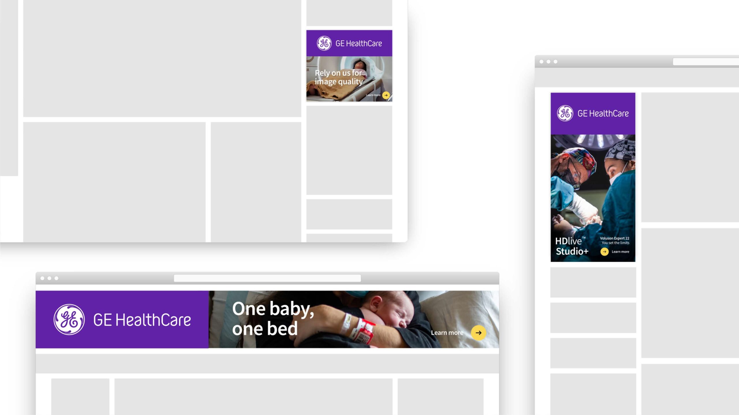
Digital media
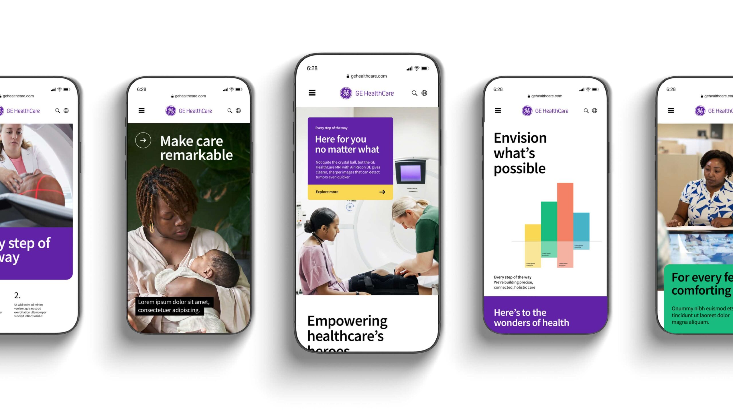
Mobile
Copy and design in these applications are intended to be for illustrative reference.
Promotional items
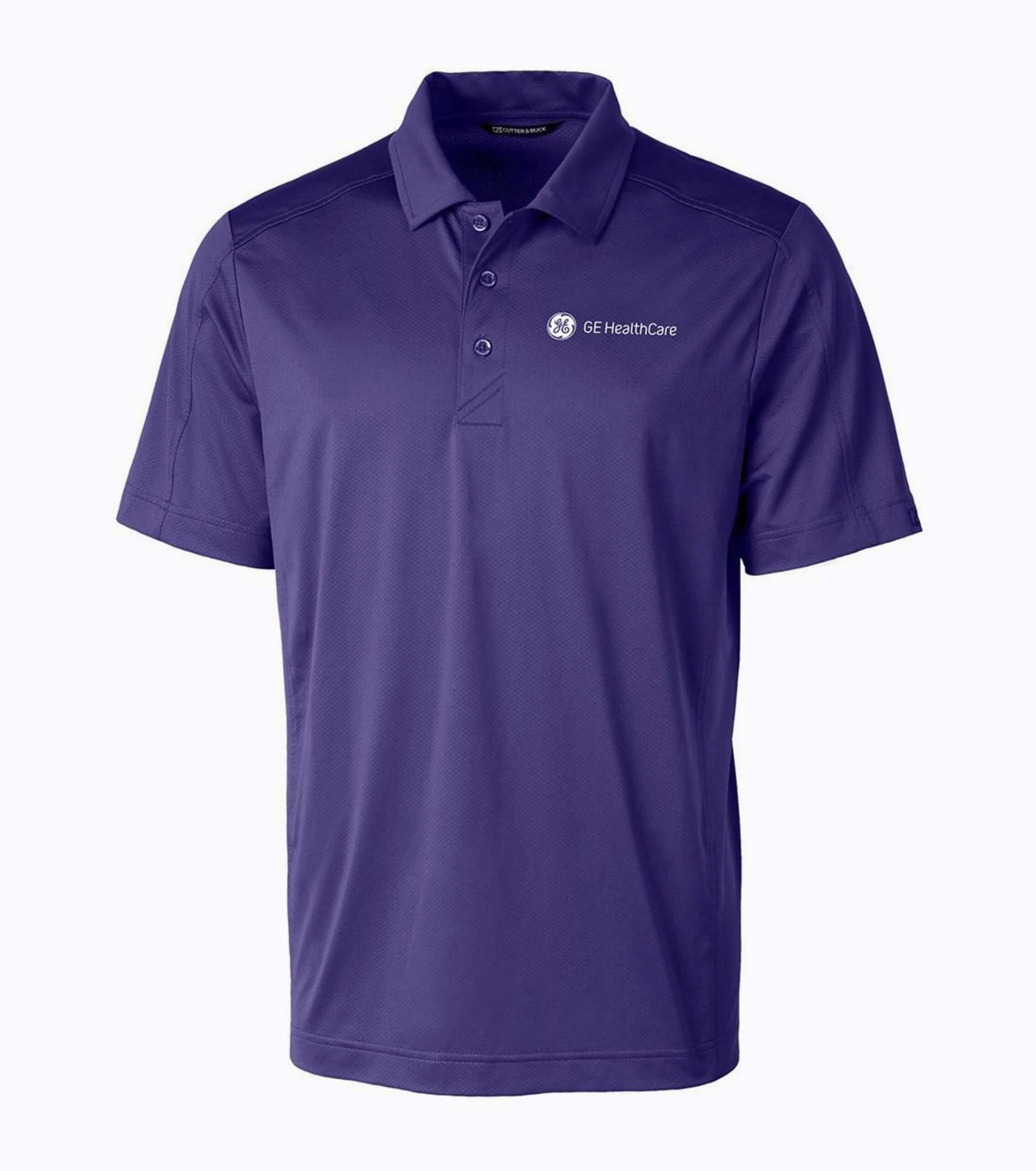
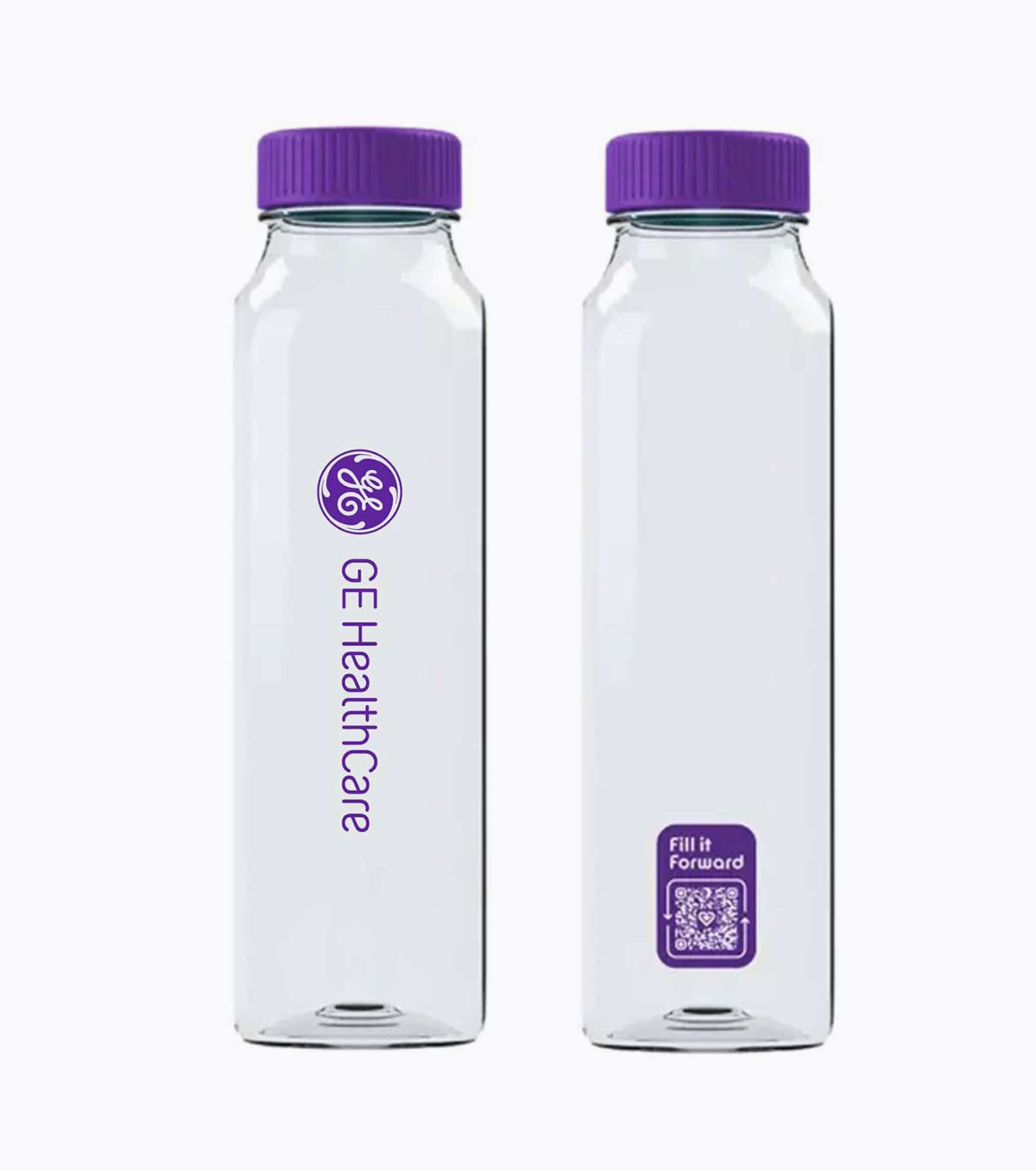
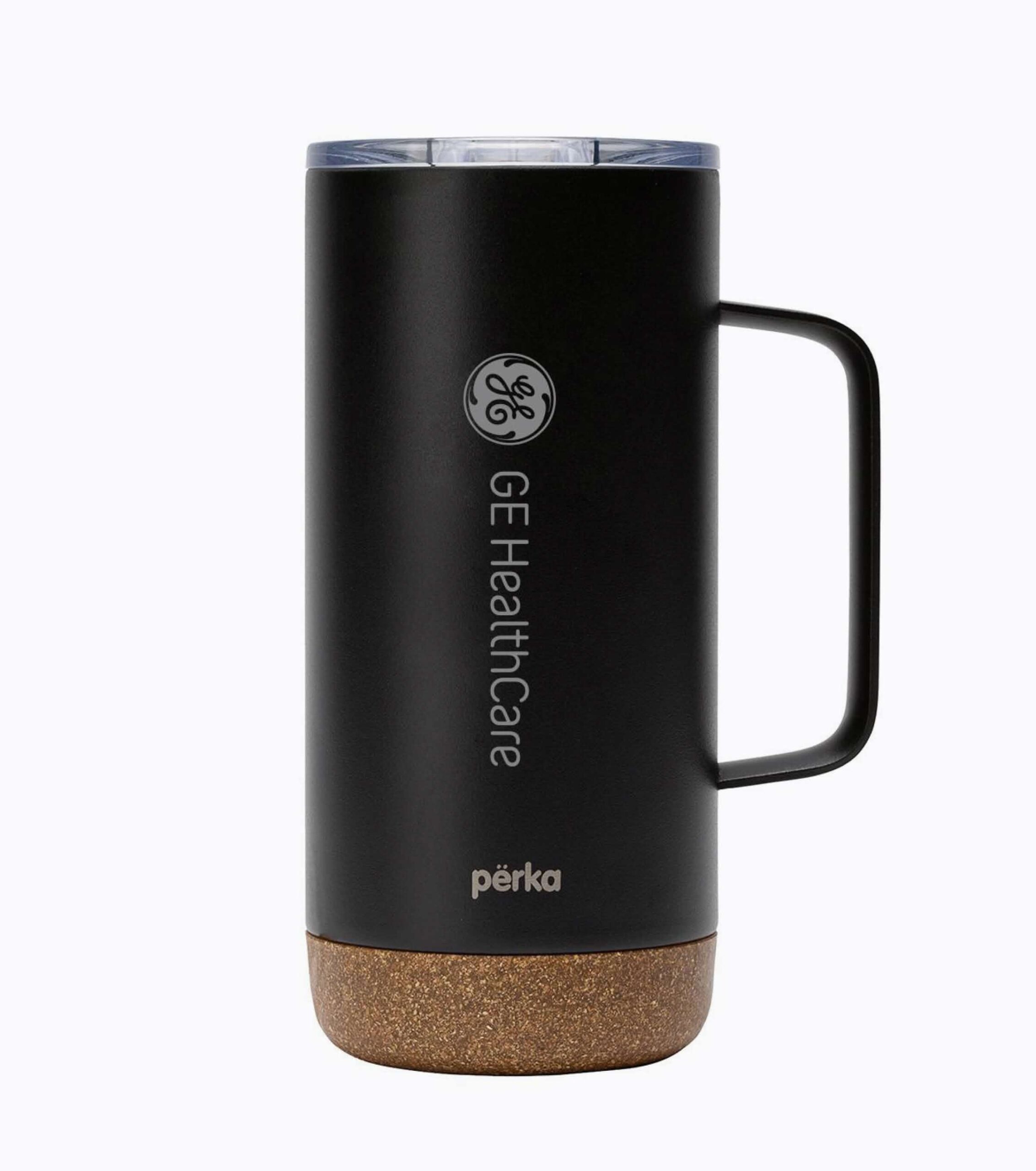
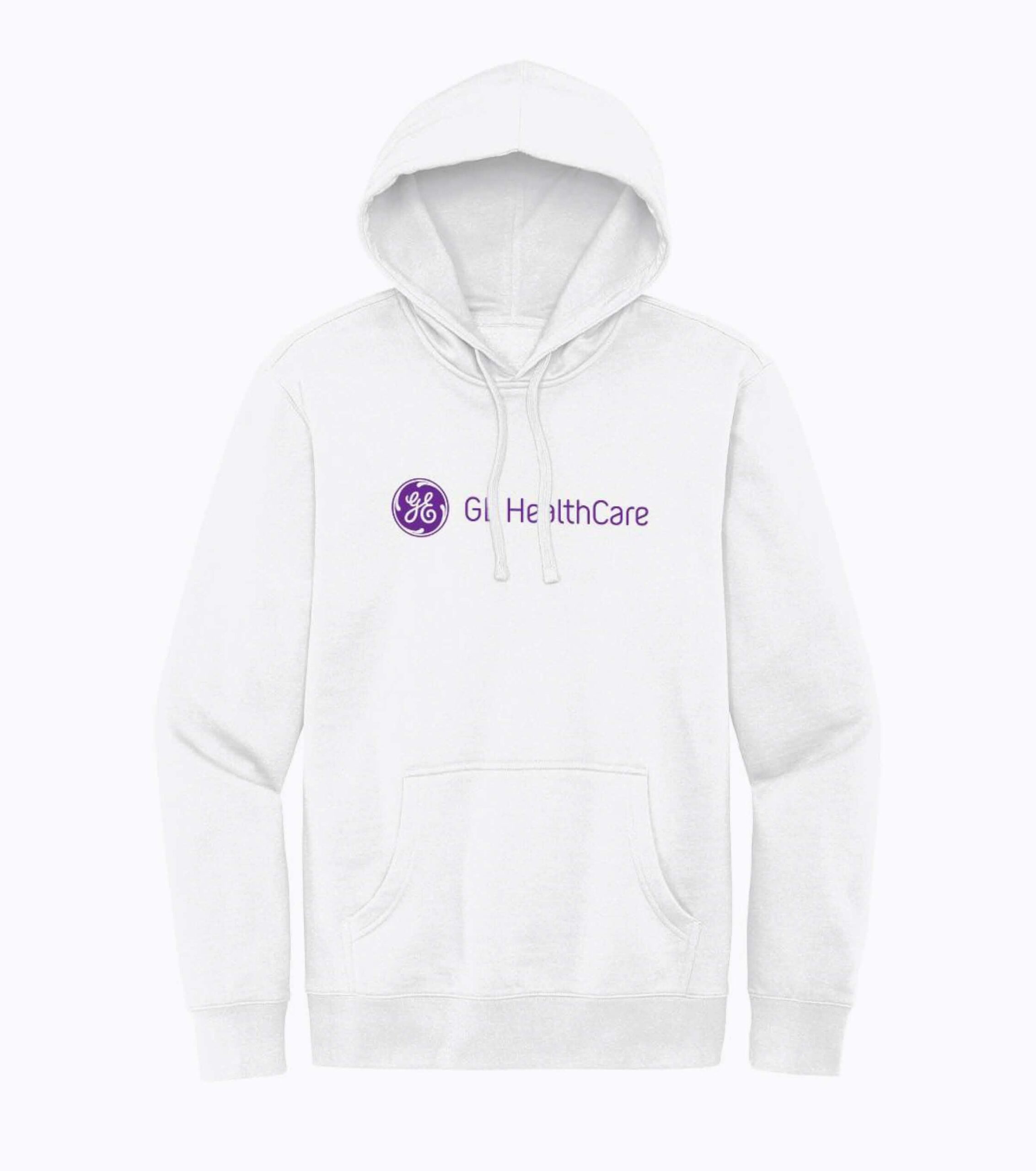
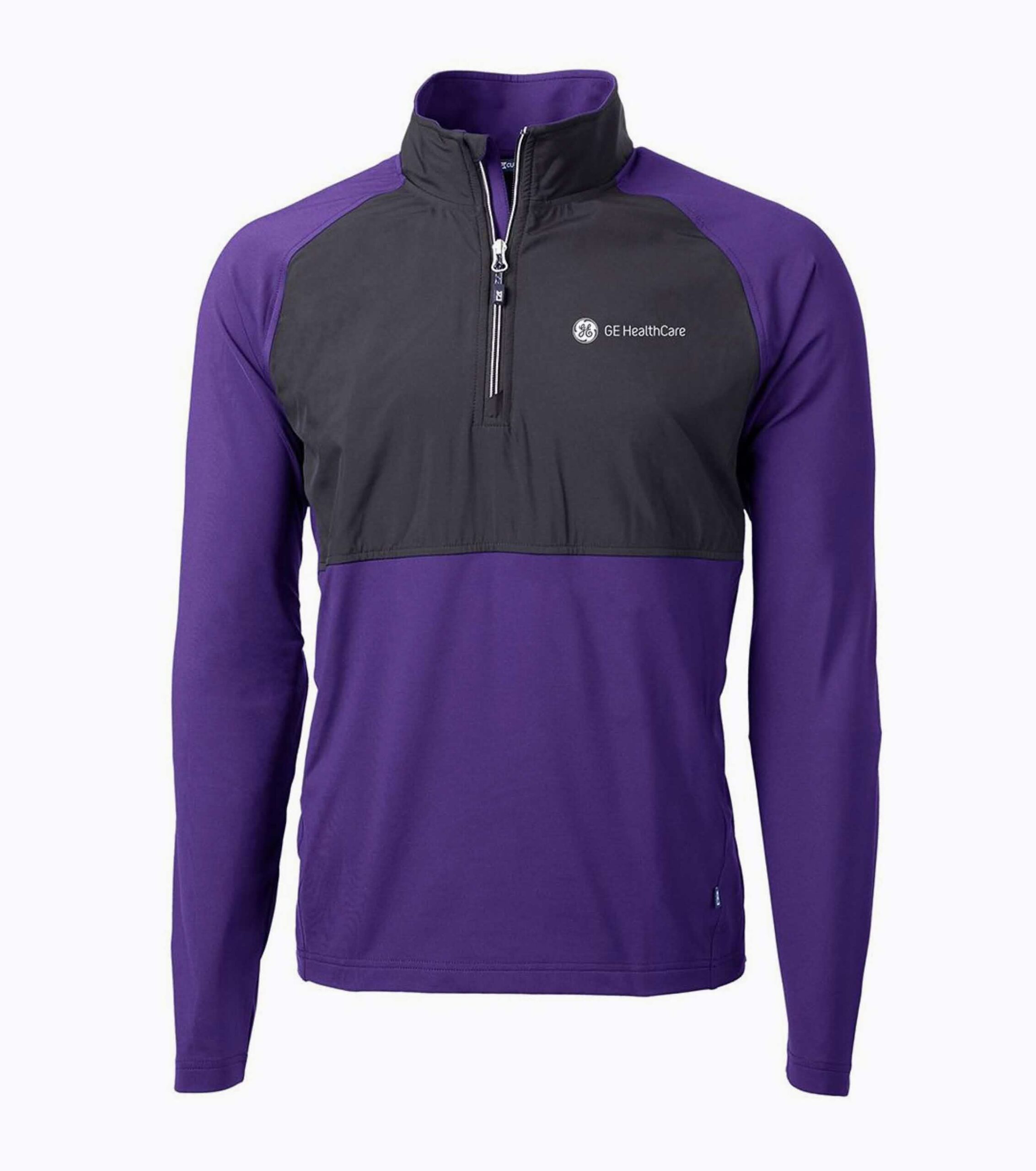
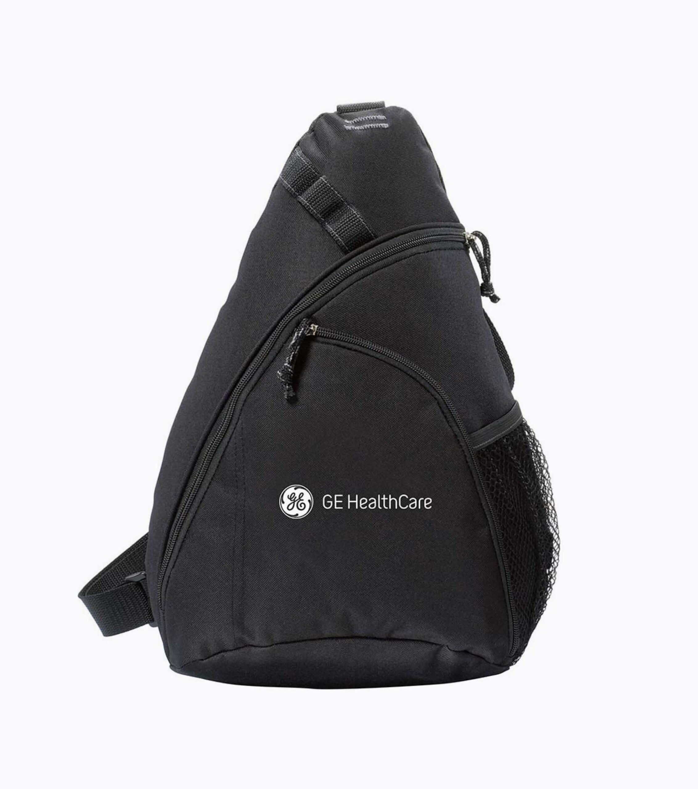
Select apparel and promotional items carefully to ensure they represent the GE HealthCare brand appropriately. Do not place our brand on items that are walked on, consumed or disposable, such as napkins or face masks.
For guidance, contact the brand team at brand.health@gehealthcare.com.
Visit GE HealthCare’s Brand Shop (USCAN only).