
Color
Expressing warmth, compassion, optimism and vision
Informed by our brand strategy, the GE HealthCare color palette reflects our identity, grounded in compassion, innovation and humanity.
Use color with intention, not as decoration. Our palettes should support content and create clear information hierarchy so we communicate simply and effectively.
Follow these guidelines and do not assign specific colors to any product, product family, group or team.
Palette and accents
Color overview
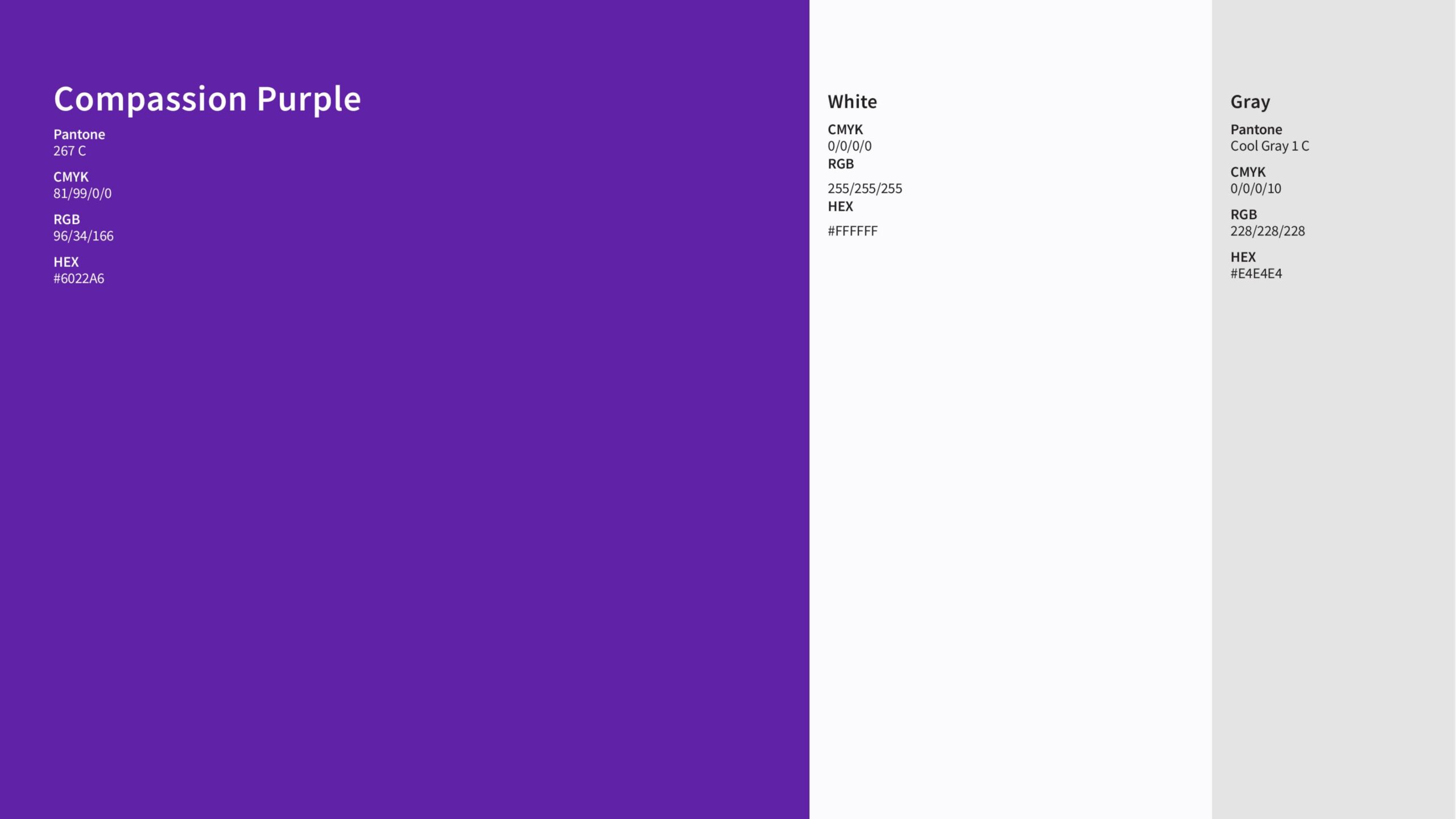
Primary color palette
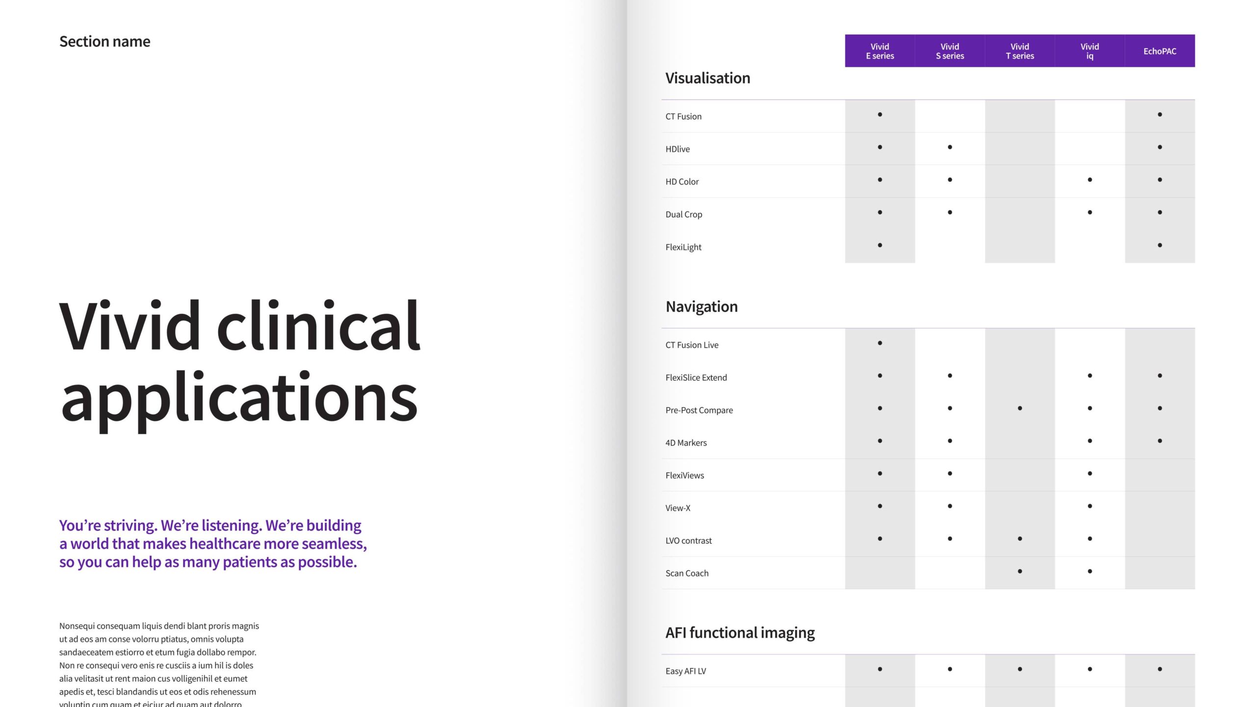
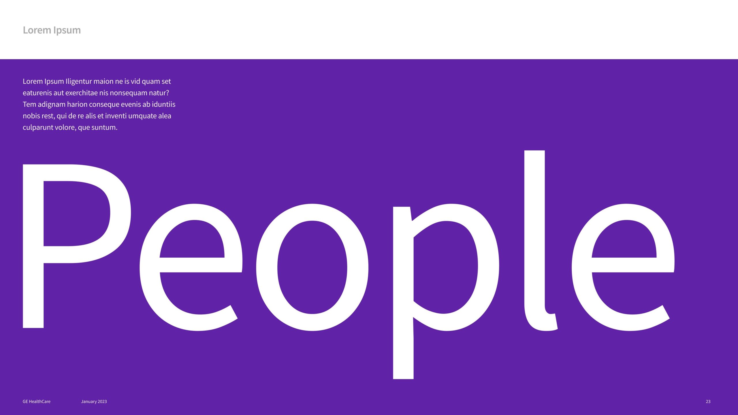
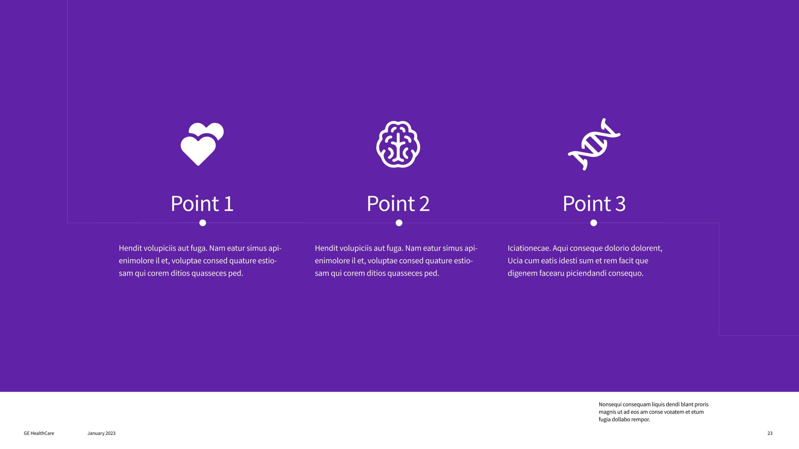
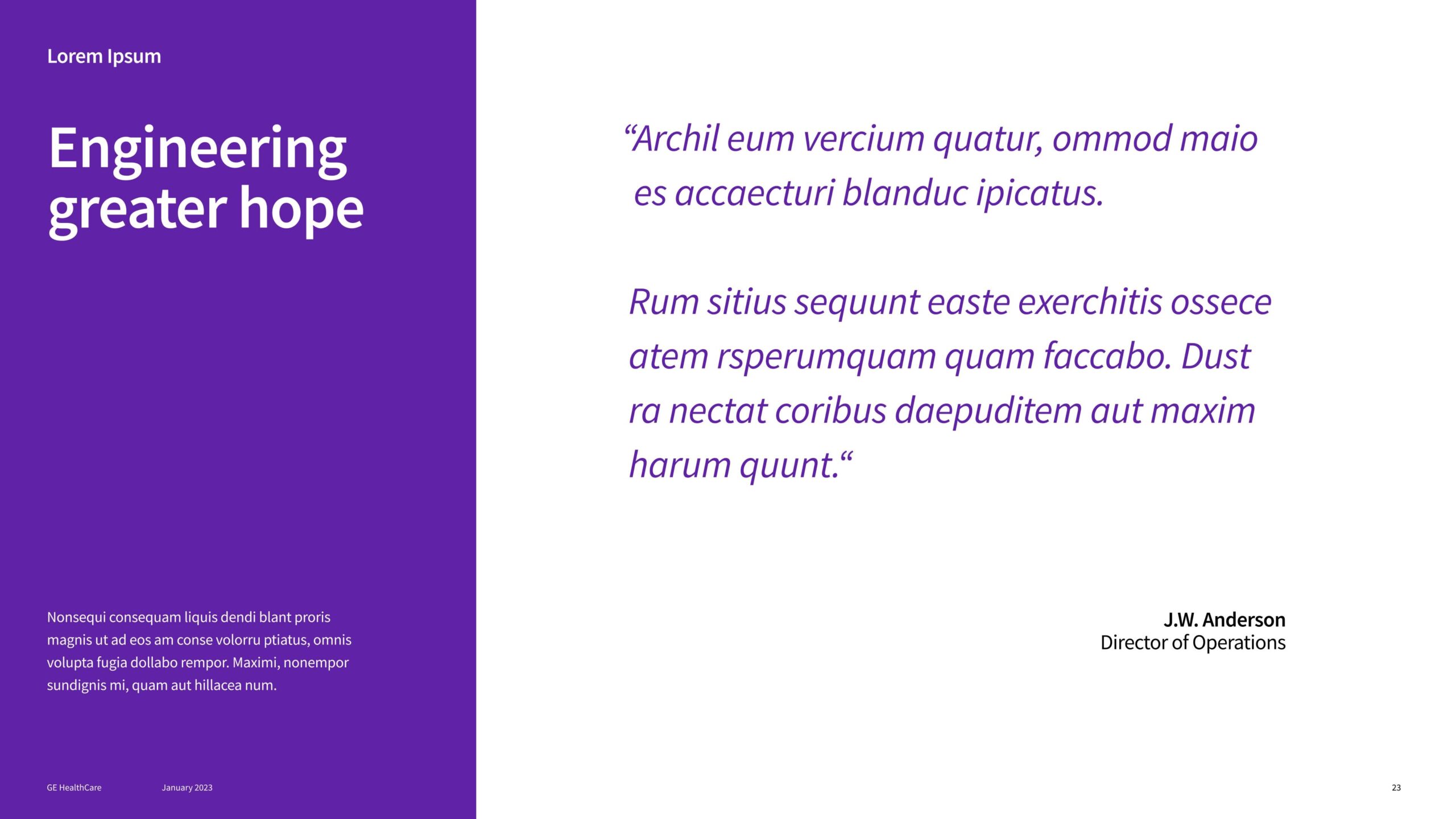
Compassion Purple is our primary color and should be the dominant color in branded communications. Use black for typography only.
Within a composition, gray highlights secondary information and balances layouts that feel overly white. Three additional grays are reserved for infographics and are defined in the Infographic Guidelines.
Accent color palette
The accent palette reflects the diversity, empathy and optimism of our brand. Use these colors functionally as a secondary design element to categorize and separate information, build hierarchy or signal interactive elements.
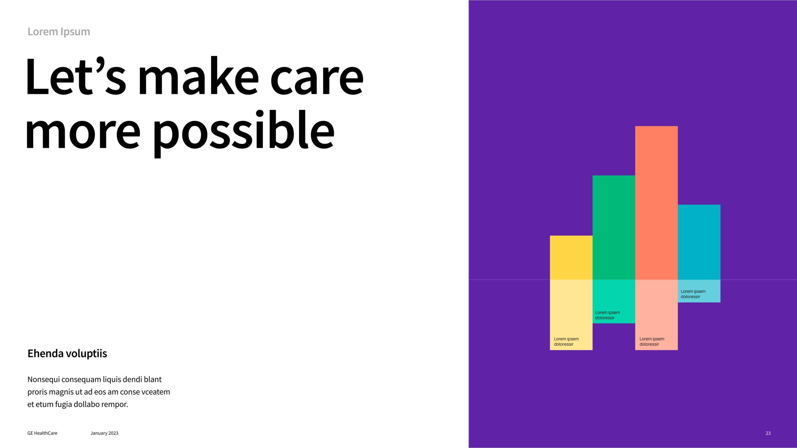
The accent palette includes Turquoise, Yellow, Green and Coral. Tints of these colors extend the palette and are used primarily to differentiate information in infographics, charts and tables.
Never use accent colors for decoration alone.

For additional guidance, please refer to our Accent Colors Guidelines.
For additional information on our website color palette please reference our Website Guidelines.
View our website design system and color application in Figma.
Usage and accessibility
Digital accessibility colors
Specific digital accessibility color usage guidelines apply to digital applications only. They ensure legibility across all branded communications viewed on screen.
In general, use black or Compassion Purple text on a white background. Use white text on Compassion Purple or black backgrounds.
Use only black text on accent or gray backgrounds.
Do not use accent colors or grays for text. Do not use white text or icons on accent color backgrounds.
Primary application
For use in infographics and as accent colors
For use in infographics, charts and tables
Color proportions and usage
The examples shown demonstrate color proportions within our design system.
Compassion Purple
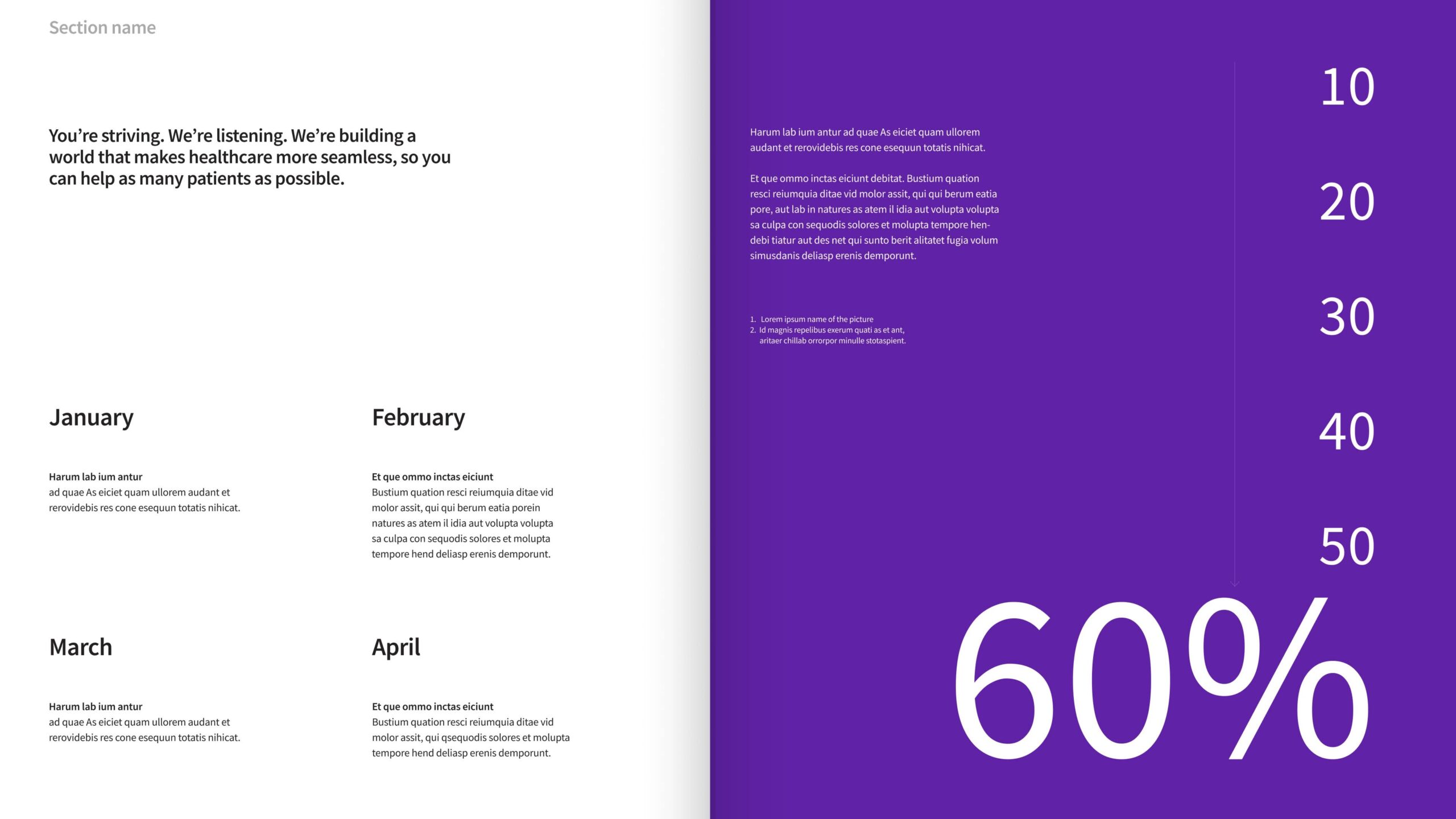
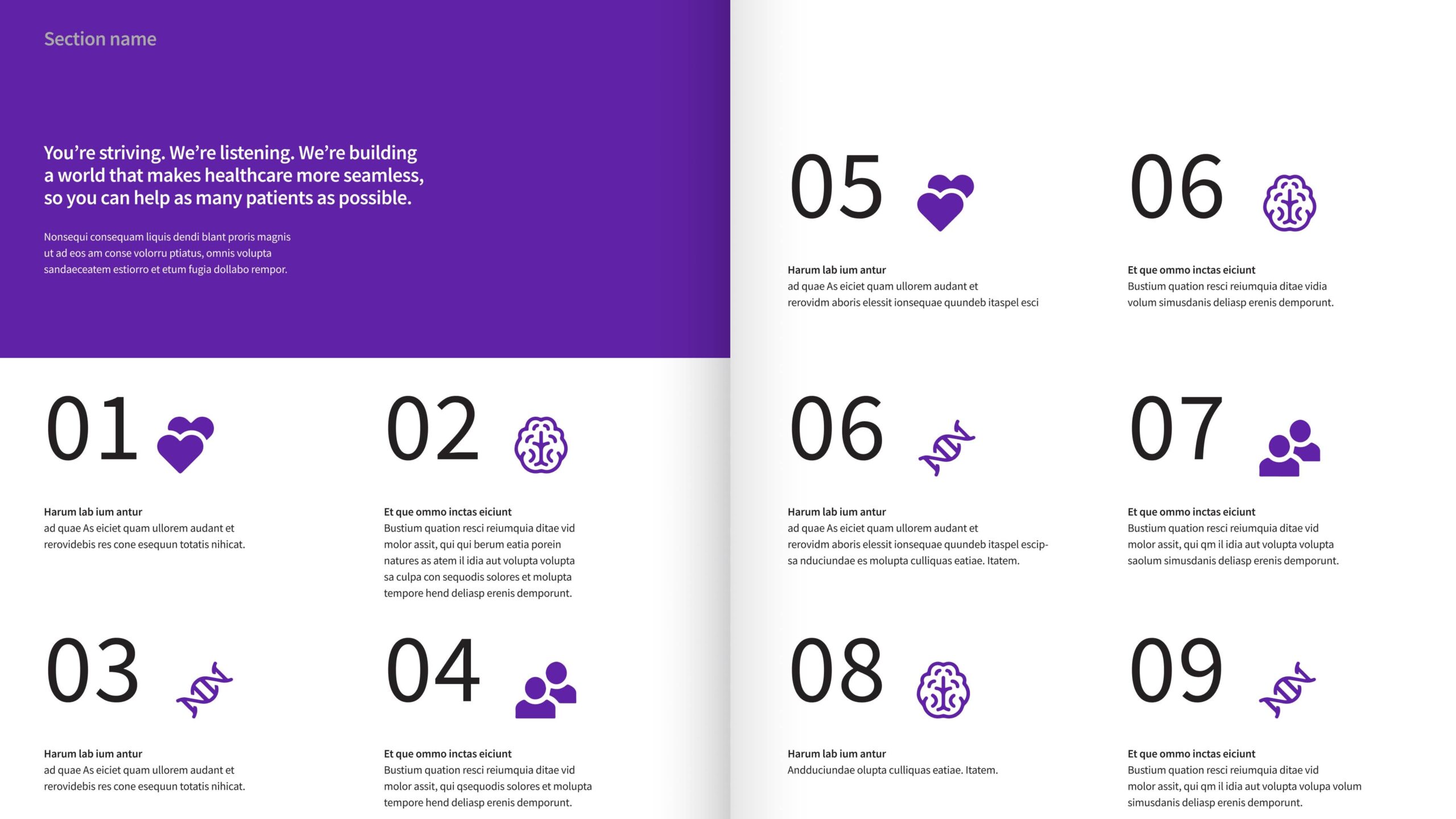
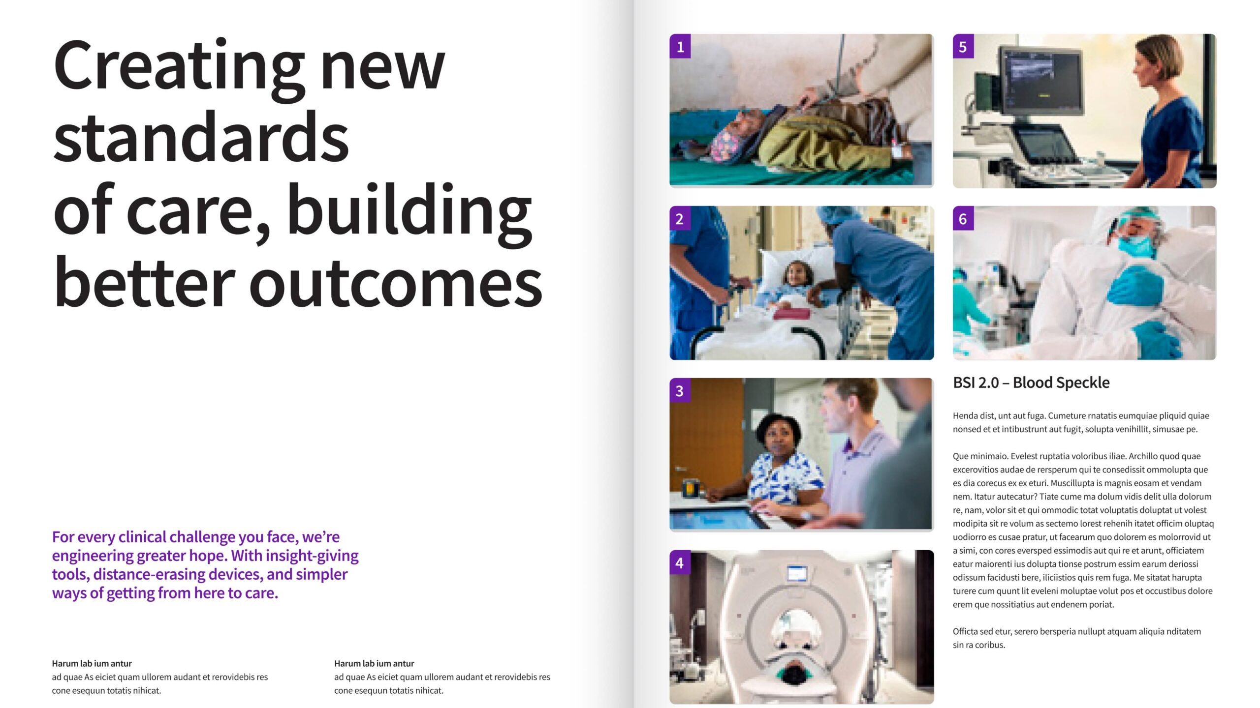
Compassion Purple must remain the dominant color in layouts to reinforce the brand.
In single-format mediums, follow a 70% Compassion Purple and 30% accent color ratio. In multi-format media, apply this ratio at a macro level, allowing greater flexibility across interior pages or spreads once Compassion Purple is clearly established.
Accent palette
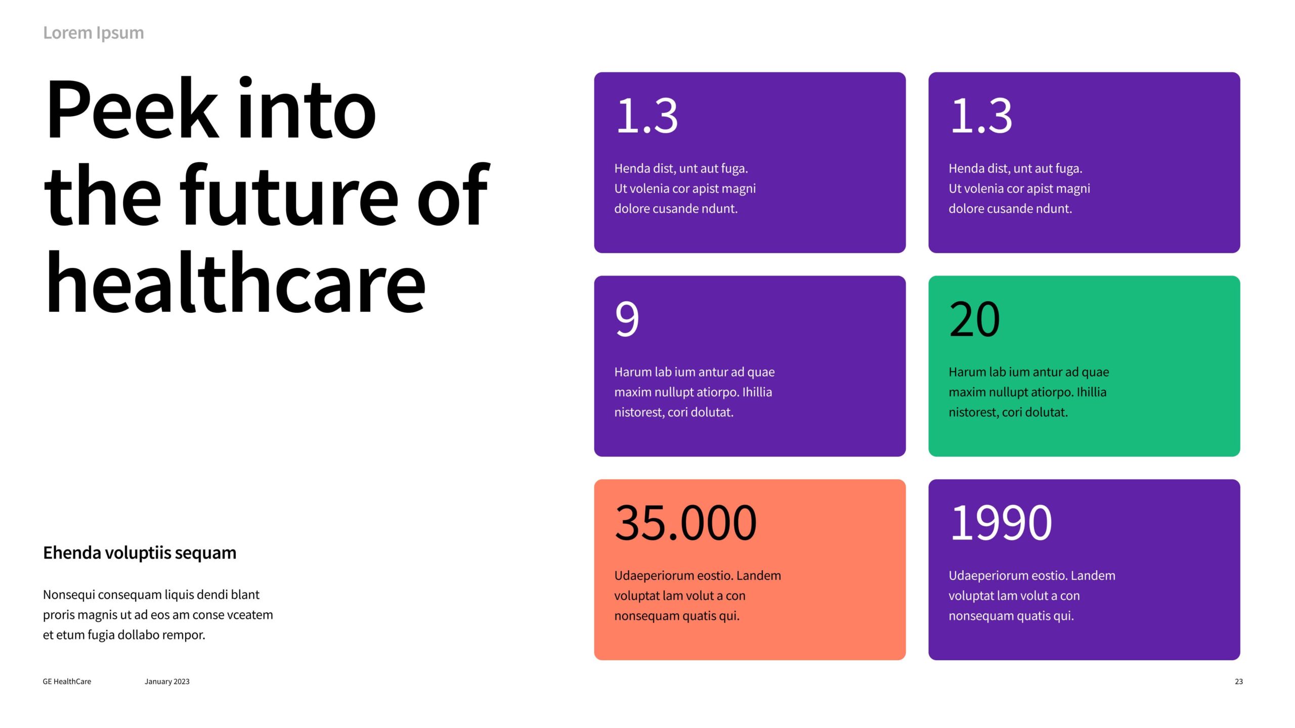
Use accent colors in conjunction with Compassion Purple. Apply tints of a single accent color for a monochromatic approach or use them to differentiate information in infographics.
Do not use accent colors as large background fields in single-format media.
Tints/grays
Tints of accent colors, along with four designated grays, extend the palette. Use them primarily to highlight or differentiate information in infographics, charts and tables.
Primary color usage
If using color, Compassion Purple should be the dominant color in applications.

Accent color usage
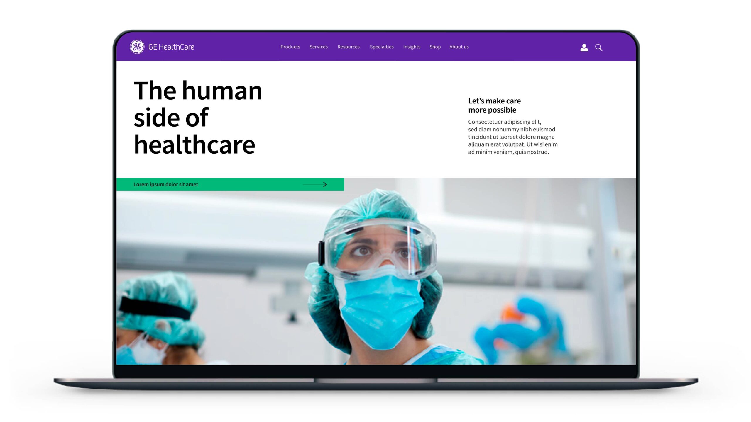
Interactivity: Accent color can be used to highlight interactive elements in digital design applications.
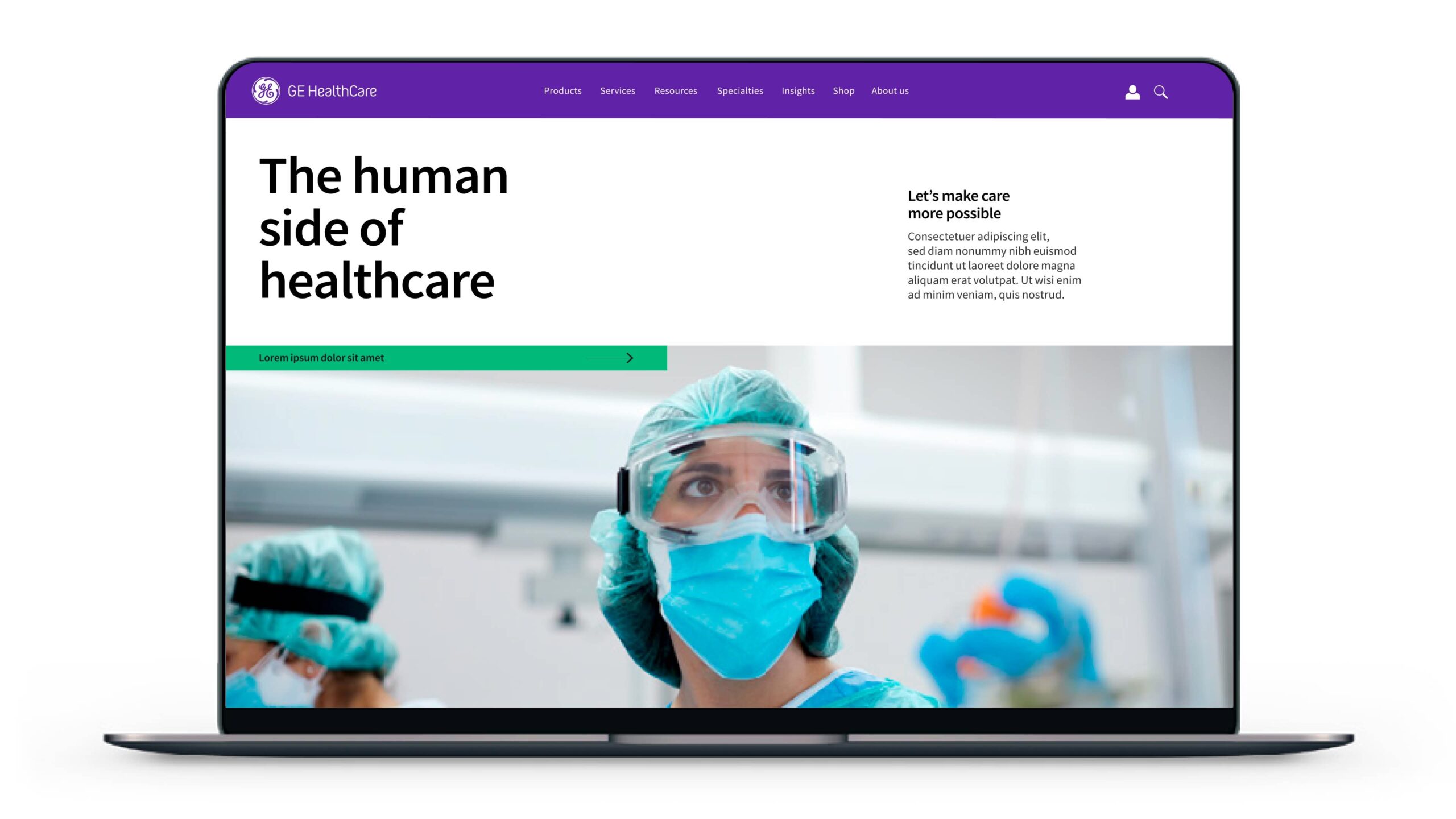
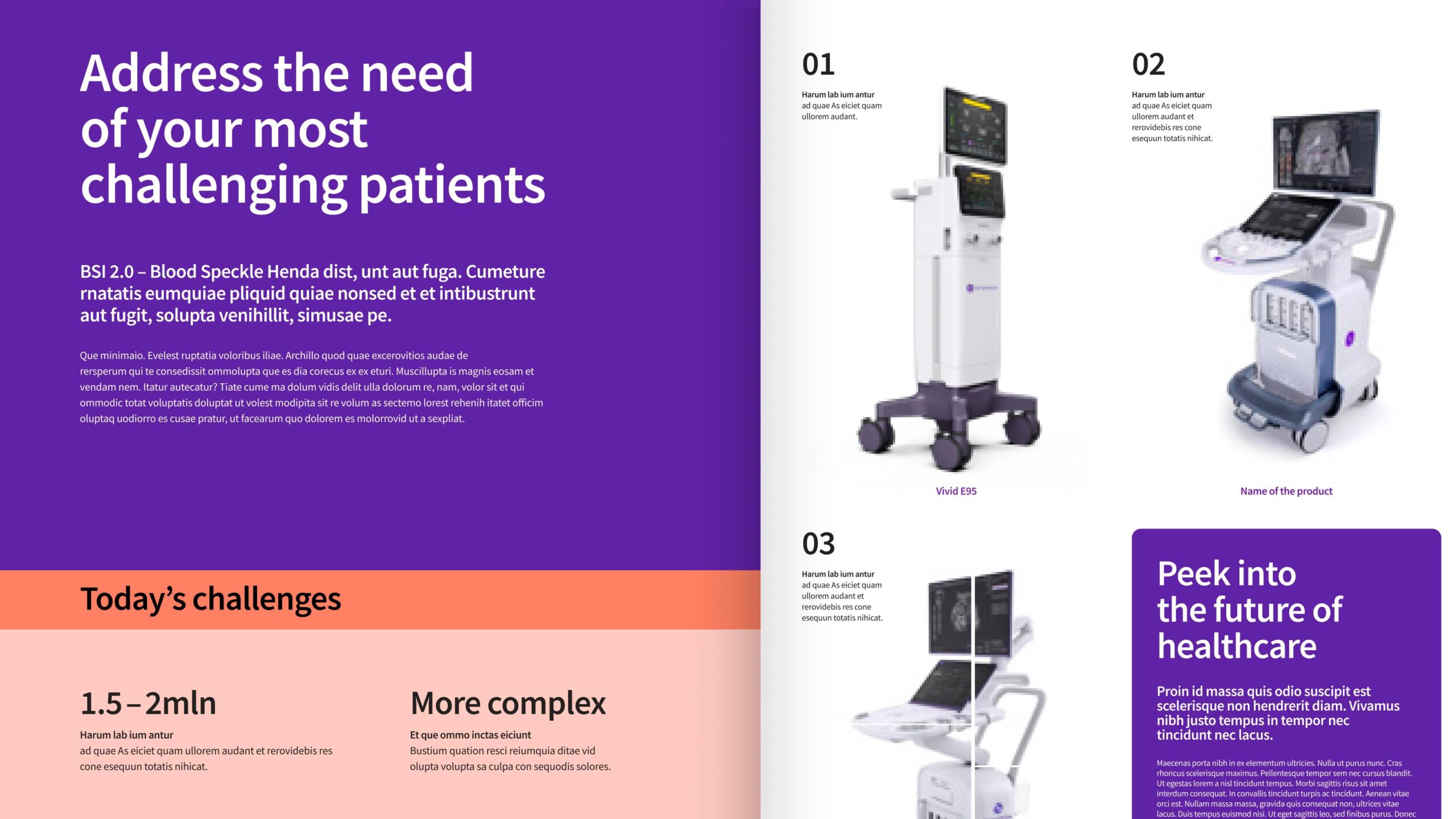
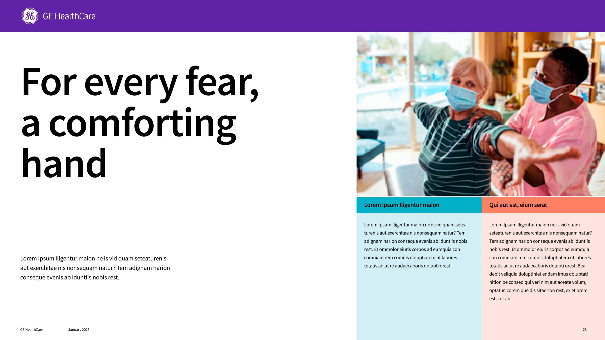
Building hierarchy: Accent colors/tints can be applied using a monochromatic approach to separate information.
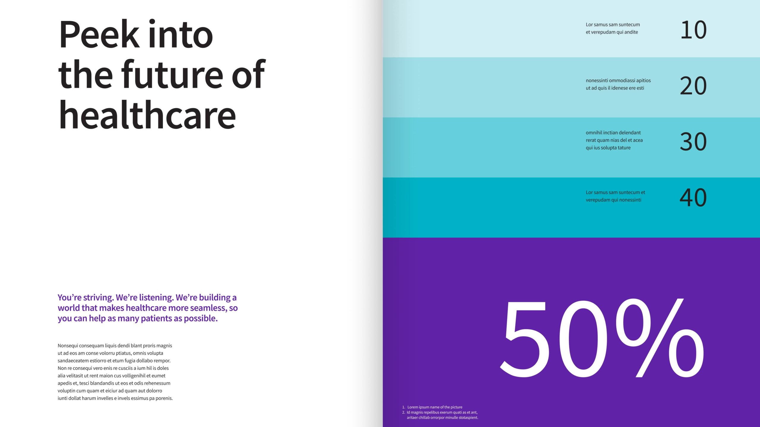
Categorization: Accent color can be used to categorize and separate information for data and charts.
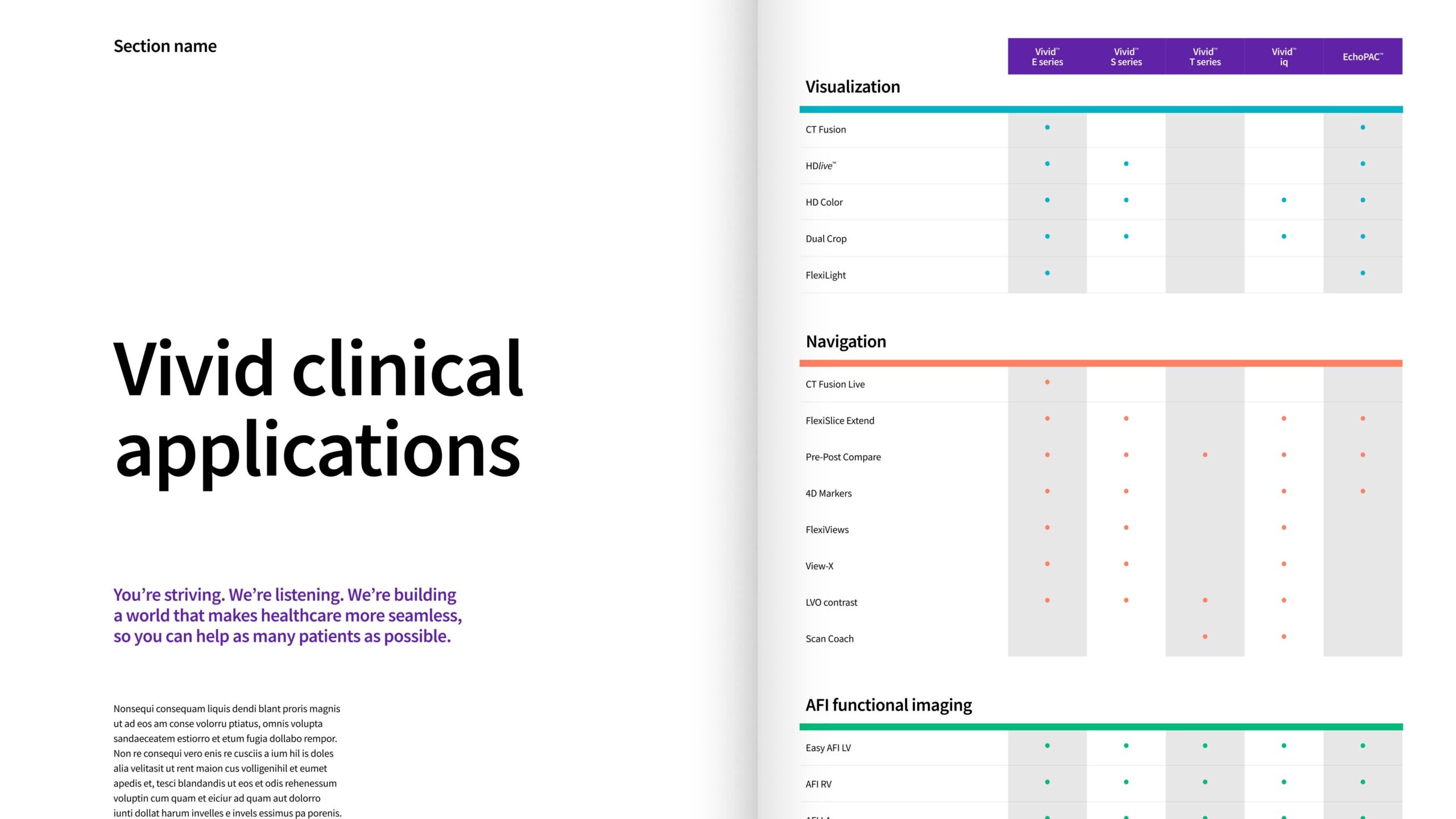
Accent color principles
The established accent color palette is purpose-driven, designed to enhance visual impact, strengthen brand identity and communicate information with clarity and precision.
Functionality
Accent colors communicate hierarchy, highlight interactive elements, and further establish our visual identity, ensuring that users understand our content and engage with it in an intuitive and clear manner. In essence, accent colors serve as powerful tools for content creators to direct focus, convey meaning, and elevate the overall functionality of a design.

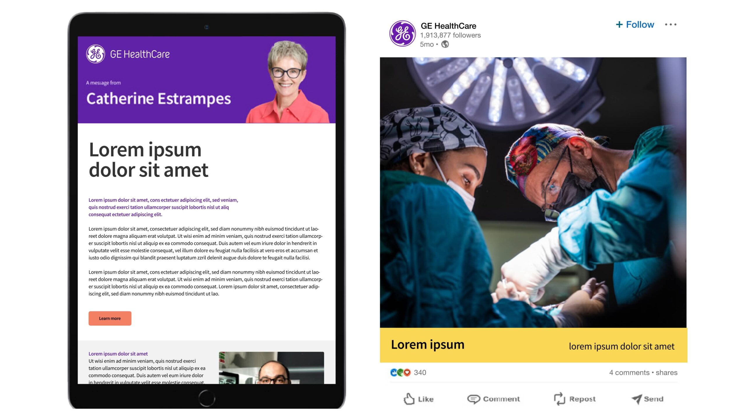
Balance and contrast
To achieve balance and harmony in accent color usage, consider the contrast with other brand elements, such as typography or backgrounds, to ensure readability as well as visual impact. Maintain a cohesive visual experience by using primary and accent colors in the correct ratio for specific applications.
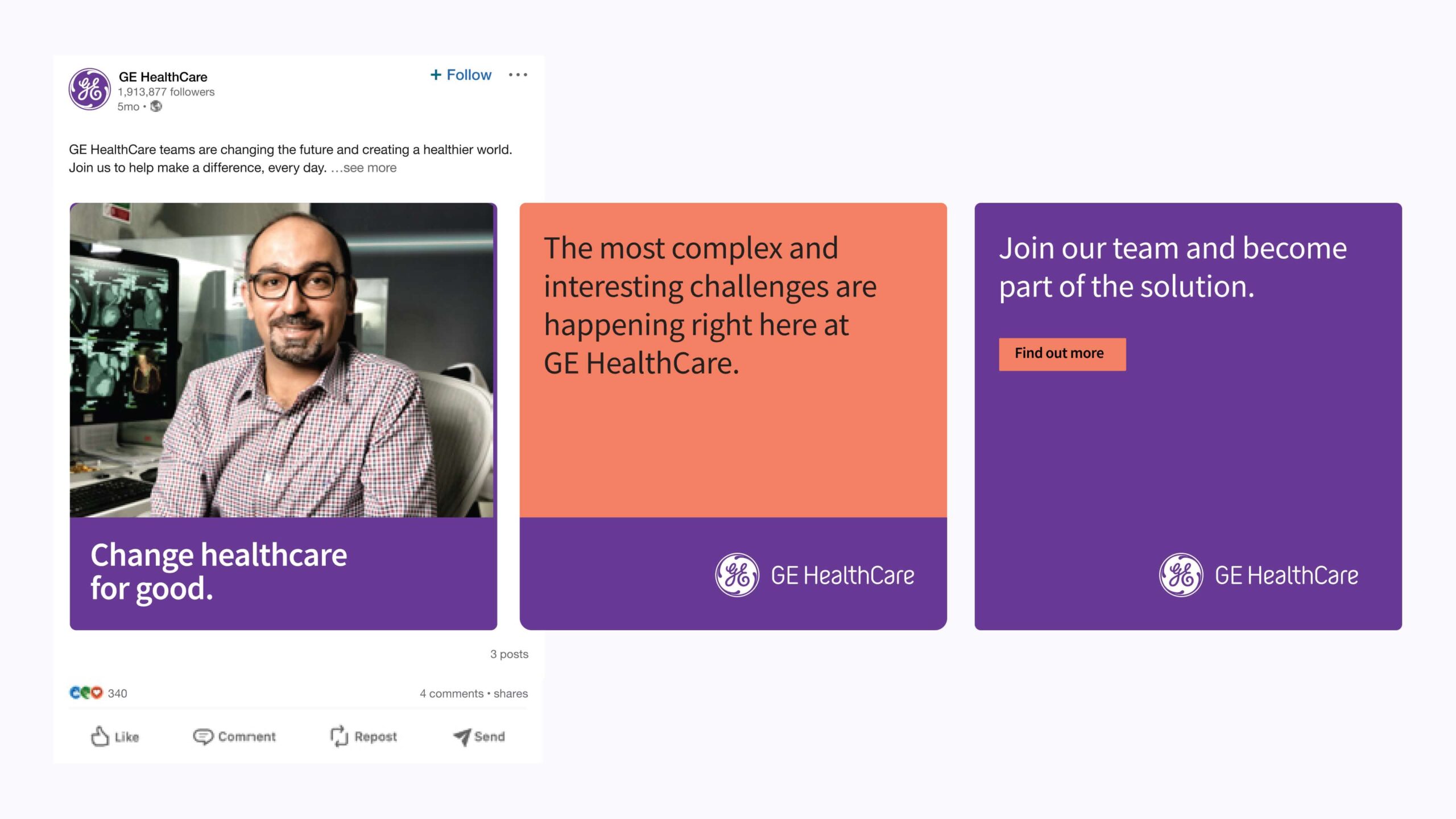
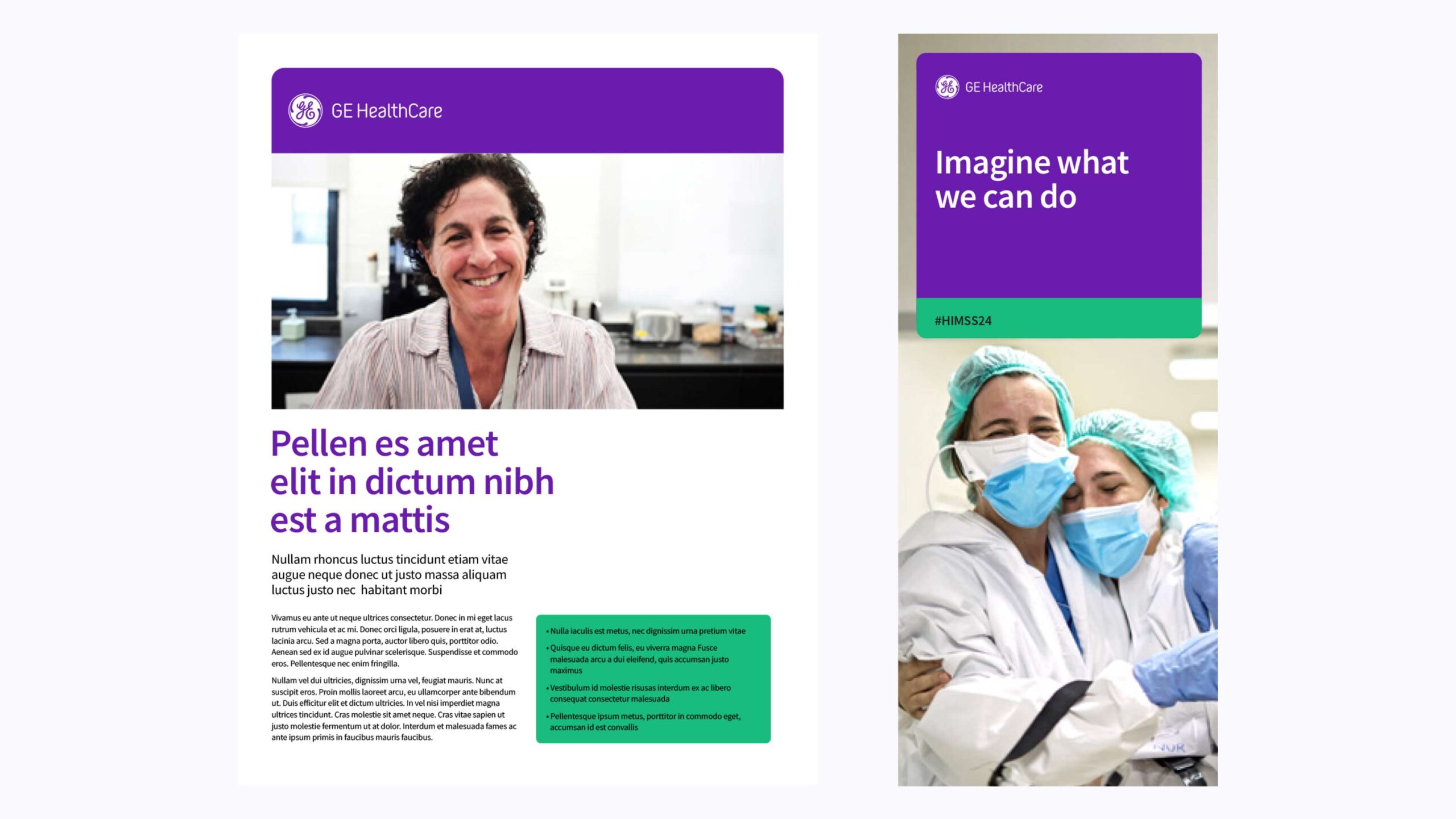
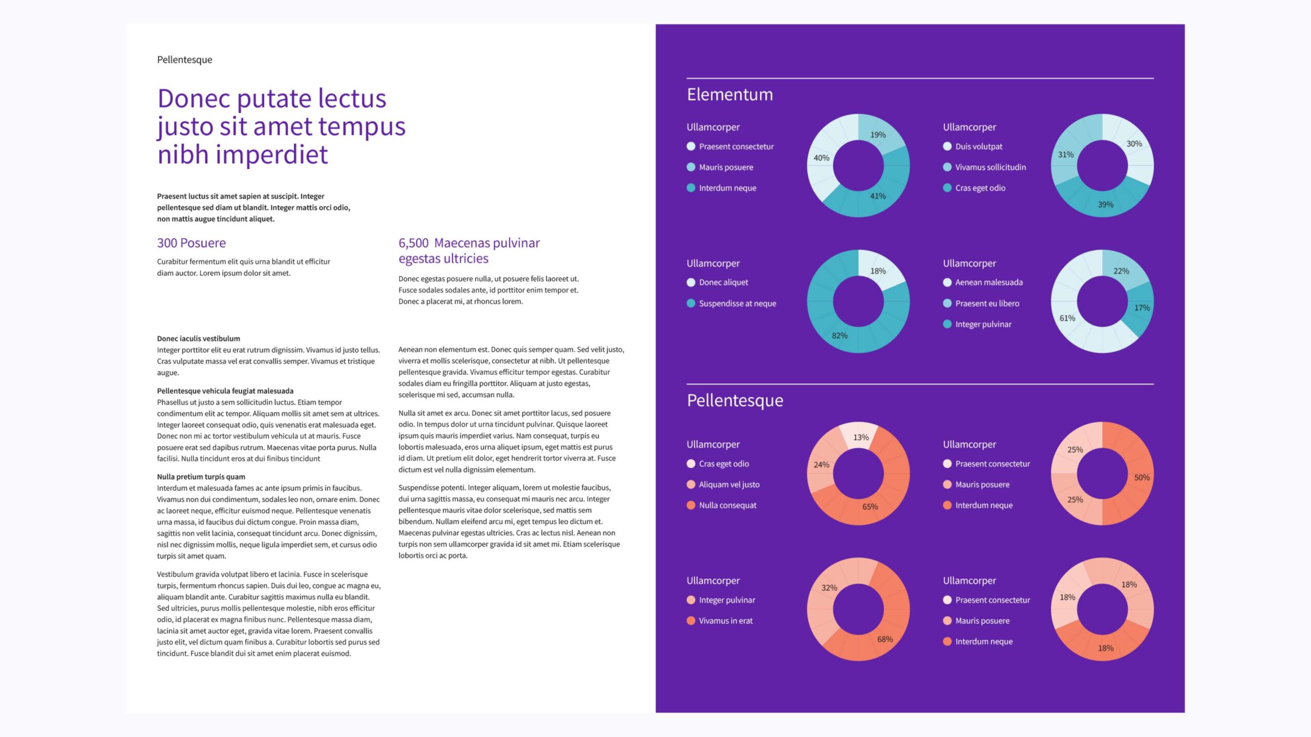
Versatility and adaptability
Accent colors offer versatile adaptability in design, enhancing supporting graphics, backgrounds, secondary elements, and categorization. They allow flexible adaptation of the brand’s visual identity across different media while maintaining the primary role of Compassion Purple in our visual identity system.
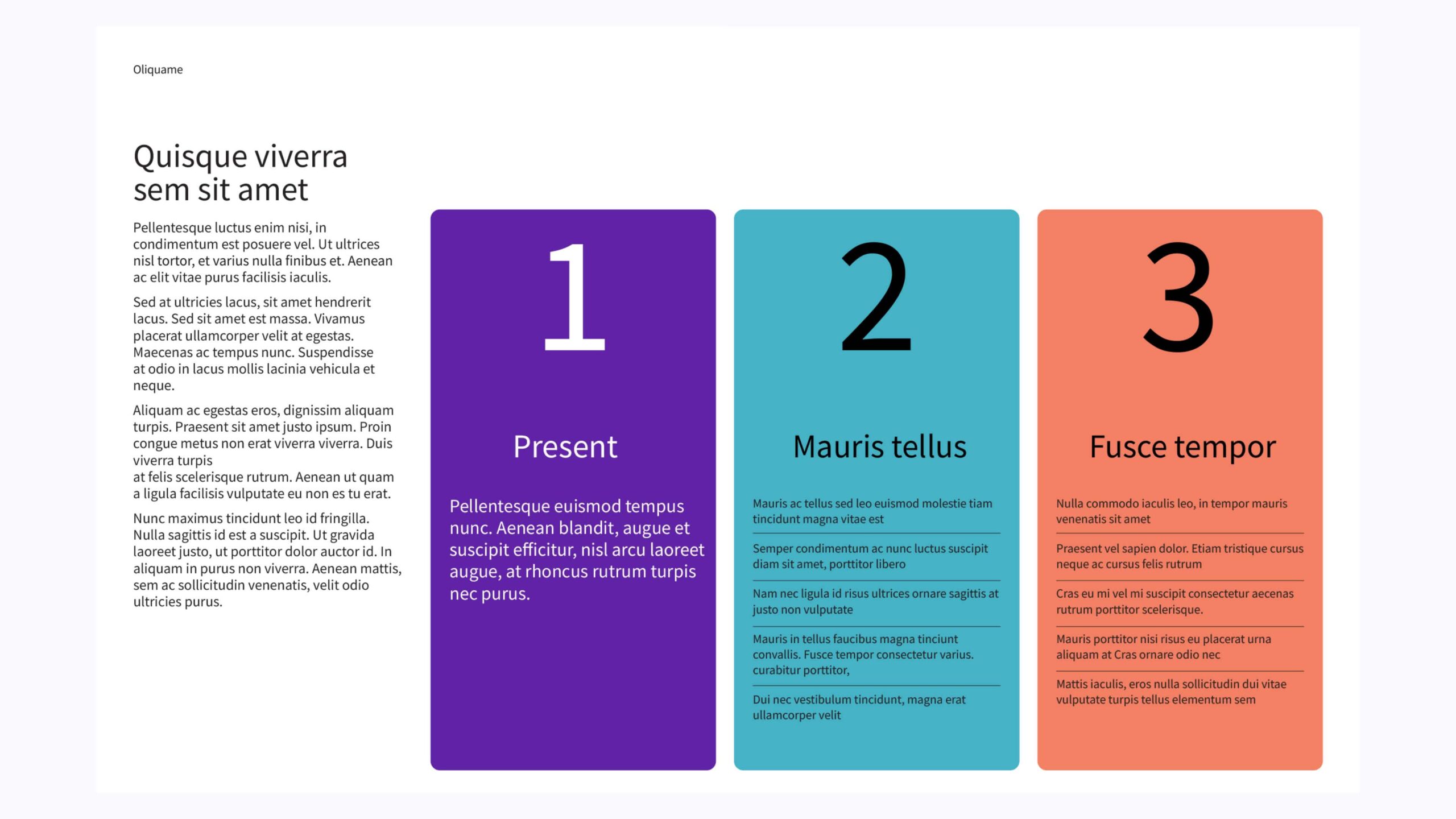
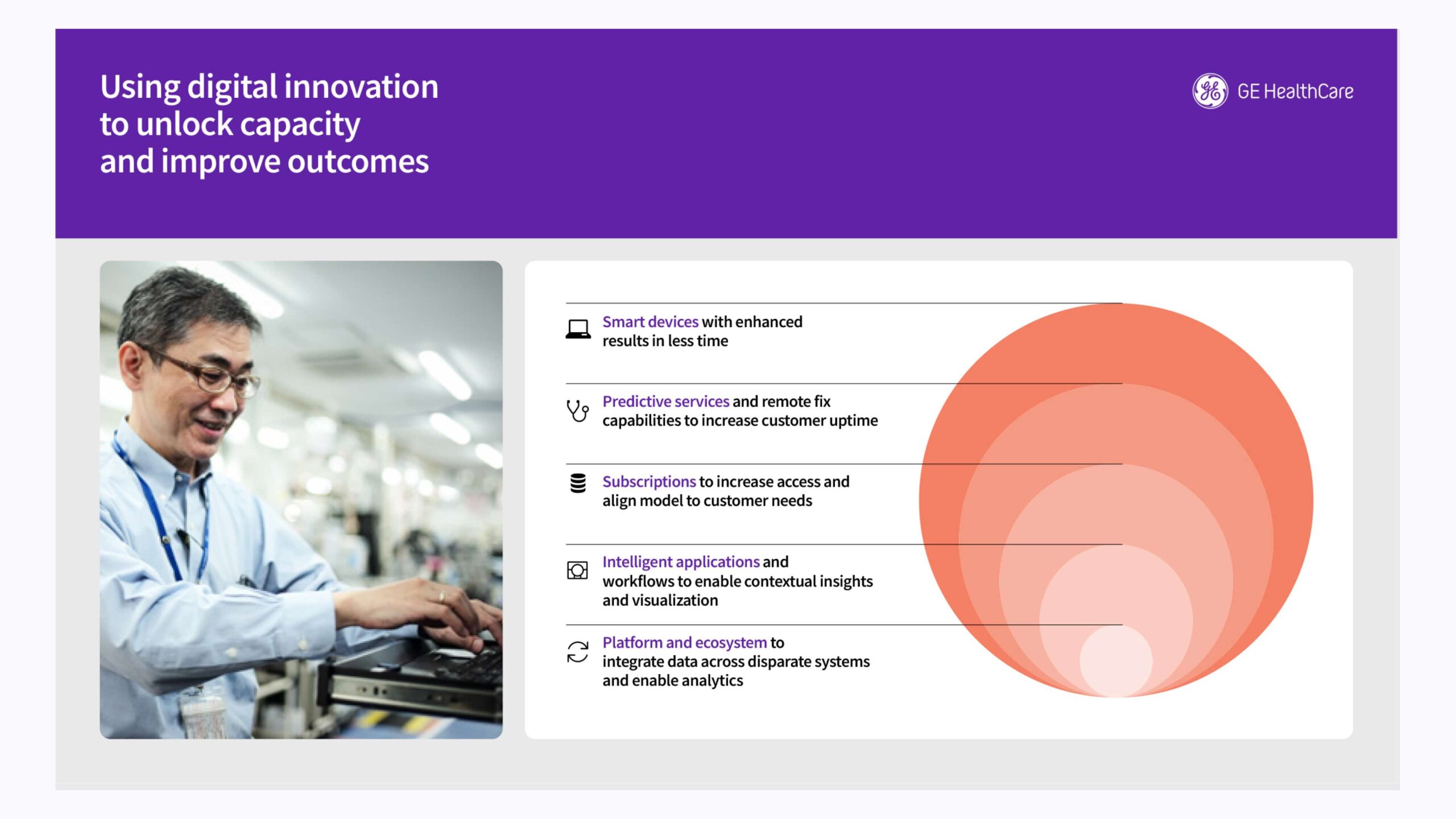
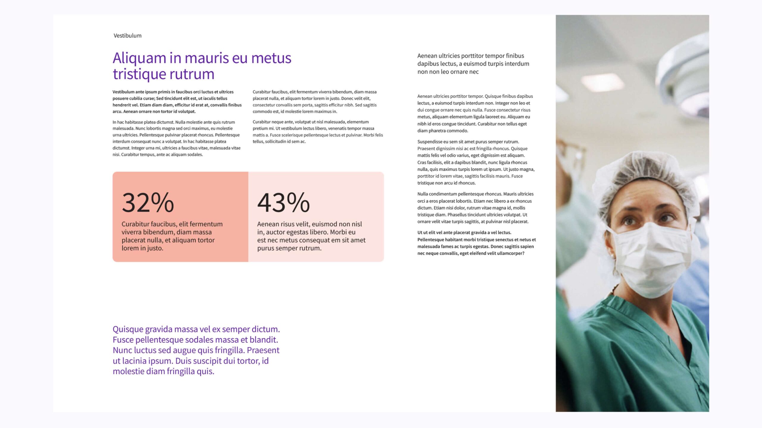
Color ratio and usage
The examples shown illustrate color ratios within our design system.
Primary ratio
(Compassion Purple only)
Use Compassion Purple exclusively to reinforce the brand. Do not introduce accent colors in this approach.
Primary and accent ratio
Use the accent palette alongside Compassion Purple as a secondary, functional element. Apply tints for a monochromatic approach or to differentiate information in infographics.
Compassion Purple must remain dominant, with accent colors limited to a 70/30 ratio. Do not use accent colors as large background fields in single-format mediums. Accent colors should never exceed 30%.
Primary and accent hint ratio
Use primary and accent colors in a 50/50 ratio when white or gray occupies most of the layout. Apply both as subtle hints, allowing negative space to lead.
Use accent colors to highlight or differentiate information in infographics, charts and tables.
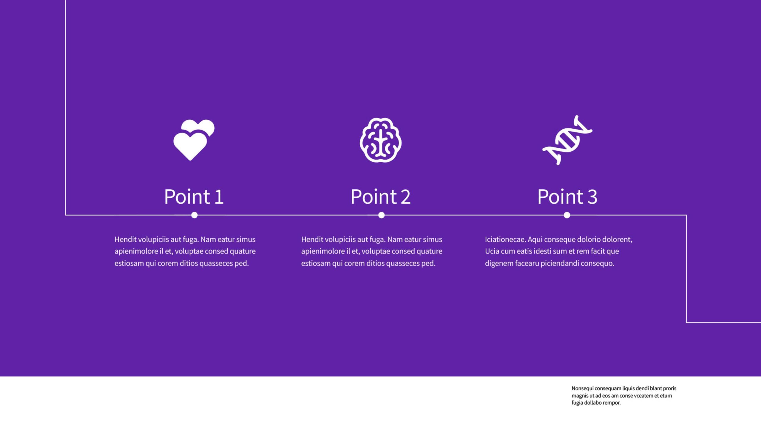
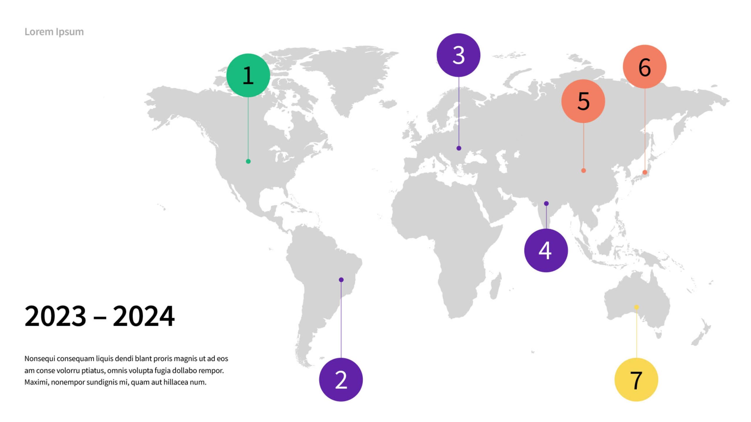
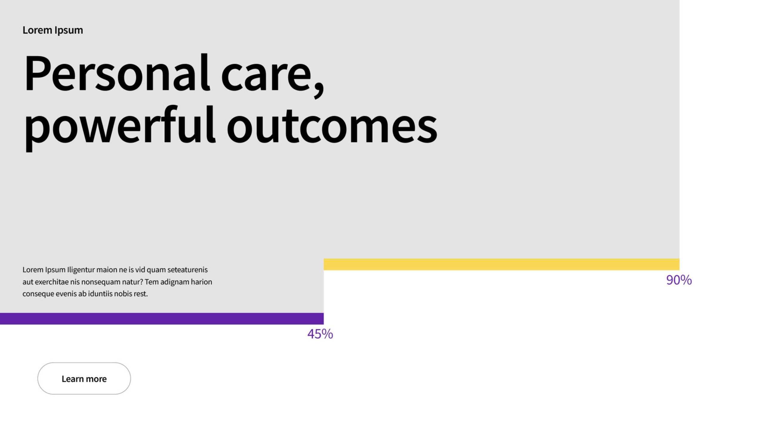
Primary ratio Compassion Purple
Purple only | No accent color
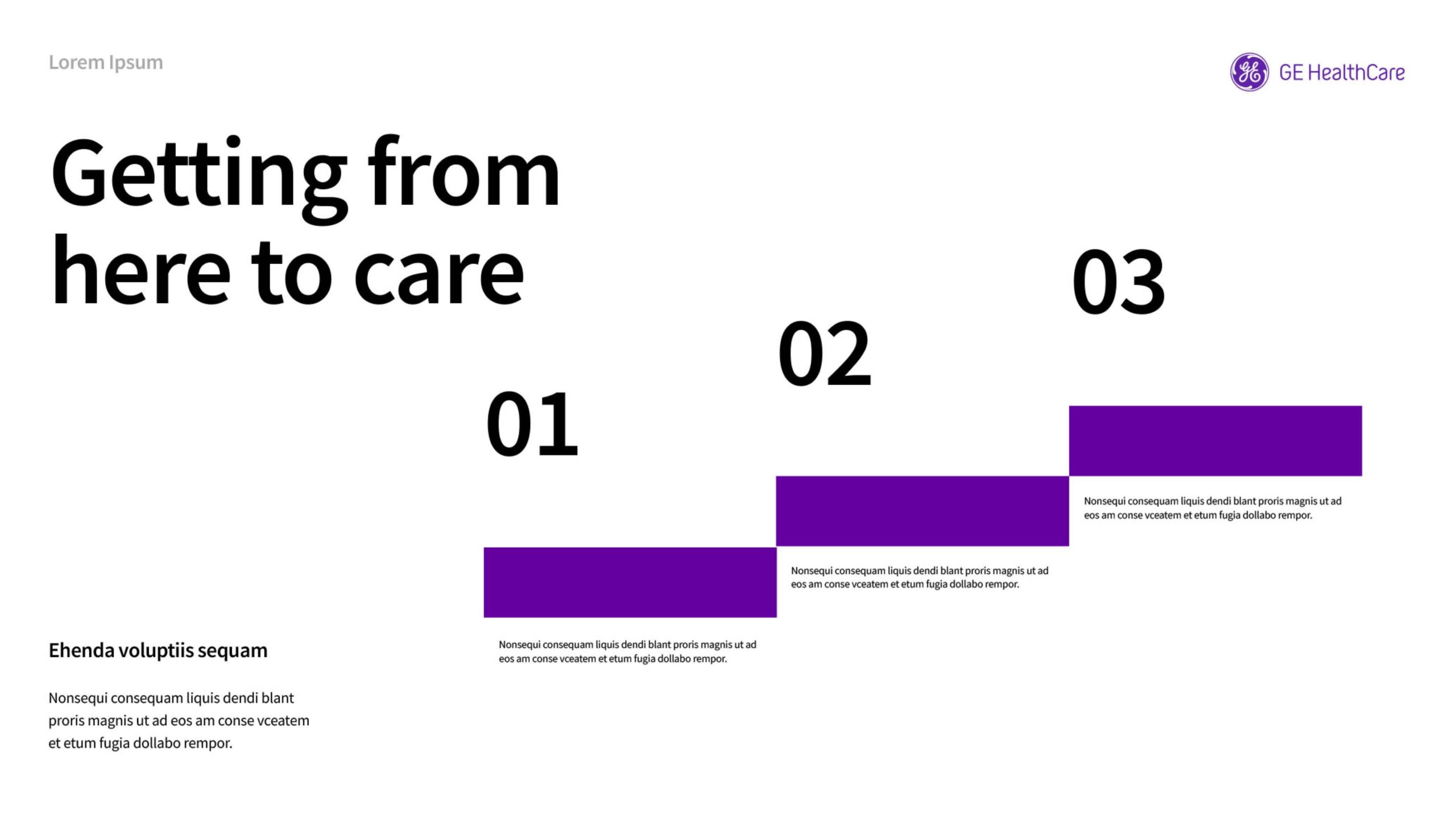

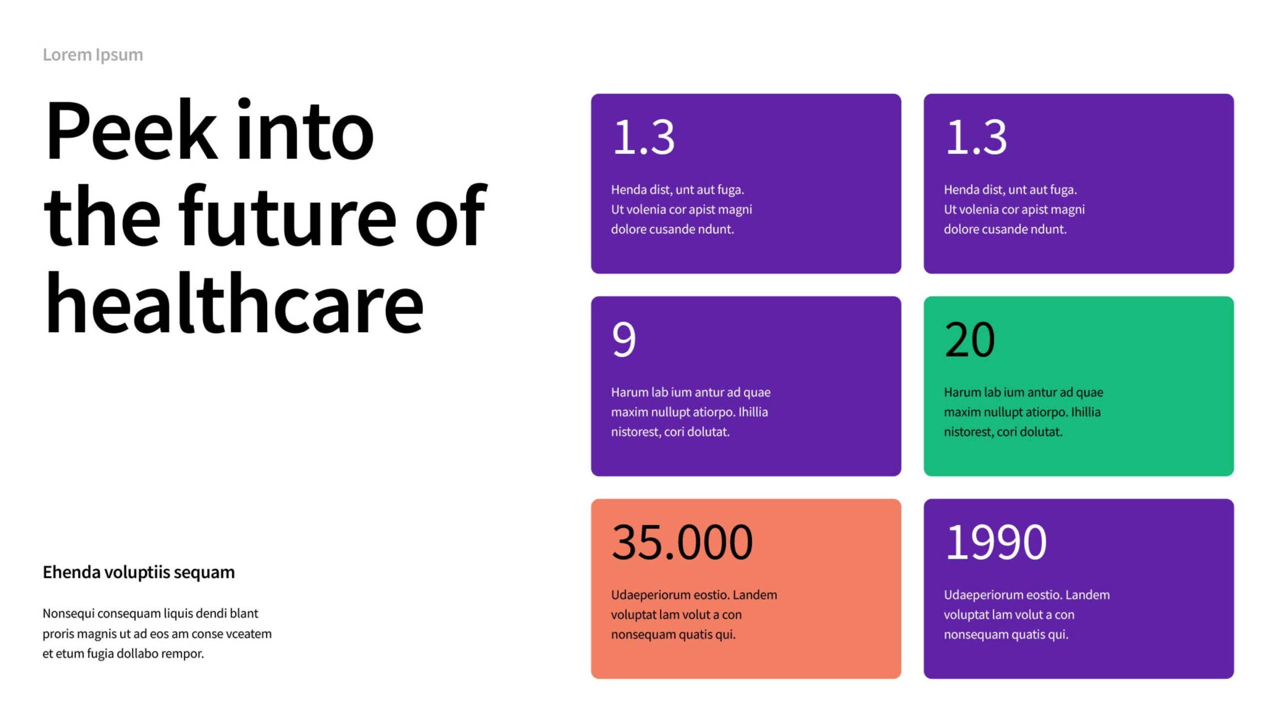
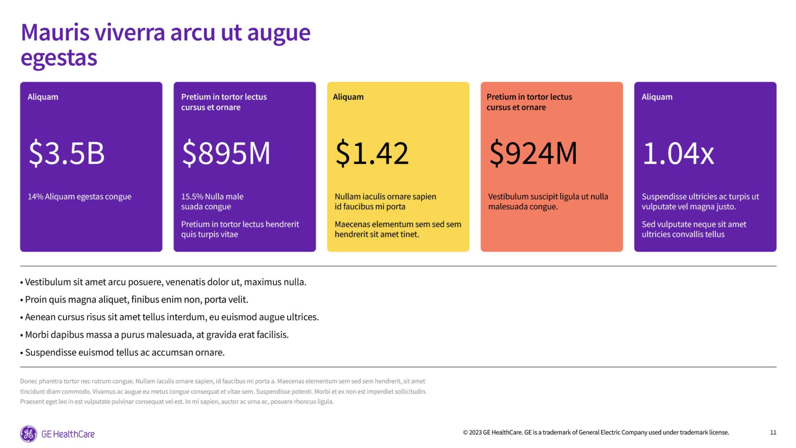
Primary/accent ratio
70% Compassion Purple | 30% Accent colors

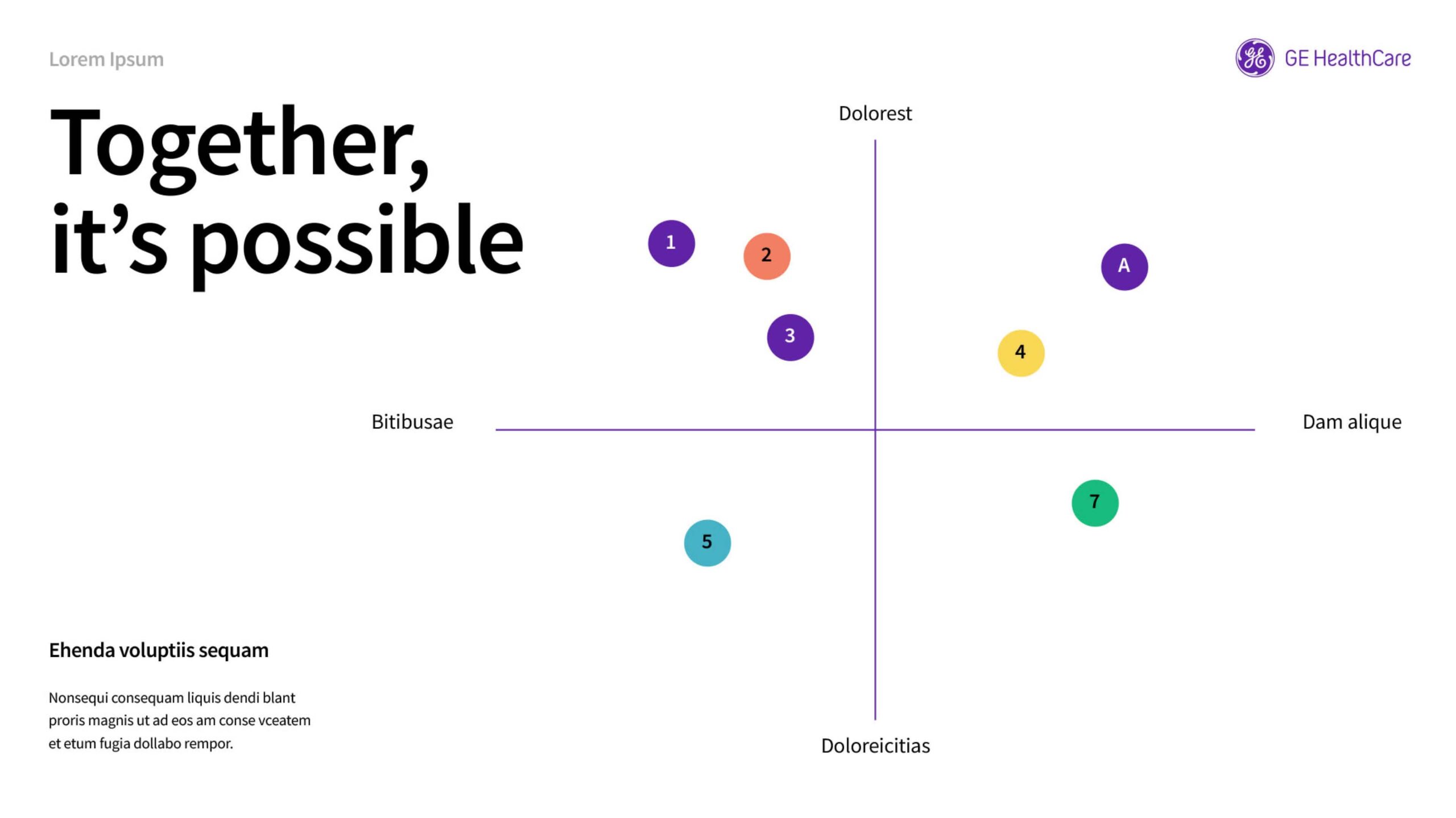
Primary/accent hint ratio
50% Compassion Purple | 50% Accent colors
Color don’ts
Color accessibility don’ts
Use colors only as defined in these guidelines to maintain consistency and accessibility.
Refer to the examples shown to understand what to avoid.

Don’t use the accent colors for typography.

Don’t use the background colors for typography.
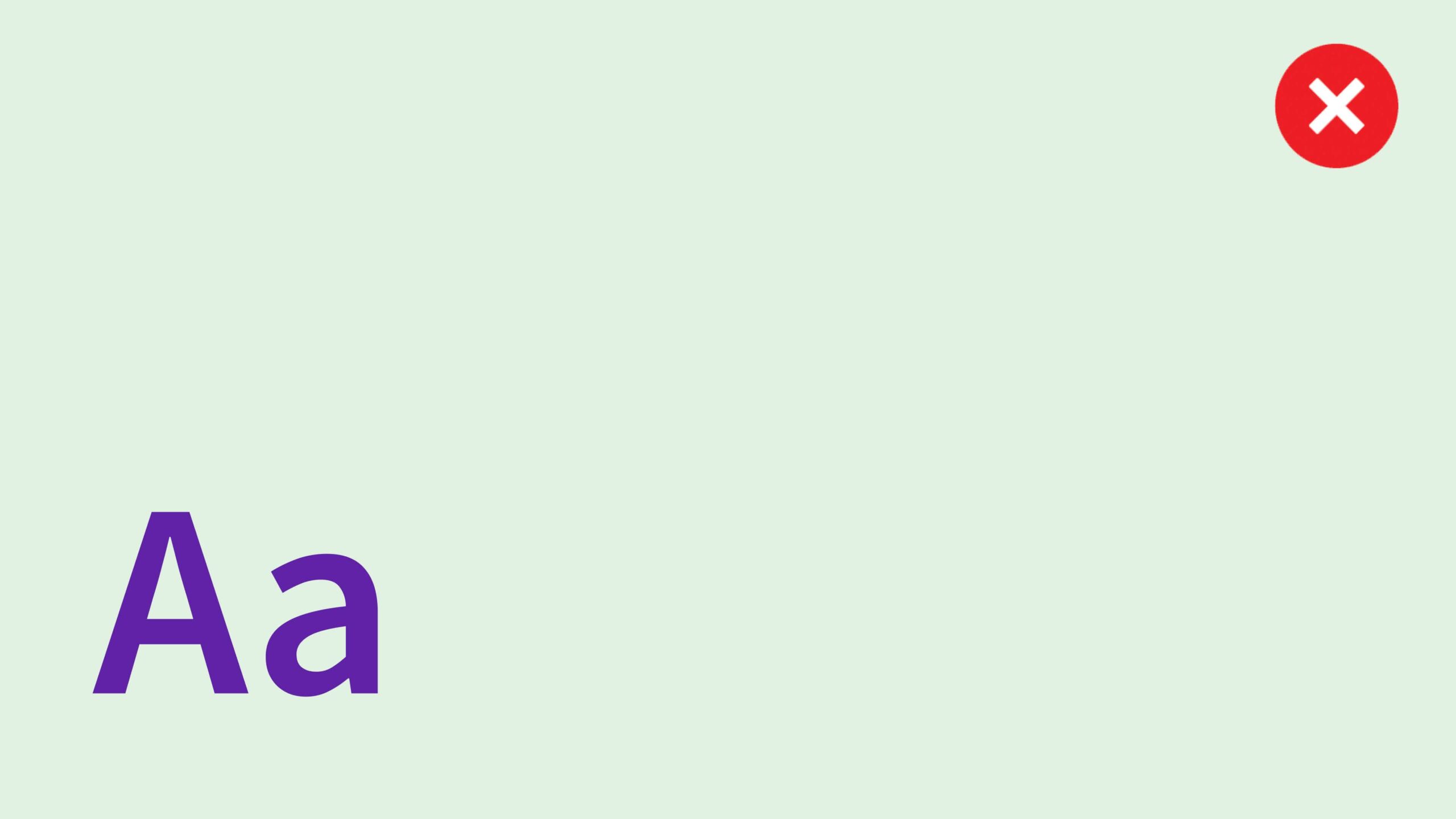
Don’t use the interaction colors for typography.

Don’t use white typography on an accent color background.

Don’t use dark backgrounds with dark text as this this will not meet accessibility requirements.

Don’t use the status colors as backgrounds.

Don’t use the accent colors for backgrounds.

Don’t use large amounts of accent colors.
Color don’ts
To maintain brand consistency, avoid the color use cases shown.
Never place GE HealthCare product names on an accent color background.
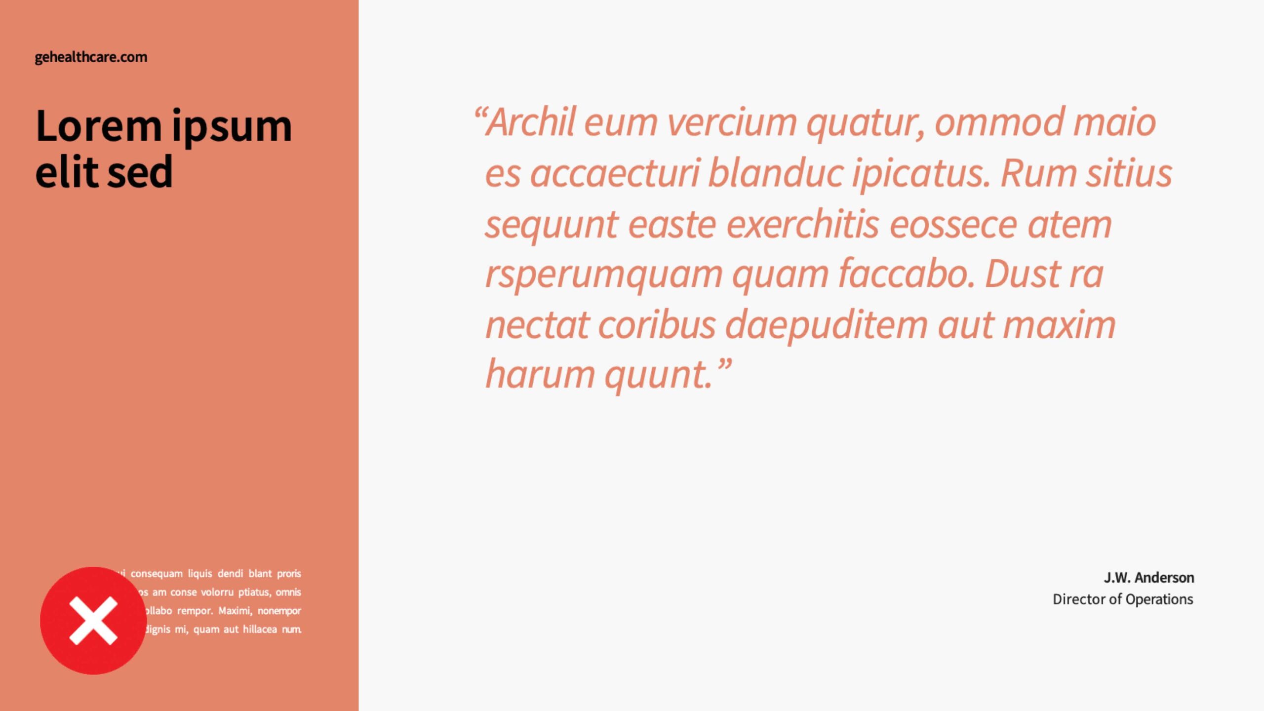
Don’t use an accent color as the dominant color in a layout. Don’t use accent colors for type. Don’t place a URL on an accent color background.
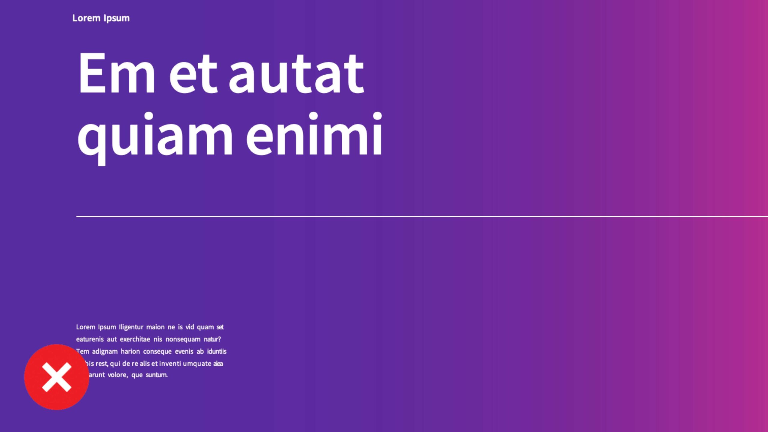
Don’t use gradients.
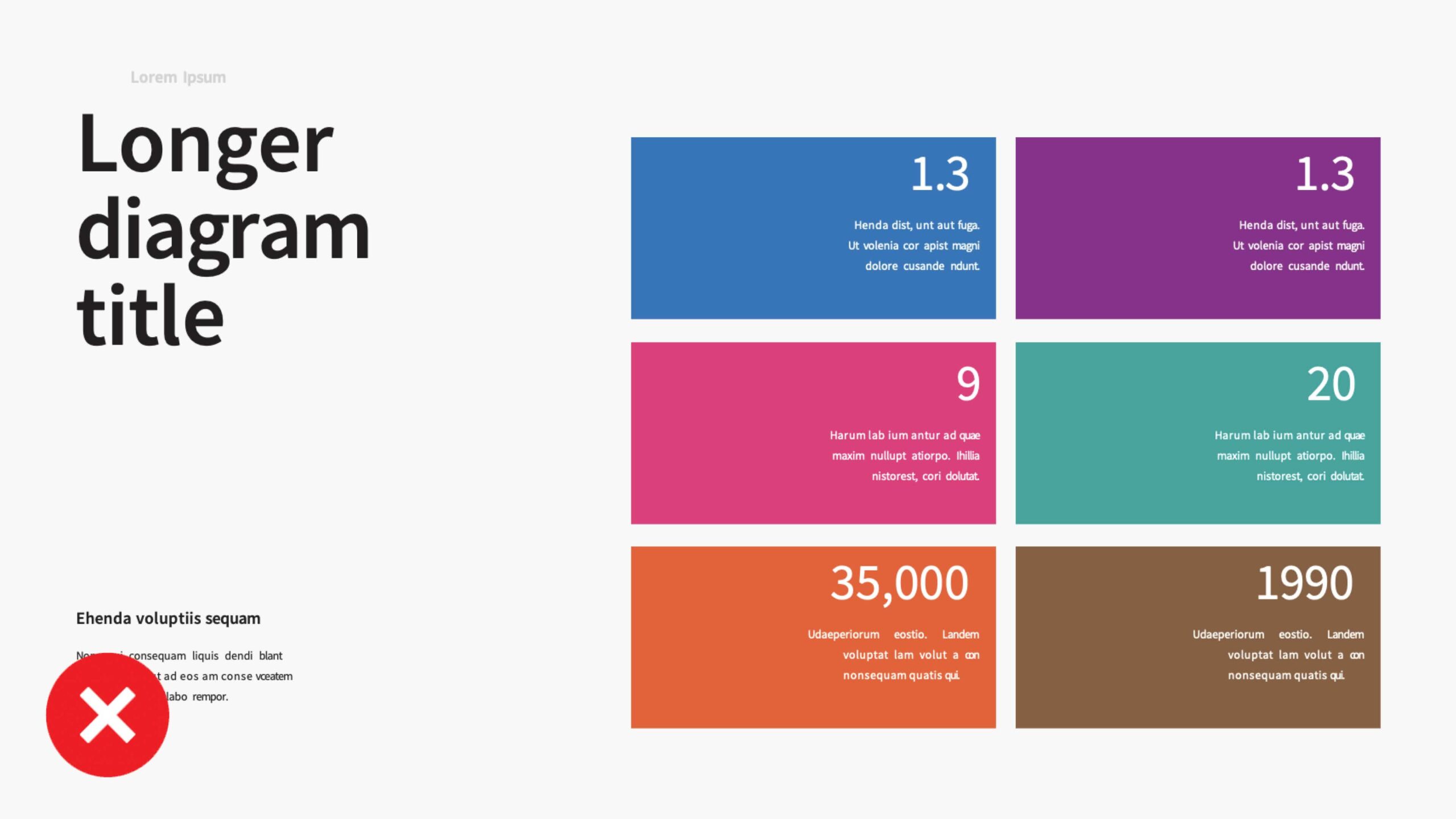
Don’t use colors from outside the color palette.

Don’t use accent colors for decoration. Using accent colors must serve a functional purpose. Don’t use multiple accent colors together (except with infographics, tables, charts, to help highlight or separate information). Don’t use accent color bars vertically.
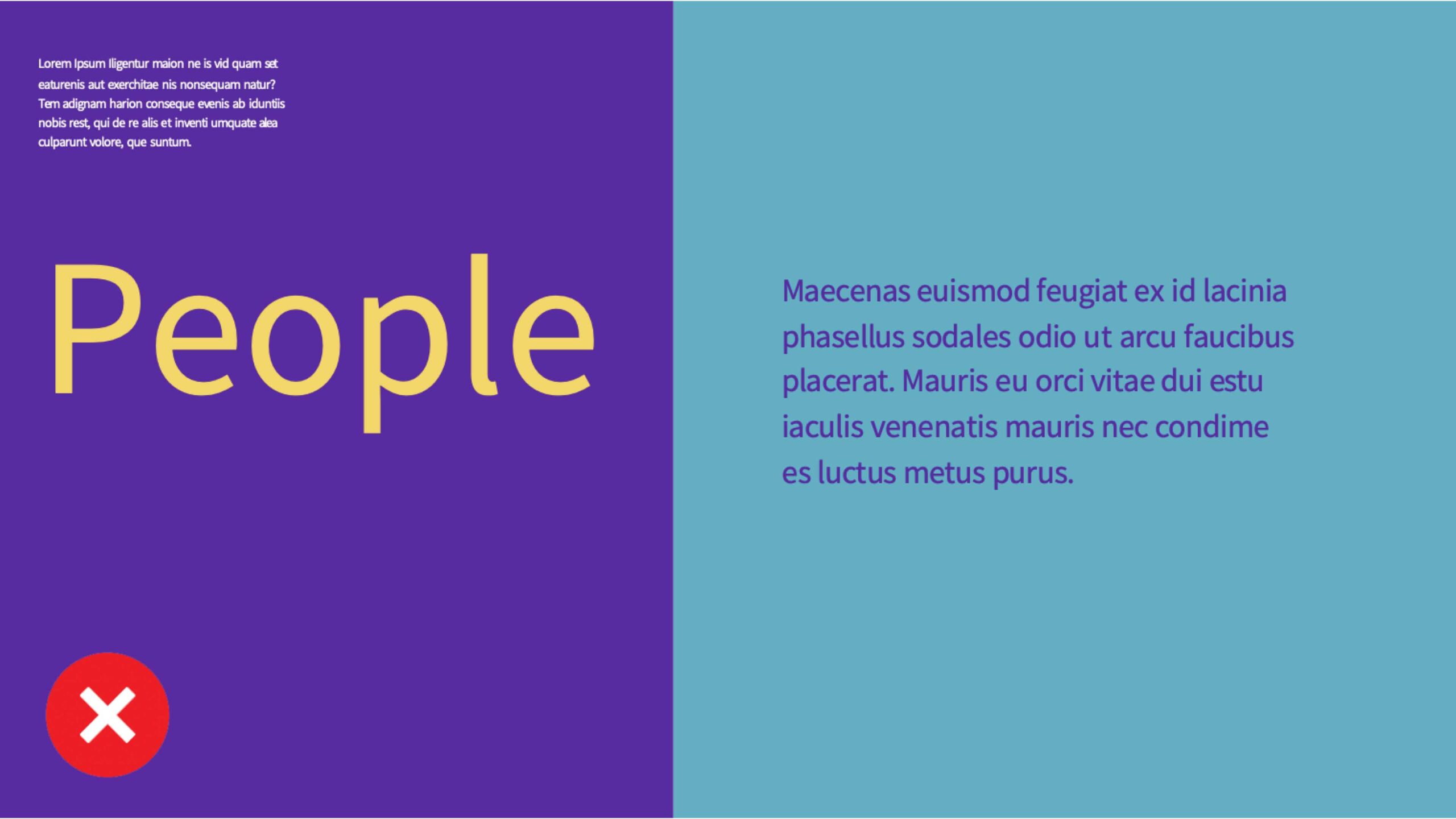
Don’t use an accent color type on top of Compassion Purple or Compassion Purple on top of an accent color.

Don’t place accent colors immediately adjacent to the GE HealthCare logo.
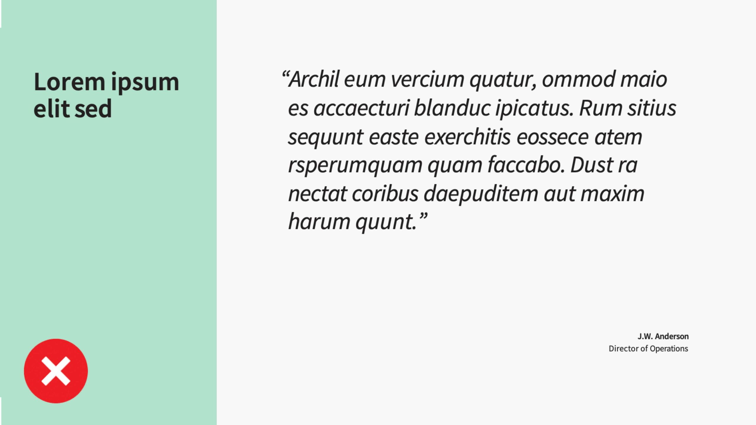
Don’t use a tint of an accent color alone. Tints should be accompanied by the accent color at 100% to help highlight or differentiate information.
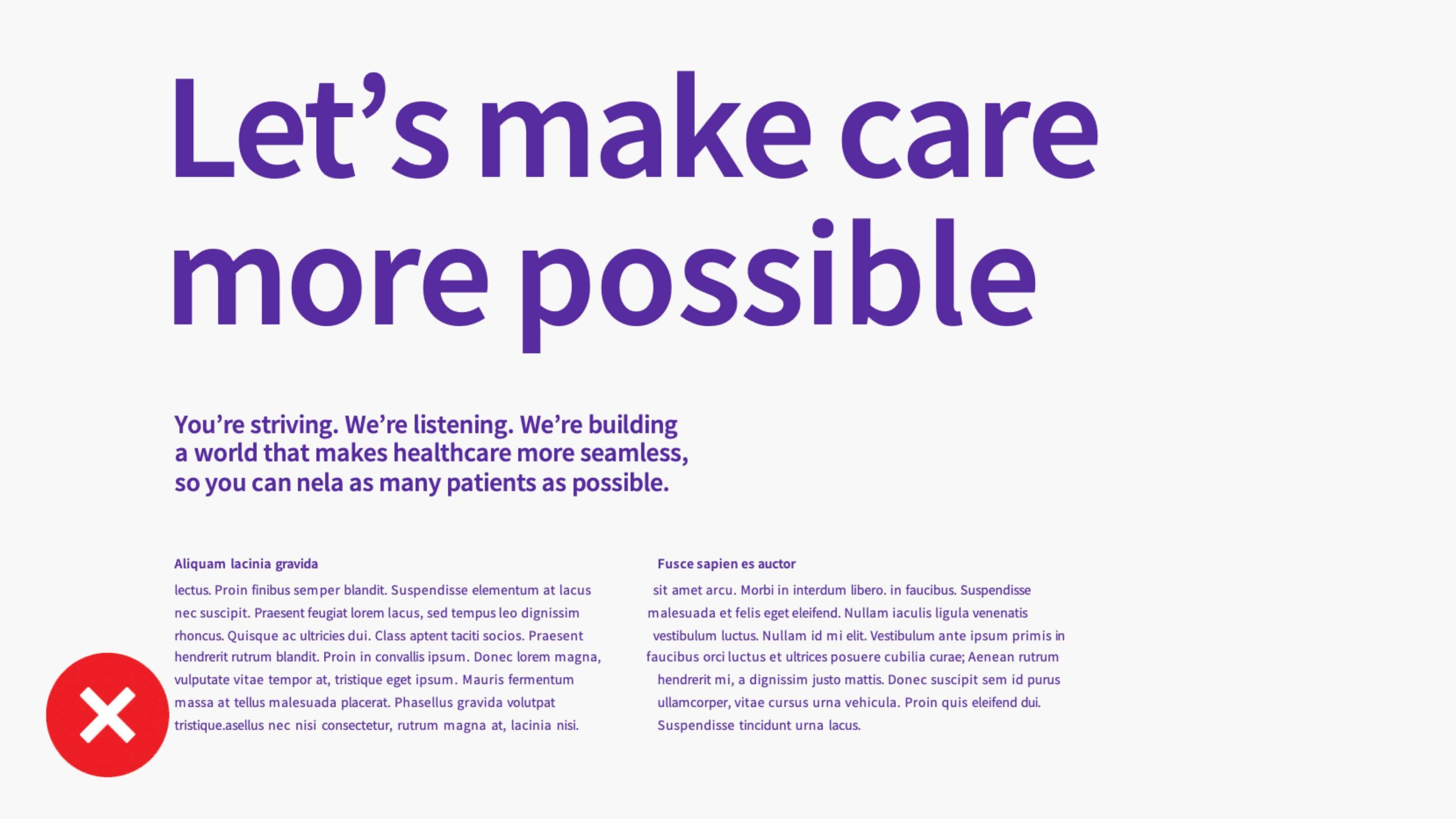
Don’t overuse Compassion Purple in all type hierarchies at once (headline, subheadlines, and body).
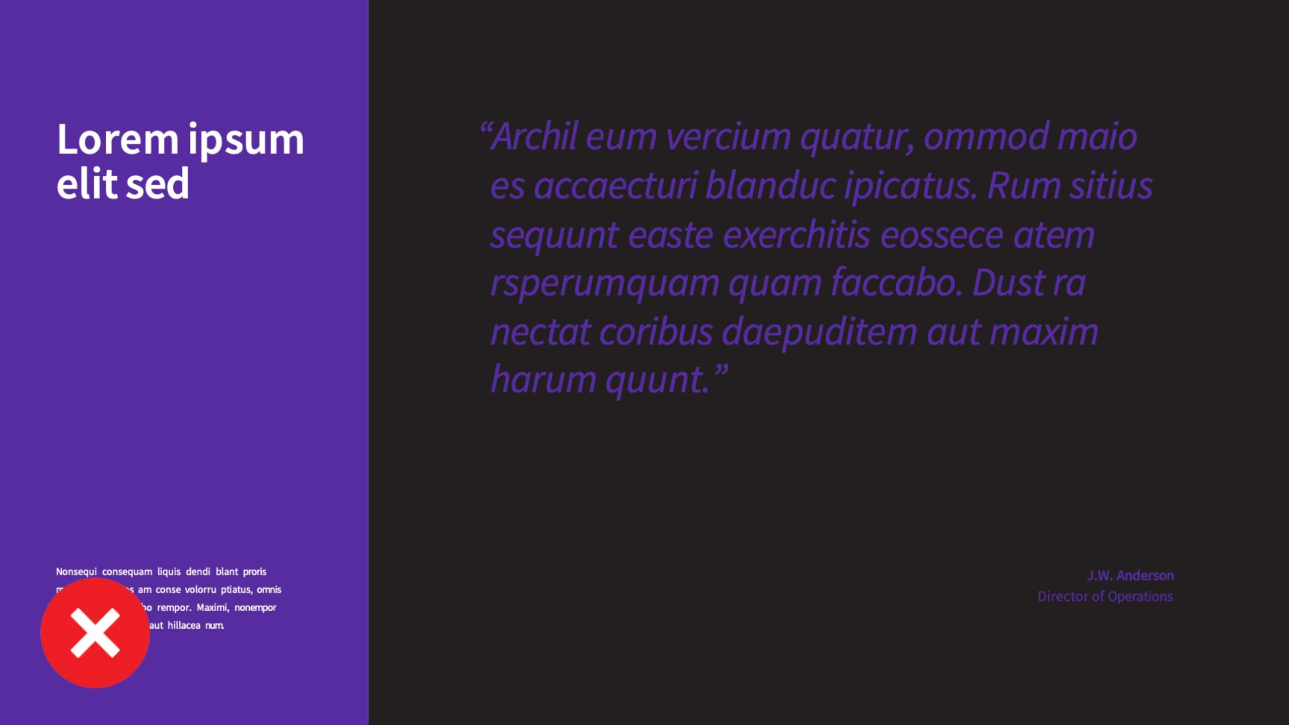
Don’t use black as a prominent background color unless necessary for clinical images.